Search

Search this blog:

Search This Blog

Showing posts with label Data Story. Show all posts

New Zealand Win First Ever Winter Olympic Gold


 Zoi Sadowski-Synnott has brought home the GOLD for New Zealand in the Women's Slopestyle final. This marks New Zealand's first ever Olympic Gold medal, and only our 4th ever Winter Olympics medal.

screenshot NZ history Olympics


She competes in the Women's Big Air next week Monday and Tuesday, so tune in to see how she does or keep an eye on my Beijing 2022 Olympics report for live updates. 

Updating the Data Source

Last year I did a post on updated data sources from Olympics to Paralympics where the sources both had the same format (column headers, etc).

This year, Olympics.com site kept timing out before I could get the data to load into Power BI, so I had to find a new source. This source had slightly different column headers and data format. 

So that means I can't simply go into Data Source settings and change the source:

screenshot data source settings

Instead, I chose to Get Data and create a new query, transforming it to have EXACTLY the same column names as my previous query for Tokyo 2020 Olympics. 

Now, if we delete the Tokyo2020 query and load the Beijing2022 query, all my visuals and relationships will break. Even if I rename them.

However, if you copy the code from Advanced Editor of the new Beijing2022 query into the Advanced Editor from the old Tokyo2020 query, Power BI will treat this as the existing table and maintain your visuals and relationships. Even after you rename it and delete the dummy Beijing2022 query you've just copied! Voila! Working smarter, not harder.

Freediving for Depth: The value of learning advanced equalization techniques


I just finished my AIDA 4 Star Master Freediver course with World Champion Constant Weight No Fins diver William Trubridge this weekend.

Photo of freediving course students and instructors in Lake Taupo, NZ

It was four full days of sun, learning, diving and fun. Now that the course is over, I'm digesting all the new things I learned and working on putting them into practice.

This post is a little different than my usual, as it's sharing the report I created based on my learnings in the AIDA 4 course. This course introduces some advanced freediving techniques, such as mouthfill equalization, that can dramatically increase your maximum depth when diving (if that's you're goal). 

The Report

You can view the Freediving Deeper Techniques report and interact with it in Power BI. It's pre-populated with some common depths and reasonable achievements to give you an idea of the leap freedivers can make after mastering the techniques covered in the AIDA 4 course. 

If you're a freediver, play with the values and see what you can achieve. If you're not a freediver, enjoy learning about the physics behind this crazy sport.

DAX Parameters

This report uses lots of DAX parameters which enable the viewer to change the values in order to see their impact. 

Navigator Button

I'm very excited to finally show you the Navigator Button. Last year I wrote a blog about how to design custom navigation in Power BI using buttons. At the end of last year, Microsoft introduced the Page Navigator button to Power BI, making this process so much easier. Now you just need to add a single button to your page and all page names are automatically populated in the navigation pane. You can even change the orientation in case you want your buttons going down the left hand side instead of the top/bottom.

The Course

In order to become an AIDA 4 star certified freediver, you must prove a minimum level of performance:

  • Dive to at least 32m depth and back using only the aid of fins (no pulling on the rope)
  • Dive at least 70m distance in the pool using only the aid of fins
  • Complete a static breath hold greater than 3 minutes 30 seconds in the pool

Additionally, you must also demonstrate that you are capable of assisting fellow divers and yourself in adverse conditions:

  • Rescue a diver from 20m depth and tow them at least 50m to the boat/shore
  • Rescue a diver from 15m depth while you're wearing only 1 fin
  • Return from 20m depth without a mask or nose clip and with only 1 fin

Finally, you must also pass a written exam that tests your knowledge of theory in various areas including nutrition, equalization, environment, safety, training, performance and more.

You can read my summary of the weekend on the Auckland Freediving site: AIDA 4 Star with William Trubridge

Power BI Forecasting with irregular time periods


Will Auckland move to Alert Level 3 on Monday?

Power BI screenshot of COVID lockdown levels and case numbers

It's day 31 of Lockdown Level 4 for us Aucklanders (how did that happen and what have I done with all that time?!). Monday we will find out if Auckland stays in Level 4 or moves to another alert level.

This is already Auckland's longest time in Level 4, and it seems everyone is getting stir crazy; We've all walked our neighbourhoods so many times we know every nook and cranny by heart. It's been rainy the past week or so, so we've also probably finished all the puzzles in the house (twice), read plenty of books, watched the Top 10 on Netflix, run out of flour from excessive baking and put on a few kilos. Well, that's been my lockdown anyway. 😂

After all that activity, I'm left wondering what Monday's announcement will bring for us Aucklanders; will we get to enjoy someone else's cooking skills with Lockdown Level 3? (See my Lockdown with Takeaways post if you're not from NZ.) Or will we stay in Level 4 a bit longer to beat the delta variant? (If so, send me your favourite recipes - I need new ideas!)

I have been wanting to overlay the current case numbers with the last big lockdown we had in Auckland, so finally got around to making it happen. 

View the Live Power BI report

DAX Data Overlay for Forecasting

Power BI has some built in forecasting that will automatically calculate and forecast, allowing you to change the number and length of periods, as well as the seasonality. However, this doesn't work for irregular time frames. COVID lockdowns in New Zealand don't really have a seasonality. It also doesn't allow you to overlay past actuals at the same time as forecasting, so I decided to create some crazy DAX measures to show what I wanted.

GENERATESERIES: Days since start of Lockdown

The first calculation I made was to create the X-axis: Number of Days in Lockdown

DAX has an easy function that can make this axis for you. Click New Table to create a new table for this calculation: 

Days In Lockdown =

GENERATESERIES (

    -10,

    100,

    1

)

This creates a single column table with numbers ranging from -10 to 100, increasing by 1 each row. I decided to start at -10 because the first lockdown in NZ started about 10 days after the first reported case, so this would ensure we could see that history in the graph.

Key Dates table

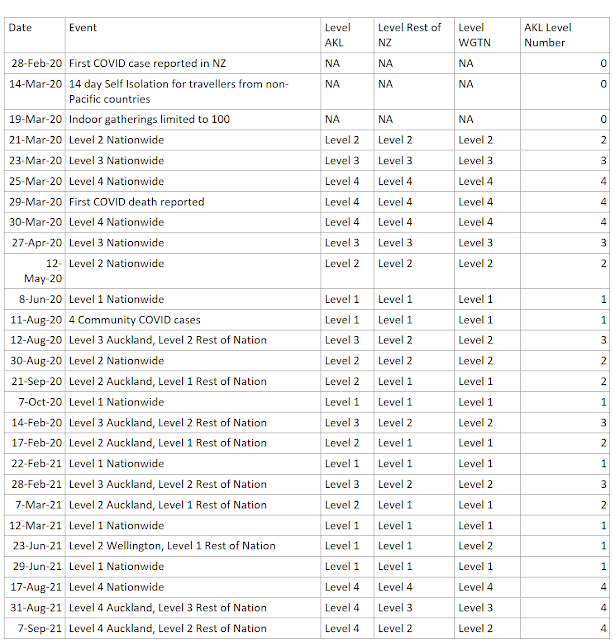
The next step was to list all the key dates and alert levels throughout both lockdowns. I know that I can use approximate lookup in DAX to display the current level if I just provide a list of Alert Level start dates, which is conveniently compiled on the Timeline of Key Events COVID19.govt.nz website.

table of key COVID19 NZ Dates

This table should NOT be related to any of the other tables in the data model - we'll make all the magic happen with DAX.

Along with key dates table, I created two measures for the start date of the two periods I wanted to compare: 

Key Start Date Period to Compare

Lockdown March 2020 Start Date =

DATE ( 2020323 )

Key Start Date Current Period

Lockdown August 2021 Start Date =

DATE ( 20210817 )

If you prefer, you could add a Parameter (an unrelated Date table) allowing users to select the Key dates themselves. This will make it possible to compare dynamic date ranges and custom time periods.

DAX Variables and Approximate Lookup: Convert Date to relative time since Start of Lockdown

I'm comparing to the start of lockdown, but you can use this method to compare any two time periods by relative length/duration. We simply need to use the value of the GENERATESERIES column we created, add that to the value of the Key Start Date value. I'm calling this value my 'CaseDate', but it's the date in your Fact table. 

Key Date Approximate Lookup

For the alert level status, we need to use the DAX approximate lookup technique, I have chosen the MAXX(FILTER( option: 

Lockdown August 2021 AKL Level =
VAR _StartDate = [Lockdown August 2021 Start Date]
VAR _Duration =
    MAX ( 'Days In Lockdown'[Days In Lockdown] )
VAR _CaseDate = _StartDate + _Duration
VAR _KeyDate =
    MAXX (
        FILTER (
            'NZ Key Dates',
            'NZ Key Dates'[Date] <= _CaseDate
        ),
        'NZ Key Dates'[Date]
    )
RETURN
    IF (
        _CaseDate
            <= TODAY (),
        SUMX (
            FILTER (
                'NZ Key Dates',
                'NZ Key Dates'[Date] = _KeyDate
            ),
            'NZ Key Dates'[AKL Level Number]
        )
    )
 

This will allow us to calculate the Alert Level in Auckland on each relative day since the Key Start Date of Lockdown. 

Power BI levels overlay chart

Key Date Exact Lookup

The DAX for the Case numbers is a bit simpler, since we have a value for each date that has cases (unlike the Key Dates table which only contained the Start date value). Therefore we don't need the MAXX calculation and can do an exact lookup: 

Lockdown August 2021 Cases =
VAR _StartDate = [Lockdown August 2021 Start Date]
VAR _Duration =
    MAX ( 'Days In Lockdown'[Days In Lockdown] )
VAR _CaseDate = _StartDate + _Duration
RETURN
    IF (
        _CaseDate
            <= TODAY (),
        COUNTX (
            FILTER (
                'NZ Cases',
                'NZ Cases'[Report Date] = _CaseDate
            ),
            'NZ Cases'[Index]
        ) + 0,
        "TBC"
    )

This allows us to calculate the total case numbers on each relative day of lockdown since the Key Start Date: 

Power BI chart cases overlay

Then put them both together in an area chart and voila! Easy to see the patterns and similarities and differences between the two time periods. 

Sunday's spike of 40 new cases is concerning for what Monday's decision may bring, but only time will tell the actual result. For now, I'll content myself with forecasting and playing with Power BI visuals.

Advanced Filter OR vs AND


This post was inspired by @saud968 from the Power BI Community and their post on Multiple values from same column under same visual

Their question centered around being able to find all the survey results that were equal to 4 AND all the survey results that were equal to 5. While the wording I have used here, specifically the word AND, is commonly how we approach and think of the problem, it will unfortunately trip you up when working with advanced filter logic. 

Screenshot Power Query Advanced Filter

I am going to keep this post generic, as this concept can apply to DAX Logical Operators (specifically && and ||), Excel Advanced Filter conditions, Power Query Advanced Filters with And / Or selection and more!

The Problem

Let's use the below table as our sample data. Nice and simple, only 5 rows of ice cream orders:

Order ID Name Location Country Flavor Scoops
1 Allison Chicago USA Chocolate 2
2 Phil Wellington NZ Vanilla 2
3 Allison Auckland NZ Chocolate 1
4 Vijay New York USA Mint Chocolate Chip 1
5 Agnes San Francisco USA Vanilla 1

The boss wants to know the total number of scoops for Chocolate of any kind, so Chocolate and Mint Chocolate Chip scoops combined total. How do we write the filter - using AND vs OR?

Let's start simpler:

If we want all Orders for vanilla that's easy: Order IDs 2 and 5. 

venn diagram vanilla only

If we want all Orders for 1 scoop that's easy: Order IDs 3, 4 and 5. 

venn diagram 1 scoop only

But what if we want Orders for vanilla AND 1 scoop?

What about Orders for vanilla OR 1 scoop?

AND: 1 scoop AND Vanilla

Let's start with the AND condition: 

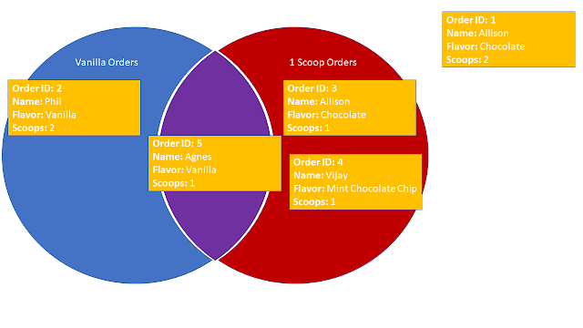
venn diagram

As you can see in the Venn Diagram above, I have moved Order ID 5 to the middle of the Venn Diagram, since it is both a Vanilla AND a 1 scoop order, so it falls into BOTH filter conditions. 

If we choose an AND filter, we will only get the intersection of the chosen conditions, in this case, Order ID 5 only.

OR: 1 scoop OR Vanilla

But what if we wanted all four of those Orders 2, 3, 4 and 5?

Well, again referring to the Venn Diagram above, in order to get all orders, we need to include ALL orders that fall into Vanilla Orders and ALL orders that fall into 1 Scoop Orders. 

As I have mentioned before, the use of that pesky little word and in the sentence above often gets us into trouble. We have already demonstrated that when using the AND filter, we only get Order ID 5. So to get all four orders we must need to use the OR condition. But why?

Let's rephrase our question to look at EACH order individually, as that is how the filter conditions are evaluated when we use them in the various Power BI, Excel, etc applications: 

Does each Order have either Vanilla OR 1 scoop?

Now we have the key to success. Looking at EACH item individually:

  • Order ID 1, does it have either vanilla or 1 scoop? NO
  • Order ID 2, does it have either vanilla or 1 scoop? YES, vanilla only
  • Order ID 3, does it have either vanilla or 1 scoop? YES, 1 scoop only
  • Order ID 4, does it have either vanilla or 1 scoop? YES, 1 scoop only
  • Order ID 5, does it have either vanilla or 1 scoop? YES, vanilla AND 1 scoop

So now we can see that by using the OR condition on EACH item, we get the desired result of all four orders that have either 1 scoop or vanilla.

EACH item is evaluated individually

Now that we know that each item is evaluated individually, let's rephrase our questions and revisit the AND filter. 

Does each Order have Vanilla AND 1 scoop?

  • Order ID 1, does it have vanilla and 1 scoop? NO
  • Order ID 2, does it have vanilla and 1 scoop? NO, vanilla only
  • Order ID 3, does it have vanilla and 1 scoop? NO, 1 scoop only
  • Order ID 4, does it have vanilla and 1 scoop? NO, 1 scoop only
  • Order ID 5, does it have vanilla and 1 scoop? YES, vanilla AND 1 scoop

Find the Chocolate and Mint Chocolate Chip combined total scoops

To determine which filter condition (AND vs OR) to use, we need to think about evaluating EACH item individually. 

If we draw our Venn Diagram, we can see that nothing is in the middle AND condition section: 

venn diagram

Does each Order have Chocolate AND Mint Chocolate Chip?

  • Order ID 1, does it have Chocolate and Mint Chocolate Chip? NO, Chocolate only
  • Order ID 2, does it have Chocolate and Mint Chocolate Chip? NO
  • Order ID 3, does it have Chocolate and Mint Chocolate Chip? NO, Chocolate only
  • Order ID 4, does it have Chocolate and Mint Chocolate Chip? NO, Mint Chocolate Chip only
  • Order ID 5, does it have Chocolate and Mint Chocolate Chip? NO, 

Does each Order have Chocolate OR Mint Chocolate Chip?

  • Order ID 1, does it have Chocolate or Mint Chocolate Chip? YES, Chocolate only
  • Order ID 2, does it have Chocolate or Mint Chocolate Chip? NO
  • Order ID 3, does it have Chocolate or Mint Chocolate Chip? YES, Chocolate only
  • Order ID 4, does it have Chocolate or Mint Chocolate Chip? YES, Mint Chocolate Chip only
  • Order ID 5, does it have Chocolate or Mint Chocolate Chip? NO, 

Therefore, in order to get both Chocolate AND Mint Chocolate Chip orders, we actually need to use an OR filter condition. 

Solution

In conclusion, be careful how you word your filter condition questions - don't mislead yourself. In order to pick the correct filter condition (AND vs OR):

  • Evaluate EACH item individually
  • Make a Venn Diagram
    • AND filter condition: Intersection of all conditions (aka the middle of the Venn diagram)
    • OR filter condition: Union of all conditions (aka everything within the Venn diagram)

Now we can confidently tell the boss that there are 4 total scoops that were either Chocolate OR Mint Chocolate Chip because we used an OR filter condition to filter our data. 

Welcome to Level 3: Lockdown with Takeaways


Auckland and north remain in Level 4 lockdown for the time being, but for those of you living south of the Bombays in New Zealand - welcome to Level 3 lockdown, or as it is affectionately called: Lockdown with Takeaways.

View the Power BI Report

Lockdown with Takeaways

For those of you who don't have the great fortune of living in New Zealand, Level 4 lockdown requires all non-essential businesses to shut. This basically means we can go to the supermarket and pharmacy, but nowhere else. I'm still unclear on how a store gets classified as 'supermarket', as butchers and bakeries cannot open, but veggie stores and convenience stores can open. Level 3 enables any store or restaurant to open for contactless service. This means we can get 'takeaways' as we call them here in NZ, or 'fast food' as you may call them. You can also act as your own delivery driver, as click and collect is available if it can be done contactless. 

Flatten the Curve


screenshot Power BI log chart


In her daily briefing yesterday, the Prime Minister showed off another visual aid (last week it was a map of close contacts of known cases): a graph of where the New Zealand case numbers could be had we not gone into Level 4 lockdown. 

I have been tracking the NZ COVID 19 cases on a logarithmic scale since the beginning, but yesterday's briefing inspired me to highlight it more prominently.

Page Navigation Buttons

I realized that depending on your browser, screen resolution, device, etc, accessing the built in page navigation of Power BI might be tricky. So, I have decided to build it into my report pages.

screenshot Power BI report page

The image above shows an example of what you can create using Power BI buttons.

How to create a Power BI Table of Contents

Creating Buttons in Power BI is easy, it just takes time and care to ensure you have set all the correct actions, tooltips and formats for each button. 

In the page above, I have actually created 8 buttons - two for each page. I did this because I wanted the flexibility of being able to change the image without needing to use another application to merge it with the label, and I wanted the user to be able to click either the image or the button in order to navigate.

Step 1: Insert Button

On the Insert tab in Power BI, you'll see Buttons, Shapes, Image. Any of these can actually be used as a 'Button', so pick whichever you prefer. In the above I used Buttons > Blank.

Step 2: Format Button

If you chose an image as your Button, you have already done half the work. Now just format the size, border, etc.

If like me you chose a Blank Button, we need to fill it with an image. Expand the 'Fill' property of your button and click the + to add an image.

screenshot Power BI format button

Set the transparency - I set mine to 0% because I am creating the text labels as separate buttons.

Step 3: Button Action

Finally, turn the Action to 'On'. Note, this can be done for a button, shape or image, so it doesn't matter what you picked in Step 1.

Choose 'Page navigation' for the Type and select the page you want to navigate to. Note: This can be conditionally formatted which means your button behavior can change depending on the user selections. How cool is that?!

Finally, type something useful in the 'Tooltip' box. This does take extra time, but I think it makes your report MUCH easier to use, so is worth spending the time now as it will save you answering lots of questions from users later.

If you don't want to add a tooltip, leave it blank for the default 'Click here to follow link' message, or as of this month you can even turn the tooltip off!

Step 4: Repeat

Now that you have one button, repeat the process for all other buttons (you can save some time with copy/paste, but you'll need to set all the actions). This is where the care and testing comes in - it's very easy to miss a tooltip or action if you're not careful.

Don't forget to add back buttons on all the other pages so that the user can return to the table of contents.

Try it Out

Have a go navigating through the report below to see how the buttons work. There are lots of other ways you can use buttons for navigation - add them as tabs to the top or side of your page, use a slicer to let the user select the desired page and click 'Go', or tell a story enabling the user to navigate through the report in a specific sequence.

Preview Feature: Data Point Rectangle Select


Today is the day New Zealanders will learn the fate of COVID 19 Lockdown levels for the next few days/weeks. Those of us in Auckland are guaranteed Level 4 through Tuesday, but the rest of the country holds hope of moving down to a lower level in time for the weekend.

What do the numbers look like? 

Since we've had a long (enjoyable) gap with no Community COVID 19 cases in NZ, I thought this would be a good excuse to play around with the Power BI preview feature: Data Point Rectangle Select

Data Point Rectangle Select

In order to use this in your reports, you must:

Step 1: Enable the Preview Feature

Open Power BI Desktop

Click File > Options and Settings > Options

Tick the box to enable 'Data Point Rectangle Select' and click OK.

Restart Power BI Desktop.

Step 2: Use It!

If in Power BI Desktop, you'll need to use the Ctrl key to activate this feature. If in Power BI service it works with just a simple drag and drop. 

That's it! You've now got the power to select specific areas, outliers and ranges using visuals as filters. 

Demo

Below is a short 1 minute video I made on Wednesday, showcasing how I used this feature to hone in on the most recent COVID 19 outbreak in New Zealand and compare that to our first outbreak and the only other time we were in Level 4 Lockdown. The numbers look pretty comparable, but hopefully more isolated to one part of the country.

Stay Safe NZ!

BONUS: Toggle and Bookmarks

At the very end of the video, you'll notice I toggle the map to show the COVID 19 cases for all time across New Zealand, rather than focusing just on the current active cases. I have a tendency to go overboard with Power BI DAX, visuals, and features, which can lead to information overload if you're not careful. 

Historically I've struggled with deciding what information to cut, or how to make it easy for the user to choose without taking up precious real-estate on my screen. 

Well, the Power BI toggle might just be the perfect solution. Thanks to Havens Consulting: Creating Sliding Toggles With Native Buttons in Power BI for the tutorial and David Johnston's winning Enterprise DNA report for the inspiration to toggle! Check out their videos and let me know your thoughts on toggles.

Categorical Date Slicer in Power BI


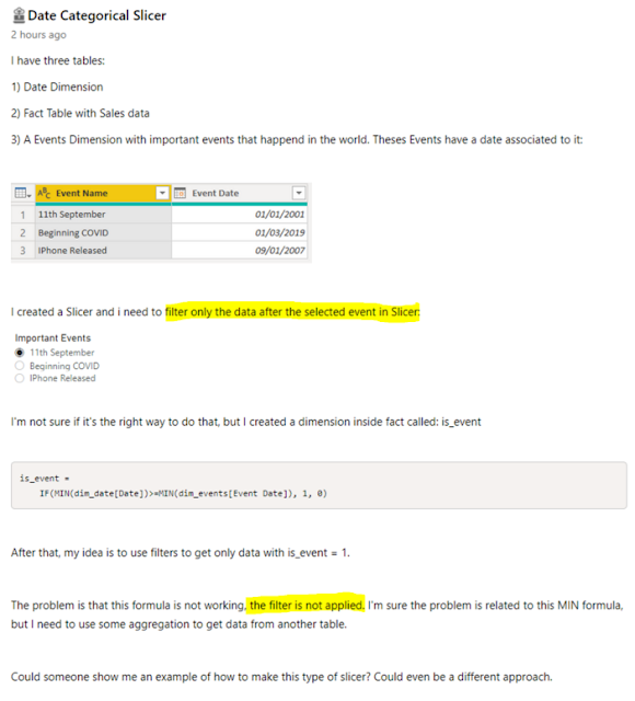
Today's post is inspired by @Iguima of the Power BI Community. You can read their original Date Categorical Slicer question on the Power BI Community Desktop Forum.

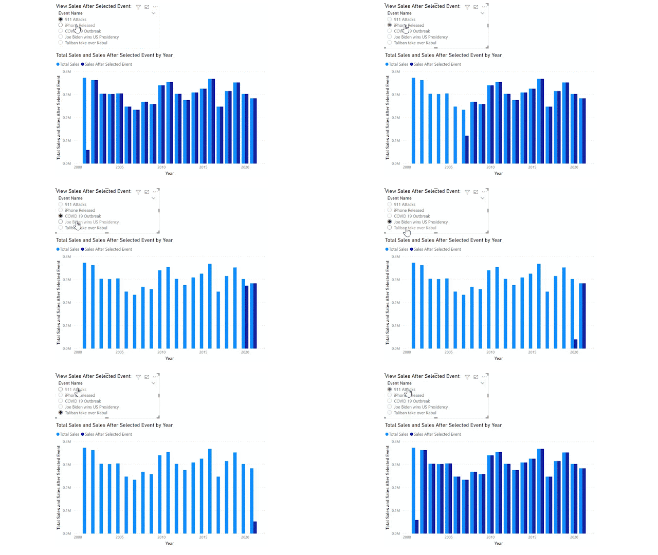
The original poster would like to achieve a categorical date slicer that enables the report user to filter the Sales (fact) table for all data AFTER the selected event/date category. Something similar to the final result below:

GIF screenshot Power BI final result

Note the events span over 20 years and include the 911 terrorist attacks on the USA, COVID 19 pandemic and also some not so catastrophic events such as iPhone first release date. I have added a few more recent events for 2020-21 in case you want to test on your own sales data (which might not span 20+ years!).

Event Name Event Date
COVID 19 Outbreak Wednesday, March 11, 2020
Joe Biden wins US Presidency Saturday, November 7, 2020
Taliban take over Kabul Sunday, August 15, 2021
911 Attacks Tuesday, September 11, 2001
iPhone Released Friday, June 29, 2007

For reference, I have highlighted the important parts of the original question: 

screenshot Original Poster's Question in Power BI Community forum

There are two key issues in this request: 

  1. We want to filter for data only AFTER the selected event. Most filter behavior will return data only ON the selected event.
  2. We want this to be responsive to the filter and slicer selections made by the report consumer.

I have already written about key issue number 2 in a previous blog on Reporting Order of Operations. Basically, calculated columns do not respond to report filters and slicers. We need to solve this problem with a MEASURE.

Data Model

Before we can get into the measure and DAX, we need to review the Data Model. Any of my former students will tell you this is the foundation of your Power BI report. Without the correct data model, DAX won't work. 

For this scenario, we want the Important Event to act as a bookend for our Date table, not filter it just for that specific date. Therefore we need to ensure that the Important Events table is NOT related in any way to the other tables in our data model. 

Below I have a very simple data model: Calendar (date dimension) and Sales (fact) with my Important Events (Categorical slicer table) unrelated to any of these.

screenshot Power BI data model

DAX Formula

Now that we have the Data Model sorted, we can move on to the DAX.

We start with a simple measure for Total Sales:

Total Sales =
SUM ( Sales[Sales Amount] )

Use this [Total Sales] measure in a visualization by Calendar[Year].

We then add a slicer for the 'Important Events'[Event Name]. Since the Important Events table has no relationship to our data, this won't do anything in our report. 

In order to get the Total Sales to filter based on the slicer, we need to figure out what value the user has selected. I have chosen to use the MIN function in case multiple events are selected. This will ensure we are looking at all data after the earliest event.

Selected Event Date =
MIN ( 'Important Events'[Event Date] )

NOTE: Because the [Selected Event Date] is a measure, it will respond to user selections in the slicer as per the Reporting Order of Operations blog. 

Finally, we can use this measure as a filter. You may initially be tempted to write the following DAX and get an error: 

screenshot wrong DAX formula

I haven't used CALCULATE within the filter, but I have used [Selected Event Date] measure, and every measure has an implicit CALCULATE function in front of it. Therefore this DAX expression is not allowed. 

Instead, we need to provide a ROW CONTEXT for the calculation, here I use the FILTER function to provide this context. Now, I am able to use the [Selected Event Date] measure (with its hidden CALCULATE function and all) inside the filter expression:

Sales After Selected Event =
CALCULATE (
    [Total Sales],
    FILTER (
        'Calendar',
        'Calendar'[Date] > [Selected Event Date]
    )
)

Hurray! We get the final result we're looking for, as per the GIF at the start of this article. 

CONCLUSION

You cannot use COLUMNS to respond to filter/slicer selections.

You must not have relationships if you want to do before/after/range filters. 

Once we have overcome these two obstacles, the desired result is achievable. Now to just update any other measures with this added filter. 

Tokyo 2020: Per Capita Medal Rankings


Finally, the results you've all been waiting for!

I've had students, fellow MVPs, Aussies and New Zealanders alike ask for the per capita medal rankings for the Olympics. Ask and you shall receive. 

For this data, I've merged the population data from Wikipedia into the OlympicTeams table and calculated the Medals per 1 Million people for each country. 

Happy to say that it's an extraordinary year for New Zealand - we're ranked number 2 per capita in Gold First medal rankings. I've also replaced the United States with Australia in this per capita page as we have to keep the trans-Tasman rivalry alive and well. Australia you have some catching up to do - NZ have more than double the per capita medals with 2.93 to Australia's 1.39 as of now. 

screenshot Power BI per capita page

Keep up to date with the live results in the report below (per capita is page 2).

Enjoy the Olympics!

Tokyo 2020: RANKX


I'm sitting here watching the Olympic action in the Velodrome for men's pursuits finals and proud to say that New Zealand is currently in the top 10 teams overall in the Olympics! Well, as long as you're using the 'Gold First' ranking method that is. They're number 12 if you are ranking by total medals count. 

screenshot Power BI Gold First Medal Ranking

Olympic Medal Ranking System

Lucky for New Zealand, most of the world goes off the Gold First ranking method. This is certainly how they have been ranking the teams on New Zealand TVNZ 1 throughout the Olympic games. 

However, that is not always the case in the United States. I recall watching broadcasts of Olympic games where the total medal count is all that determines the order of the teams. Looking at the stats, it's not surprising that the United States does things differently (were you surprised anyway? We often march to the beat of our own drummer in the USA). 

Tokyo 2020 Ranking Controversy

Do a quick Google search and you'll see some controversy around the USA media Olympic team ranking systems. Here's an excerpt from Independent.co.uk:  

Screenshot quote

Historically, the difference between the Total Medal Count and Gold First Ranking has only mattered in a few years, such as 2008 when China had most Gold but USA had most Total medals.

The USA and China have been battling for first place throughout the Tokyo 2020 Olympics, with ROC and Japan high on the list as well. Currently, USA ranks first in Total Medal Count, but only second (to China) in Gold first ranking. Come on team USA - bring home the Gold!

screenshot Power BI graph Total Medals ranking

RANKX DAX Function

I thought I'd take this opportunity to write a post on the RANKX function in DAX. This is a complex function that I have spent many hours researching, testing and tweaking. What makes the RANKX so difficult to get right?

  • Dynamic measures - when using RANKX in a measure, you need to be aware of the DAX context and ensure you use the needed modifiers, such as ALL and CALCULATE, otherwise you'll end up with every team ranked number 1!
  • Ties - how do you break ties in RANKX? This often becomes a math problem, and one that I need to solve for the Gold First ranking method

The DAX Measure

Gold First Rank =
IF (
    CALCULATE (
        [Tokyo 2020 Total Medals],
        ALL ( OlympicMedals )
    ) > 0,
    CALCULATE (
        RANKX (
            ALL ( OlympicTeams ),
            CALCULATE (
                [Tokyo Gold] * 10000 + [Tokyo Silver] * 100 + [Tokyo Bronze]
            ),
            ,
            DESC,
            SKIP
        ),
        ALL ( OlympicMedals )
    )
)

Gold First Ranking System

Let's start by understanding the Gold First ranking system in the Olympics. It's pretty straightforward - the team with the most Gold medals is ranked 1, next most Gold medals is number 2, and so on. But what if two teams have the same number of Gold medals? Then we look at Silver for the tie break. 

screenshot Power BI ties ranking

For example in today's rankings, France, Republic of Korea and New Zealand all have 6 Gold medals, but France have more than twice as many Silver medals with 10 Silver and are therefore ranked in 8th, higher than Republic of Korea and New Zealand. Republic of Korea and New Zealand each have 4 Silver medals, so are again tied. Therefore we look to Bronze for the tie breaker - Republic of Korea have 9 Bronze to New Zealand's 5 Bronze, therefore Republic of Korea take 9th and New Zealand take 10th place. Just 1 Gold medal and New Zealand could overtake both France and Republic of Korea to gain 8th place!

Rank Expression

In order to rank these teams accurately, I need to calculate a value or 'expression' that can be used to rank them. We need to ensure that Gold is given the most weight, Silver next and Bronze the least.

In order to make sure that a country with lots of Bronze and no Golds is not ranked above a country with 1 Gold, we need to choose the appropriate weighting. To determine this appropriate weighting, I will start with the smallest value. 1 Bronze medal gets 1 point. 

Next, I need to understand my data and ask a very important question:

What is the maximum number of Bronze medals a single Team might win in a single Olympic games?

The USA have won 701 Bronze medals in total (the most of any team), so it's definitely less than that. In Rio, 359 Bronze medals were awarded to all the Teams, so again, a single team will not earn more than that. I have decided that it's highly unlikely that a single team will earn 100 Bronze medals or more in a single Olympic games. Therefore I'm granting 100 points for a Silver medal. This ensures that a Team with 1 Silver medal will always beat a team with 0 Silver medals, even if that 0 Silver Team have earned 99 Bronze medals. Okay, now how many points should a Gold medal be worth? I have chosen to give Gold medals a weighting of 10,000 points. This means that again a Team with 0 Gold medals and 99 Silver and 99 Bronze will have 99*100+99=9,999 points, but still not enough to beat a Team with 1 Gold which earns them 10,000 points.

Okay, now that we've got the mathematics out of the way, let's look at the RANKX function. 

RANKX (
            ALL ( OlympicTeams ),
            CALCULATE (
                [Tokyo Gold] * 10000 + [Tokyo Silver] * 100 + [Tokyo Bronze]
            ),
            ,
            DESC,
            SKIP
        )

Starting from the inside, we see our weighted medal expression: 

 CALCULATE (
                [Tokyo Gold] * 10000 + [Tokyo Silver] * 100 + [Tokyo Bronze]
            )

which assigns the points we have allocated to each Gold, Silver or Bronze medal. I have put this inside a CALCULATE function for completeness and out of habit, but since we aren't using any aggregate functions it's not necessary, I just find it helpful when working with row context to always use the CALCULATE.

This expression will be evaluated over the row context of the entire list of OlympicTeams. We MUST use the ALL function here in row 2, or else every Team will be ranked as 1.

   ALL ( OlympicTeams ),

Using ALL OlympicTeams ensures that we compare the current row to ALL other Teams. Without the ALL function, we'd simply be comparing New Zealand to New Zealand and France to France. That's pretty boring! We want to compare New Zealand to France, Republic of Korea, USA and ALL the OlympicTeams. 

The rest of my expression helps ensure that the Rankings will display as I want them to when the user filters to show only Bronze or only Silver medals - this shouldn't change the Gold First Ranking System, so I've added the last line: 

        ALL ( OlympicMedals )

Go ahead and test out the report. Hopefully the USA will bring home a few more Golds so we can avoid the controversy of the two ranking systems, and I'd love to see NZ have another stellar day tomorrow and bring home some Gold to beat France and Republic of Korea. 

Enjoy the Olympics!

Tokyo Olympics: Automate Twitter Posts


If you follow me on Twitter (@ExcelAllison) you may have noticed I've been playing around with Power Automate and sending out automated Tweets throughout the Olympic games. I've really been enjoying following my two 'home teams' and watching the medal tallies tick up, with near-instant alerts. 

Power Automate

Power Automate is a fantastic tool and really versatile in what it can do. It doesn't require any formal coding, though there is a bit of a learning curve at first and it does help to have some basic understanding of logical functions. However, if you put in a few hours a week to get up to speed with Power Automate, it could save you 2-3 days a month that you'll no longer have to spend on repetitive administrative tasks. I'm not exaggerating - there are studies and the time saved is real!

screenshot PowerAutomate

Objective

The goal of this exercise was to a) demonstrate the capability of Power Automate and b) drive traffic to my Tokyo Olympics 2020 Power BI report and blogs. I wanted to take advantage of the live data streaming throughout the Olympic games and engage with it on some level. I'm not very good at Twitter, but I knew that Power Automate has a Twitter connector so thought I'd give it a go - it's the perfect public forum for testing and showcasing the Power of Power Automate and Power BI together.

Born in the US but living in NZ, I wanted to keep up with both teams throughout the Olympics. NZ tv have been doing a good job of keeping us posted on the Kiwi results, but getting instant updates on the US athletes required a bit more effort. 

Key Components

Okay, so let's lay out the concept from start to finish: 

  1. Connect to live dataset using Power BI
  2. Create explicit measures for the key metrics we want to track (in this case total medals earned by NZ and total medals earned by US)
  3. Publish Power BI dataset
  4. Setup automated, scheduled refresh on Power BI dataset
  5. Create dashboard and manage alerts for the two key metrics
  6. Create flow in Power Automate that is triggered by the alert

We've already completed steps 1-5, so this post is all about step 6. As I started working through this process, I further developed step 6, thinking about what I wanted to accomplish with my flow and what my goals were. I wanted to:

  • be alerted when my favorite teams won a new medal
  • understand what they had won or what was happening in the Olympics
  • share that joy with others

Power Automate has lots of connectors for alerts, notifications and information transfer, but Twitter seemed like the perfect platform for sharing the joy with others and also for figuring out what else was happening with the team.

I created two identical flows - one called 'Congrats Team NZ' and one called 'Congrats Team USA'. To simplify this post, we'll focus on the Congrats Team USA post (I used this one for testing purposes as USA got a medal before NZ and has earned more medals than NZ, so this flow has given me more opportunity to refine and test the process.)

Congrats Team USA

 After a few iterations and learning a bit about Twitter and the Twitter connection, I have developed the 'Congrats Team USA' flow to complete the following tasks: 

  1. Start whenever a new medal has been earned by US (as triggered by alert in Power BI dashboard)
  2. Search for Tweets from @TeamUSA on Twitter - limit search to 1 latest Tweet
  3. Retweet that Tweet (hope here is that it's related to the medal they've just earned)
  4. Post new Tweet - apparently this can't be the same Tweet over and over (and I'm sure my followers would get tired of it too) so I developed a list of inspirational quotes to add to this Tweet. In order to post the new Tweet, Power Automate will:
    1. Go to the SharePoint list of quotes, find the next in sequence and add that text to the Tweet
    2. Update the sequence of all quotes in the SharePoint list to move all items forward one place in line (getting ready for the next run of the flow with a new quote)
    3. Post the Tweet on Twitter

Twitter Rules

There are a few restrictions that Twitter and/or Power Automate place on your tweets that might be common causes for failure, so double check you've got all these in place if you want your flow to succeed:

  • 280 characters or less: Tweets must be less than 280 characters! If you exceed this limit, your flow will fail.
  • Avoid duplicates: You can't post the same tweet twice, nor retweet the same tweet, within a certain time period. Ensure your tweets are unique.
  • Volume quota: Keep within the limits of the Twitter API 
  • # not @: Mentioning users or any reference to @ character will be removed from your tweet, but # and hyperlinks are ok.

How To

Alright, so how do we setup this Flow?

Step 1: Create SharePoint list of Quotes

From Teams or SharePoint, create a New List. Lists are a super cool app that probably deserve an entire post to themselves, but I'll go through the essentials here. I created a new Blank List. 

screenshot SharePoint list

By default, this list will have a single column called 'Title' that must be single line of text and is a required field.

Click on the Settings cog at the top of the list and choose 'List Settings'

Scroll down to find the 'Title' column and click on the link to edit the column. Untick the required box and Save. 

Add a new column - multiple lines of text and call it 'Tweet Text'.

Add a new column - number and call it 'Sequence'. 

We'll use both of these new columns in our Flow.

Now click on 'Edit in grid view' and add some inspirational quotes or Tweet messages. Remember the character limit! For the 'Sequence' column, start with 1 and increment by one each row. 

Click 'Exit grid view' to save your changes.

Step 2: Create Flow

Navigate to Power Automate and click 'Create' to start a new flow. 

Click 'Automated cloud flow'

Type 'Congrats Team USA' (or fill in your team name).

Trigger: When a data driven alert is triggered

Search for Power BI in the triggers. Select 'When a data driven alert is triggered'. Click 'Create'.

Search Tweets

Click 'New step' and search for Twitter. Add the 'Search tweets' action. At this stage you will be asked to login to your Twitter account to create the connection.

Enter your desired Search text. In my flow I put 'from:@TeamUSA' as my search text. 

Expand 'Show advanced options' and limit the maximum results to 1.

screenshot search tweets step

Retweet

Click the 'New step'. Search for and add 'Retweet'. 

From Dynamic Content, add the Tweet Id from the Search Tweets step. This step will automatically get added to an 'Apply to each'. Even though we limited our search results to 1 Tweet, Power Automate still sees it as a list of Tweets, so will Apply the RETWEET to each search result. 

Click the three dots at the top right of the Retweet step and ensure it's using your signed in Twitter connection.

Variables: Quote and NewSequence

Variables are basically a box to hold information. You can then move and reuse this information, or even add and subtract from it. Variables MUST be initialized in Power Automate before you can use them. In this Flow, I created a String variable for 'Quote' and a Float variable for 'NewSequence'. 

I left value blank for both, we'll assign this later.

Get Items (SharePoint List)

Add a new step for 'Get Items'. This will return the values of the columns in a SharePoint list. 

Select your Site Address and List Name that we created in Step 1 from the drop down.

Apply to each SharePoint List Item

Add a new 'Condition' to the Flow. Choose 'Sequence' column from the Get Items step. This will automatically wrap the Condition inside an Apply to each step. Everything we do in here will now be done to EACH item in the SharePoint list. 

screenshot Flow apply to each SharePoint List item

We want to find the next Quote in Sequence - our list starts with Sequence = 1, so that's the quote we want. Ensure your Condition looks like the image above: Sequence is equal to 1.

If yes, add a step for 'Set variable'. Set Quote text Variable to 'Tweet Text' column from the Get Items step. Since we're still inside the Apply to each, this will happen for each item, IF the Sequence is equal to 1. If no, we'll leave that blank.

Now add an action for 'Set variable' below the condition, but still inside the Apply to each. We want to shift ALL the items in the list (not just the one we chose for the quote) so that they move 1 place in line and the next list item ends up with Sequence 1 for the next time this flow runs. 

  • Set the 'NewSequence' variable equal to value of 'Sequence' column from the Get Items step.
  • Add a new step for Increment Variable. Choose the 'NewSequence' variable and type -1 in the value to increment. 
  • Add an new step for Update Item (SharePoint list). Select your Site Address and List Name that we created in Step 1. Put the ID from Get Items into the ID field. Put NewSequence variable in the Sequence field. This moves every item one step forward in sequence/line.

Post Tweet

Below the Apply to Each, add a new step at the very bottom of the flow and search for: Post a Tweet.

Type your Tweet text, be sure to include the Quote Text variable in there somewhere and follow the Twitter character limits!

screenshot Post Tweet step

Save & Test

Once you're happy with your Tweet, save it and test when the Power BI alert triggers. You may need to come back to edit and troubleshoot some small errors. Remember - all testing in Power Automate is live to the data connection. You may want to use a test Twitter account or SharePoint list for testing. When you're ready, you can easily update the connections to the live data sources and Twitter accounts. 

Enjoy!

Tokyo Olympics: Dashboard Alerts & Updates


Today's post is about Power BI Dashboards - what they are, why we need them and how I used it to automate my Twitter posts (more on that in my next blog post). 

Power BI Dashboards

Dashboard is a term that is widely used, but in the world of Power BI it has a specific function. A Power BI Dashboard: 

  • displays key metrics that you need to know RIGHT NOW
  • can combine data from multiple reports and datasets, in one place
  • enables you to set alerts on key measures

I really like this visual, borrowed from the Microsoft Docs on Dashboards to explain how dashboards differ from reports: 

diagram datasets reports dashboards

Manage Alerts

It's not possible to embed a dashboard on a public website, so I haven't created my dashboard for aesthetics. Instead, I have focused on the alert functionality and used my dashboard to trigger a Power Automate flow. 

I have chosen to put only card visuals into my dashboard. Card visuals provide a single value that Power BI can monitor. This means we're able to set alerts on any of these card tiles in the dashboard. 

How to set up alerts

To set up alerts on a dashboard: 

  1. Pin a card or KPI visual to dashboard (or create one using question and answer). You can pin tiles from your report by hovering over the visualization and clicking the 'pin' icon. 
  2. From the dashboard, click the three dots at the top of your card visual and select 'Manage alerts'. NOTE: for alerts to work, this visual must display a single value that Power BI can monitor. You will NOT see the 'Manage alerts' option for a column chart for example.
    screenshot Power BI dashboard Manage Alerts menu item
  3. Set the alert threshold. Note that Power BI will send you an alert ANY time the data changes if it's over/under the threshold you selected. For my scenario, I want to know any time the US wins a medal, so I have set my threshold to 0. Any time the data changes, I'll get an alert that the US has earned another medal. If the number doesn't change, the alert won't trigger (even if the value is greater than 0). Pretty powerful!
    WARNING: If you republish the dataset this will trigger the alert, even if the value hasn't changed, so if you're using it for a similar purpose to me, you may want to update your alerts threshold to the current number, then republish the dataset.
    screenshot Power BI manage alerts settings

Update Dashboard Tiles

Dashboard tiles will update automatically when the dataset is refreshed - they don't need the report anymore to update. That means that if you change something in the report, the dashboard won't change. 

How I broke my dashboard

However, if you rename, remove or drastically alter the measure that is used in the dashboard tile, Power BI won't have any way to calculate that tile anymore. In the image below you can see the first two tiles on my dashboard display the PowerBI icon and no data value. 

screenshot Power BI dashboard
This is because they are referencing the [New Zealand Total Tokyo2020] and [United States Total Tokyo2020] measures. After pinning these dashboard tiles, I went back to my report and decided to rename the measures to [NZ Tokyo2020 Medals] and [US Tokyo2020 Medals] in an effort to shorten them a bit. Unfortunately, this change was not picked up by the dashboard. All the dashboard could see was that the original measures no longer existed. 

Therefore the dashboard tiles could not display a value. There is NO alert or warning that this has happened. 

Always check your dashboard after a dataset change/republish

In order to fix this, I simply removed the old broken tiles and repinned the new tiles. It's an easy fix, but a little bit of a gotcha if you aren't aware.

As a rule of thumb, if you make any change to the report or data model (aka you do a re-publish overwriting an existing dataset), CHECK YOUR DASHBOARD and make sure all the tiles still have references and are pulling through the correct data.

Custom Visual Review: Charticulator

This is not your ordinary custom visual - this is EVERY custom visual. Charticulator puts the power to design and develop custom visuals to ...