Search

Search this blog:

Search This Blog

Showing posts with label Excel. Show all posts

Working with Dates Regional Formats


Dates are fundamental to pretty much every report. No matter what industry you work in, at some stage you're going to work with dates in your reporting. This might be in the form of Semesters, Quarters, Seasons, Weeks, or just good old fashioned Dates. 

If you're working with Power Query or Power BI, you should have a Date Table. In this post, I'm going to demonstrate how to work with Dates that can be tricky to format. 

We're going to address a few different challenges:

  • Challenge 1A: Use Excel to format dates in the correct (regional) format
  • Challenge 1B: Use Power BI to format dates in the correct regional format
  • Challenge 2: Use Excel to enter and store dates in the correct regional format

As you can see, most of these challenges stem from regional formatting differences, and all are related to ensuring our dates are stored as dates (in both format and data type where relevant). 

Challenge 1: Format dates in the correct (regional) format

This challenge applies to all of us, whether you struggle with regional formatting or not. It's most applicable when you export data from another system.

For example, you may export data weekly or monthly from your financial software (such as Xero, QuickBooks, MYOB, Sage, Zoho or even PayPal, Stripe, etc), from your time log systems, from your Learning Management System (aka LMS for short), and so on. 

I think you get the idea - this challenge applies to those of us who are exporting data that contains dates from a system into Excel. Sometimes it just works. However, many times we run into one or both of the challenges below:

  • The dates are formatted as text, and changing the date format from 'General' to 'Date' doesn't fix it.
  • The dates are in the wrong regional format (for example your export data is in US format but your Excel only understands NZ format).

If you're struggling to get dates to format as dates with data exports / extracts, then text to columns might just be your new best friend. 

Solution A) Use Excel's Text to Columns to Fix Date Formatting

In the short video below, I demonstrate how to use Excel's text to columns to format dates as dates - in the correct regional format and not as text.

The Text to Columns feature is a great solution for one-off exports or fixes to Excel data that will continue to live and be updated within Excel.

If you are going to be exporting the same data on a regular basis, this Text to Columns fix will get tiresome quickly. I already got annoyed at having to fix each column individually. If I had to do that each week (or even monthly) I wouldn't have any time to write these blogs or do other stuff I enjoy (or need to get done!). 

Solution B) Use Power Query to Fix Date Formatting

In the short video below, I demonstrate how to use Power Query's 'Using Locale' to change the data type for dates. 

This enables us to define the regional format of our source data dates. Remember that long list of systems I spouted out at the start of this article (it's okay if you skimmed past them - just think of your system now). We need to choose the regional format for our system we're getting the data from. Don't worry about what format you want the dates in - Power Query will figure that out based on your computer and Power Query settings. 

Change Regional Settings in Power BI for date outputs

If you do want to change what format your dates end up in, you can find that in the Power BI options. 

Click File > Options and Settings > Options.

Under 'Current File' select 'Regional Settings' and change your options: 

Screenshot Power BI regional settings

Challenge 2: Use Excel to enter and store dates in the correct regional format

Both options above work great when we're working with structured data that has a consistent date format for the entire column. Unfortunately, that isn't always the case. It's far too easy to create a new SharePoint site (either from SharePoint or Teams) without considering the consequences. New Teams and SharePoint sites are created using the default regional settings of United States. This means that if we're editing Excel files online or via Teams, any dates we enter will be assumed to be in the US format. If we're editing Excel files on desktop, that's a different story. The result? An Excel file with a mish-mash of date formats and regional settings that can be impossible to sort out. 

This challenge is difficult to overcome for past data. The best advice I have for you is to get it right from the start. 

Words of wisdom:

  • Start entering dates in a format that includes a minimum of 3 letter abbreviation for Month. This ensures it's crystal clear which date you've entered - you'll know that you and Excel are on the same page.
  • Whenever you set up a new Team or SharePoint site, check the regional settings. You can see how to do this in my video below. 


Get Data from SharePoint Files into Power BI


Today I'm finally going to let you in on one of my best kept secrets - how to get data from SharePoint files into Power BI without referencing your local C:\ (or D:\ or E:\) drive. This will ensure that you can schedule refreshes on the SharePoint files you are using with Power BI.

How to Get Data from Excel or CSV file on SharePoint into Power BI (without a gateway)

Step 1: Get SharePoint filepath URL

In order to schedule a refresh in PowerBI.com on files stored in SharePoint, you need to use the https:// URL. There are two main methods I use to grab this URL.

Method 1: From Teams or SharePoint

For this method to work, you must open the file in SharePoint. 

If you're starting in Teams:

  • Click the 'Open in SharePoint' button on the ribbon of the Files tab:

screenshot Open in SharePoint button location
  • This will take you to the SharePoint document library for that file. Continue following the steps below for SharePoint.

If you're starting in SharePoint:

  • Locate the file you want to import into Power BI.
  • Click the three dots next to the file
  • Select 'Details'
  • A new pane will open on the right hand side of your screen - scroll ALL the way to the bottom
  • Click the two sheets of paper next to the word 'Path' to copy the filepath
  • That's it - you'll use this to get data into Power BI


Method 2: From Excel or desktop app

This method is easy if you've already got the file open in the desktop app. 

  • Click File > Info
  • Click the 'Copy path' button
  • This URL will have a ?web=1 after it that you'll need to delete:
    • https://excelwithallisonmvp.sharepoint.com/sites/Training/Resources/PowerBIEssentials/Adventure%20Works%20Product%20Categories.xlsx?web=1
  • Keep only the main part of the URL:
    • https://excelwithallisonmvp.sharepoint.com/sites/Training/Resources/PowerBIEssentials/Adventure%20Works%20Product%20Categories.xlsx
  • That's it - that's what you'll need to get data into Power BI

screenshot Copy path file location

Step 2: Get data into Power BI (use Get data from Web)

Even though your data source is likely to be an Excel or CSV file, we are going to use the 'Get data from Web' option to get the data into Power BI.

This is because we have an https URL that points directly to our file. The last part of the URL is the filetype (such as .xlsx) and Power BI will use that to automatically use the correct functions to import the data correctly.

  • Click Get Data > Web
    screenshot Get Data from web
  • Paste the URL from Step 1 (make sure you have deleted the ?web=1 if using Method 2)

    screenshot URL
  • Click OK
  • If you haven't used this data source previously, you'll be prompted to enter credentials. 
    • Choose Organizational Account
    • Sign in with the same account that has access to the SharePoint file.
      screenshot enter credentials


    • Click Connect
  • That's it! 
    • The next screen you see will depend on the file type. For an Excel file, I see a navigator window asking which sheets or tables I want to import. 
    • Continue importing the data as you normally would for that filetype.
      screenshot Navigator window

  • When you publish this to PowerBI.com you'll be able to schedule a refresh using your current credentials - no Gateway needed!

Custom Sort Order for Text Columns in Power BI


How to sort months properly in Power BI

How do you sort your months chronologically? Or how can we put 'Other' at the end of the list without putting zzzz in front of it?

In this post I'll look at two methods for sorting your data correctly and in any custom sort order of your choosing in Power BI.

Method 1: Use 'Sort by Column' feature to sort Months of Year 

Power BI Desktop (and Excel Data Model) have a feature that enable us to change the sort order of any column. The Sort by Column button works when you have another column in your data model that tells Power BI how to sort your data.

For example, in the table below, we have [Month] and [Month Number] columns. If we leave everything as default, the Month column will sort alphabetically, but by using the Sort by Column feature of Power BI, we can tell it to use the Month Number column to determine the order of the months.


In order for this to work, you must have:

  • Two columns: the Display column and the Sort column
  • A single value in the Sort column for every value in the Display column
  • The Sort column must be independent of the Display column (it cannot use DAX conditions)

Let's look at some examples to see what that means. 

It's okay to have the same value in the Sort column for different values in the Value column. 

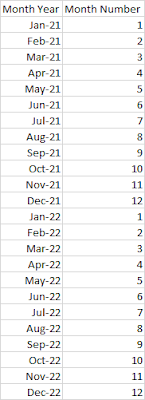
Here we have a Value column [Month Year] and we want to Sort by [Month Number]:

table example

This works because every value of Jan-21 has the same value in the [Month Number] column. It's okay to have Month Number 1 for multiple values, they'll just get sorted by default within that range. For example if we sort Month Year by Month Number, and then sort the Month Year column Ascending, the result is: 


Error: There can't be more than one value in 'Sort Column' for the same value in 'Value Column'.

We can't sort the 'Month' column by 'Month Year'. There can't be more than one value in 'Month Year' for the same value in 'Month'. Please choose a different column for sorting or update the data in 'Month Year'.

screenshot Power BI error message
If you've seen some version of that error message before, it means that you have too many sort order values for the same value in the value column. In this example below, we are trying to sort [Month] by [Month Year], but January has the sort value 202101 and 202201. Where then do we place January in the list? It's ambiguous and cannot be used as a sort by column.

sample data can't sort


Error: 'A circular dependency was detected:

Failed to save modifications ot the server. Error returned: 'A circular dependency was detected: Table[Display Column], Table[DAX Sort], Table[Display Column].'


If you don't have a Sort column in your data model, you need to add it using Power Query M code, not DAX. Due to the Order of Operations in Power BI, we cannot use DAX as a Sort by Column in Power BI.

To overcome this problem, open Power Query, click New Column > Conditional Column and create your Sort column there. Then follow the steps in the Microsoft Docs link above to use the Sort by Column feature.

Method 2: Use M Code Zero Width Space Characthers to sort Power BI data

Power BI sorting sorts in ascending order with spaces and special characters first, then numbers, followed by text: 


Your report users will notice if you start putting spaces at the beginning of your data, but we can use the Zero Width Space Character to add an invisible space that can't be seen by the naked eye, however Power BI will still see it and sort it before any other values without that space. 

Zero Width Space Characters

In M code, the Zero Width Space Character can be written as: 

Character.FromNumber(8203)

So to use this, we just need to add it as a prefix to any data. This will require some custom M coding, so we're going to use the interface to learn a few things. If you don't have the formula bar turned on, click the View tab in Power Query, tick the box next to 'Formula bar' to turn it on.

Add Prefix to Column

To add a prefix to any column, we just use the & operator in M. In order to see that in action, click the 'Add Column' tab > Format > Add Prefix

Screenshot Power BI Format

Type anything in the Prefix box:

screenshot Power BI prefix

Now check the formula: 

= Table.AddColumn(Source, "Prefix", each "zero" & [Customer], type text)

Note the part that is underlined in the formula above. The prefix you typed in the box is in quotation marks, followed by the & symbol and the name of the column you had selected. If you look at your data preview, the prefix appears in front of the text in the column you had selected.

We can replace the "zero" with Character.FromNumber(8203) so that our formula now reads: 

= Table.AddColumn(Source, "Prefix", each Character.FromNumber(8203) & [Customer], type text)

If you look at your data preview now, the new column should look the same as the original column, only there's an invisible space character there that we can't see.

This is cool, but doesn't help us with sorting when every value has this character.

Add Conditional Column

Now we're going to add a Conditional column, this will help give us the base structure we'll use to add our prefix. We want our VIP customers to appear first in the list, followed by our Standard, then Other. So to do this, we'll put two zero width space characters in front of the VIP customers, one zero width space character in front of the Standard, and none in front of the Other customers.

We're still using the built in interface to learn M code, so click the Add Column tab > Conditional Column. 

screenshot Power BI conditional column

In this area we'll just create the conditions and use the same 'Output' for each condition. This will give us the base formula, which we can then change to: 

= Table.AddColumn(Source, "Customer Sort", each if [Category] = "VIP" then Character.FromNumber(8203) & Character.FromNumber(8203) & [Customer] else if [Category] = "Standard" then Character.FromNumber(8203) & [Customer] else [Customer])

Now you'll see if we sort by this new column, or use this new column in visuals, it will automatically sort the VIP customers first, then Standard, then Other: 

screenshot Sorted data


Advanced Filter OR vs AND


This post was inspired by @saud968 from the Power BI Community and their post on Multiple values from same column under same visual

Their question centered around being able to find all the survey results that were equal to 4 AND all the survey results that were equal to 5. While the wording I have used here, specifically the word AND, is commonly how we approach and think of the problem, it will unfortunately trip you up when working with advanced filter logic. 

Screenshot Power Query Advanced Filter

I am going to keep this post generic, as this concept can apply to DAX Logical Operators (specifically && and ||), Excel Advanced Filter conditions, Power Query Advanced Filters with And / Or selection and more!

The Problem

Let's use the below table as our sample data. Nice and simple, only 5 rows of ice cream orders:

Order ID Name Location Country Flavor Scoops
1 Allison Chicago USA Chocolate 2
2 Phil Wellington NZ Vanilla 2
3 Allison Auckland NZ Chocolate 1
4 Vijay New York USA Mint Chocolate Chip 1
5 Agnes San Francisco USA Vanilla 1

The boss wants to know the total number of scoops for Chocolate of any kind, so Chocolate and Mint Chocolate Chip scoops combined total. How do we write the filter - using AND vs OR?

Let's start simpler:

If we want all Orders for vanilla that's easy: Order IDs 2 and 5. 

venn diagram vanilla only

If we want all Orders for 1 scoop that's easy: Order IDs 3, 4 and 5. 

venn diagram 1 scoop only

But what if we want Orders for vanilla AND 1 scoop?

What about Orders for vanilla OR 1 scoop?

AND: 1 scoop AND Vanilla

Let's start with the AND condition: 

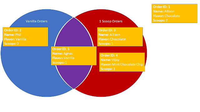
venn diagram

As you can see in the Venn Diagram above, I have moved Order ID 5 to the middle of the Venn Diagram, since it is both a Vanilla AND a 1 scoop order, so it falls into BOTH filter conditions. 

If we choose an AND filter, we will only get the intersection of the chosen conditions, in this case, Order ID 5 only.

OR: 1 scoop OR Vanilla

But what if we wanted all four of those Orders 2, 3, 4 and 5?

Well, again referring to the Venn Diagram above, in order to get all orders, we need to include ALL orders that fall into Vanilla Orders and ALL orders that fall into 1 Scoop Orders. 

As I have mentioned before, the use of that pesky little word and in the sentence above often gets us into trouble. We have already demonstrated that when using the AND filter, we only get Order ID 5. So to get all four orders we must need to use the OR condition. But why?

Let's rephrase our question to look at EACH order individually, as that is how the filter conditions are evaluated when we use them in the various Power BI, Excel, etc applications: 

Does each Order have either Vanilla OR 1 scoop?

Now we have the key to success. Looking at EACH item individually:

  • Order ID 1, does it have either vanilla or 1 scoop? NO
  • Order ID 2, does it have either vanilla or 1 scoop? YES, vanilla only
  • Order ID 3, does it have either vanilla or 1 scoop? YES, 1 scoop only
  • Order ID 4, does it have either vanilla or 1 scoop? YES, 1 scoop only
  • Order ID 5, does it have either vanilla or 1 scoop? YES, vanilla AND 1 scoop

So now we can see that by using the OR condition on EACH item, we get the desired result of all four orders that have either 1 scoop or vanilla.

EACH item is evaluated individually

Now that we know that each item is evaluated individually, let's rephrase our questions and revisit the AND filter. 

Does each Order have Vanilla AND 1 scoop?

  • Order ID 1, does it have vanilla and 1 scoop? NO
  • Order ID 2, does it have vanilla and 1 scoop? NO, vanilla only
  • Order ID 3, does it have vanilla and 1 scoop? NO, 1 scoop only
  • Order ID 4, does it have vanilla and 1 scoop? NO, 1 scoop only
  • Order ID 5, does it have vanilla and 1 scoop? YES, vanilla AND 1 scoop

Find the Chocolate and Mint Chocolate Chip combined total scoops

To determine which filter condition (AND vs OR) to use, we need to think about evaluating EACH item individually. 

If we draw our Venn Diagram, we can see that nothing is in the middle AND condition section: 

venn diagram

Does each Order have Chocolate AND Mint Chocolate Chip?

  • Order ID 1, does it have Chocolate and Mint Chocolate Chip? NO, Chocolate only
  • Order ID 2, does it have Chocolate and Mint Chocolate Chip? NO
  • Order ID 3, does it have Chocolate and Mint Chocolate Chip? NO, Chocolate only
  • Order ID 4, does it have Chocolate and Mint Chocolate Chip? NO, Mint Chocolate Chip only
  • Order ID 5, does it have Chocolate and Mint Chocolate Chip? NO, 

Does each Order have Chocolate OR Mint Chocolate Chip?

  • Order ID 1, does it have Chocolate or Mint Chocolate Chip? YES, Chocolate only
  • Order ID 2, does it have Chocolate or Mint Chocolate Chip? NO
  • Order ID 3, does it have Chocolate or Mint Chocolate Chip? YES, Chocolate only
  • Order ID 4, does it have Chocolate or Mint Chocolate Chip? YES, Mint Chocolate Chip only
  • Order ID 5, does it have Chocolate or Mint Chocolate Chip? NO, 

Therefore, in order to get both Chocolate AND Mint Chocolate Chip orders, we actually need to use an OR filter condition. 

Solution

In conclusion, be careful how you word your filter condition questions - don't mislead yourself. In order to pick the correct filter condition (AND vs OR):

  • Evaluate EACH item individually
  • Make a Venn Diagram
    • AND filter condition: Intersection of all conditions (aka the middle of the Venn diagram)
    • OR filter condition: Union of all conditions (aka everything within the Venn diagram)

Now we can confidently tell the boss that there are 4 total scoops that were either Chocolate OR Mint Chocolate Chip because we used an OR filter condition to filter our data. 

Tokyo 2020: Power Query Data Source Update and Error Troubleshooting


Lots of swimming, cycling and more happening at the Tokyo 2020 Paralympic Games. Team New Zealand have already won a Gold and Silver in swimming. Still plenty of time to earn some more. USA have earned Athletics, Cycling, Equestrian and Swimming.

I spent a bit of time creating a report for the Tokyo 2020 Olympics, and the Paralympics follows a very similar format with the same type of information and data to report. Therefore, it should be straightforward to update the report from Olympics to Paralympics, right? 

In theory. In practice, this is sometimes more challenging than it should be and we encounter all sorts of errors along the way. 

Well, I succeeded. Here's the Power BI Report with live data for the Paralympics, updated every 30 minutes:

Change Data Source

In order to update my existing report, I need to simply point the report to the Paralympic-Games link instead of the Olympic-Games link. 

Old Data Source: 

https://olympics.com/tokyo-2020/olympic-games/en/results/all-sports/medal-standings.htm

New Data Source:

https://olympics.com/tokyo-2020/paralympic-games/en/results/all-sports/medal-standings.htm

Unfortunately, not all the column headers are identical, so this is fraught with a few minor challenges along the way. 

In the video below, I demonstrate how to change and update your data source quickly and without stress, even when you encounter errors in Power Query.

Categorical Date Slicer in Power BI


Today's post is inspired by @Iguima of the Power BI Community. You can read their original Date Categorical Slicer question on the Power BI Community Desktop Forum.

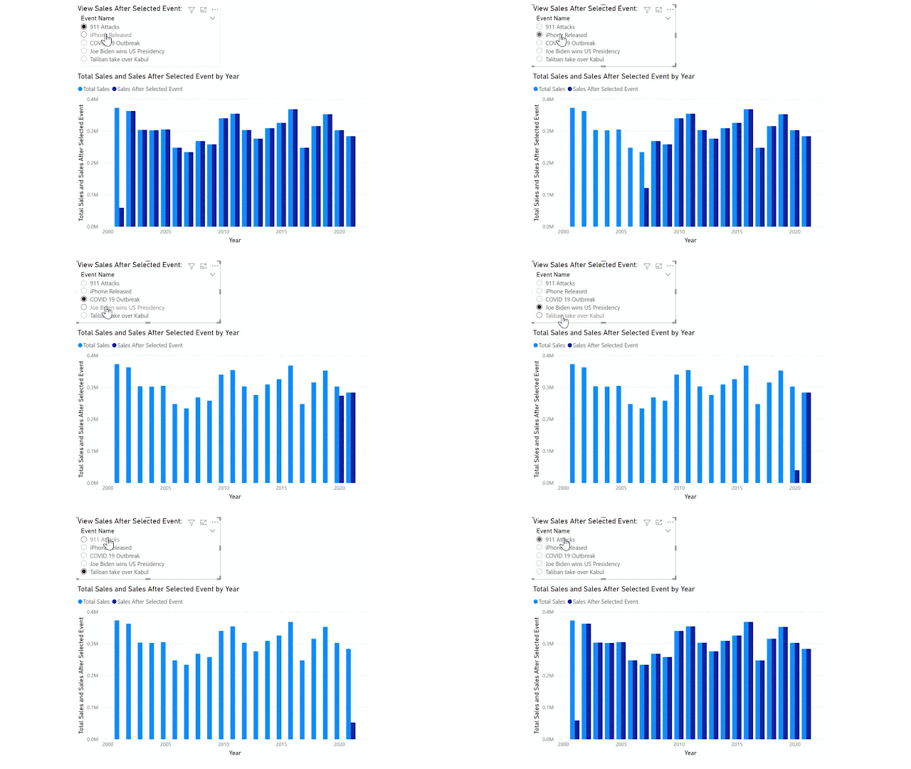
The original poster would like to achieve a categorical date slicer that enables the report user to filter the Sales (fact) table for all data AFTER the selected event/date category. Something similar to the final result below:

GIF screenshot Power BI final result

Note the events span over 20 years and include the 911 terrorist attacks on the USA, COVID 19 pandemic and also some not so catastrophic events such as iPhone first release date. I have added a few more recent events for 2020-21 in case you want to test on your own sales data (which might not span 20+ years!).

Event Name Event Date
COVID 19 Outbreak Wednesday, March 11, 2020
Joe Biden wins US Presidency Saturday, November 7, 2020
Taliban take over Kabul Sunday, August 15, 2021
911 Attacks Tuesday, September 11, 2001
iPhone Released Friday, June 29, 2007

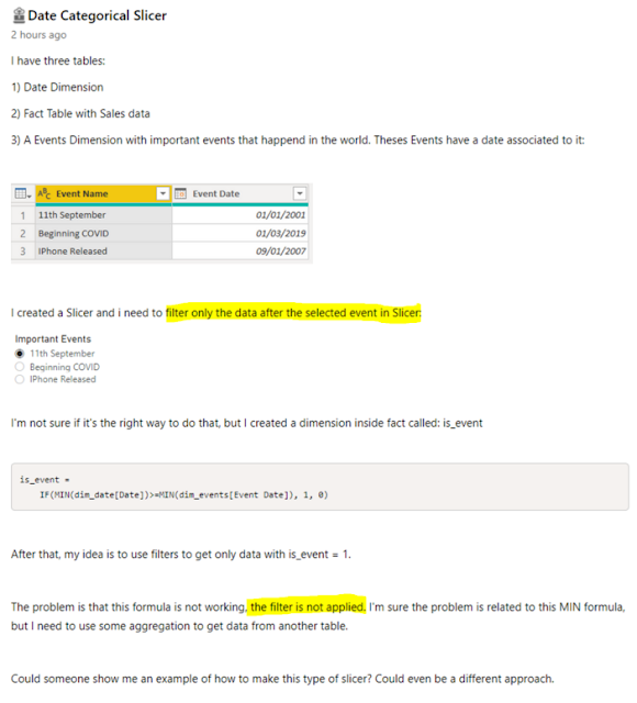
For reference, I have highlighted the important parts of the original question: 

screenshot Original Poster's Question in Power BI Community forum

There are two key issues in this request: 

  1. We want to filter for data only AFTER the selected event. Most filter behavior will return data only ON the selected event.
  2. We want this to be responsive to the filter and slicer selections made by the report consumer.

I have already written about key issue number 2 in a previous blog on Reporting Order of Operations. Basically, calculated columns do not respond to report filters and slicers. We need to solve this problem with a MEASURE.

Data Model

Before we can get into the measure and DAX, we need to review the Data Model. Any of my former students will tell you this is the foundation of your Power BI report. Without the correct data model, DAX won't work. 

For this scenario, we want the Important Event to act as a bookend for our Date table, not filter it just for that specific date. Therefore we need to ensure that the Important Events table is NOT related in any way to the other tables in our data model. 

Below I have a very simple data model: Calendar (date dimension) and Sales (fact) with my Important Events (Categorical slicer table) unrelated to any of these.

screenshot Power BI data model

DAX Formula

Now that we have the Data Model sorted, we can move on to the DAX.

We start with a simple measure for Total Sales:

Total Sales =
SUM ( Sales[Sales Amount] )

Use this [Total Sales] measure in a visualization by Calendar[Year].

We then add a slicer for the 'Important Events'[Event Name]. Since the Important Events table has no relationship to our data, this won't do anything in our report. 

In order to get the Total Sales to filter based on the slicer, we need to figure out what value the user has selected. I have chosen to use the MIN function in case multiple events are selected. This will ensure we are looking at all data after the earliest event.

Selected Event Date =
MIN ( 'Important Events'[Event Date] )

NOTE: Because the [Selected Event Date] is a measure, it will respond to user selections in the slicer as per the Reporting Order of Operations blog. 

Finally, we can use this measure as a filter. You may initially be tempted to write the following DAX and get an error: 

screenshot wrong DAX formula

I haven't used CALCULATE within the filter, but I have used [Selected Event Date] measure, and every measure has an implicit CALCULATE function in front of it. Therefore this DAX expression is not allowed. 

Instead, we need to provide a ROW CONTEXT for the calculation, here I use the FILTER function to provide this context. Now, I am able to use the [Selected Event Date] measure (with its hidden CALCULATE function and all) inside the filter expression:

Sales After Selected Event =
CALCULATE (
    [Total Sales],
    FILTER (
        'Calendar',
        'Calendar'[Date] > [Selected Event Date]
    )
)

Hurray! We get the final result we're looking for, as per the GIF at the start of this article. 

CONCLUSION

You cannot use COLUMNS to respond to filter/slicer selections.

You must not have relationships if you want to do before/after/range filters. 

Once we have overcome these two obstacles, the desired result is achievable. Now to just update any other measures with this added filter. 

Tokyo Olympics: Power Query Custom Functions


The Tokyo 2020 Olympics opening ceremony is only days away, and some of the qualifying matches are already underway. I say 'already'; I guess they're only a year late!

This is the first blog in a short series designed to:

  • demonstrate common Power BI principles using a non-sales related dataset
  • address common pain points when working with non-fact table measures
  • keep up to date with the latest stats in the Tokyo 2020 Olympic games
  • cheer for the little guy - we're going to throw population into the mix and see how the big players stack up now
screenshot Power BI Olympics Total Medals History


Over the coming weeks I'll document how I created the reports using Olympic medals data readily available on the web.

Power Query Parameters

I've blogged about parameters in Power Query before. The 'Get Data from Folder' packages up data for us nicely and does all the custom function work, but what if you have something tricky or different you need to handle in each file? What if all the sheets in Excel are named the same as the filename - the Get Data from Folder won't allow you to pick a different sheet name each time. Parameters can make this possible, but we need to get familiar with using parameters and be able to understand how the data fits together. 

This is an easy demonstration on using parameters, and it uses data that's readily available on the web. As a bonus, you can use this technique to crawl a website to get the lowest prices or read all the reviews on a product you're looking to buy. Parameters are all about finding the patterns in your data source, which in our case today is the URL of the website. 

In this sample, we connect to Olympics.com using two main URLs: 

  • Parameter Table: https://olympics.com/en/olympic-games/olympic-results
  • Sample URL: https://olympics.com/en/olympic-games/pyeongchang-2018/medals

The https://olympics.com/en/olympic-games/olympic-results site gives a simple table of all the Olympic games throughout history, and thankfully they are formatted in a way that is very similar to the Sample URL for each medals table. 


Screenshot of Olympics.com Olympic Results

When pulled into Power Query, the above table looks like this: 

Screenshot of Power Query
With just a bit of Power Query Magic, we can format it to match the URL for the Sample URL file: 

Screenshot of Power Query formatted URL part

In the first half of the video below, I walk through how I turned this table into a complete list of all Teams who have won medals for each of the Olympic games. 


Data Story of the Month: Employee Sick Leave


 Happy February everyone!

Snow storms and record low temperatures are ravaging the northern hemisphere while those of us in the southern hemisphere are back in the grind of work and school after summer holidays. In both cases, sick leave is bound to see an increase.


Using Small Multiples to Visualize Sick Leave

Sick leave can cost your company, but so can ill employees. How is sick leave impacting your business across different departments? 

I recently worked with a client to help analyze employee sick leave, looking at metrics such as the average days sick leave per employee and it inspired me to use the preview feature for small multiples in Power BI to analyze some publicly available sick leave data. 

Data.gov.sg has some easy to use datasets spanning many years. I grabbed their data for 'Average Days of Sick Leave Taken By Employees' and analyzed it in Power BI.

Source: Average Days of Sick Leave Taken By Employees-Data.gov.sg

Step 1: Enable small multiples preview

Small multiples is a preview feature that was introduced in December, 2020. That means you have to enable it before you'll see the option to use it in your reports. It also means you can turn it off if it's causing you problems. 

To enable small multiples preview: 

  1. Click File > Options and Settings > Options
  2. Select Preview features
  3. Tick the box next to 'Small multiples'
  4. Click OK.
  5. Restart Power BI desktop.


Step 2: Configure small multiples

Open Power BI and import your dataset (download the CSV from the link above to follow along with this example). 

Small multiples is currently available on the following visualizations:

  • Stacked and clustered bar and column charts
  • Line chart
  • Area and Stacked Area charts

You'll notice the Small multiples section in the fields pane for any of these visuals now that you have enabled the preview feature. 

Simply drag the desired field into this box to quickly create multiple charts using the same x and y axis. 


By default, small multiples will display a 2x2 grid. As you resize the visual, the charts within it will resize so that you can always see 4 multiples in one view. Use the scrollbar to view others if you have more than 4 small multiples.

If you want to view your small multiples in something other than a 2x2 grid, this can be changed in the Grid Layout section of the formatting for the visual:


Step 3: Visual Interactions

Small multiples behave like their own visualizations if you select an individual data point. However, you have the added benefit of treating them as a group. To do this, click on an item in the legend or a label in the x axis. Note how the cross filtering of other visuals changes: 


Using DAX to Analyze Sick Leave

The dataset from Data.gov.sg was nicely formatted and already had averages calculated for us. How can we use DAX to get these average calculations? 

For this demonstration I'm going to use a very simple dataset. Averages are tricky enough, so we'll stick with just a few numbers. 

Excel with Allison Sick Leave Data

I have created a sample dataset with a very small number of fictitious employees and recorded their sick leave over the past year. The dataset is very simple and contains two tables: 

  • DimEmployee
  • FactSickLeave


I want to know the total number of sick leave days per employee, and the average across the department. 

We can calculate this average over the ALL employees, or ABSENT employees. We'll call these 'Employees' and 'Absentees' to align with the data from Data.gov.sg used above. 

Total Sick Leave Days

Let's start with the easy measure:

Total Sick Leave Days = COUNT(SickLeave[Date])+0


Note I have added +0 to this measure because Chad, Ethyl and Flynn are healthy employees who have never taken sick leave. I want them to help bring the average down when I calculated average sick leave by department, therefore they must get credit for 0 sick leave days. We know this information is zero, not null, so it makes sense to add +0 here.

Average Sick Leave Days

Now we're ready to calculate Averages. Our report will look something like the below when we're done:


Once we have correctly calculated the Total Sick Leave Days, we can easily get the average per employee. We simply need to recall our definition of Employee = every employee in the company. In our dataset, this is everyone in the DimEmployee table. So, we will average the [Total Sick Leave Days] over the DimEmployee table: 

Avg Sick Leave Days per Employee =
AVERAGEX(
DimEmployee,
[Total Sick Leave Days]
)

But this average seems a bit low. We know that Ali took 6 days sick leave and everyone who took sick leave took at least 2 days. How can the average be less than 2? Because we are looking at ALL employees, and Chad, Ethyl and Flynn bring the average down with their perfect attendance records. 

If we want to calculate the average per absentees, we must again define Absentee = employees with more than 0 sick leave days. So, instead of calculating the average over the entire DimEmployee table, we will simply wrap it in a FILTER to filter only those employees with [Total Sick Leave Days] > 0. 

Avg Sick Leave Days Per Absentee =
AVERAGEX(
FILTER(DimEmployee, [Total Sick Leave Days]>0),
[Total Sick Leave Days]
)

You can verify these numbers using the Total calculations provided in the table above. 

Now that you have seen how to perform these calculations on a small sample dataset, try using your own data to get the same results. 

Organizational Excel Data Types


Microsoft introduced stocks and geography data types into Excel last year, but they never really caught my attention as I couldn't see their relevance to my own data. Just a few days ago they have announced the release of Organizational Data Types in Excel, giving us the ability to bring the awesome functionality to our own data. Now you've got my attention Microsoft!

How to:

Here's a demo on how to setup Organizational data types for your company in Excel.

Step 1 - Turn on Featured Tables

Featured Tables is a Power BI desktop preview feature. You need to turn this on first in Power BI desktop, and then restart. See the Microsoft documentation for this here: https://docs.microsoft.com/en-us/power-bi/collaborate-share/service-create-excel-featured-tables

Step 2 - Build Power BI Dataset with Dimension Tables

Create a dataset in Power BI. This can be specific to one team, or data that is shared across the entire company. One table that pretty much everyone will want access to is Dates. In my example, I am going to use a Course List to make it easy for the Sales team to see key information about our course offerings.

Connect to your data from within Power BI desktop. In the Model view, set each dimension table as a Featured Table. If you aren't familiar with Dimension tables, check out my posts on relationships in Power BI. If you are familiar with Dimension tables, you'll note that setting up a featured table requires you to select the unique identifying information for that dimension. In this example, we will use Course Title: 


Step 3 - Publish Power BI Dataset

Publish your Power BI dataset, with featured tables enabled, to Power BI web service. Choose a workspace based on the team that needs access to the featured table. If it's specific to the Sales team, publish to a Sales team workspace. If it's company wide, publish to a company wide workspace. 

Note: You must publish to a NEW workspace. Classic Power BI workspaces do not support Excel Data Types. See this Microsoft documentation for details on how to upgrade to a new workspace: https://docs.microsoft.com/en-us/power-bi/collaborate-share/service-upgrade-workspaces

Step 4 - Open Excel and use the Data Type

If you had Excel open during the previous steps, restart Excel. Newly created Data Types won't show up until you restart. 


In the Data tab in Excel, you will now see your new Organizational data types. Note I have Calendar and Courses available to use. 

To use the Data Type: 

  1. Type a list of values that match the values from the 'Row label' column in the featured table. In this example, I will type a few course titles. 
  2. Select the data, and click the Data Type from the Data tab in the ribbon.
  3. If Excel finds an exact match to your value in the featured table, it will display the icon for that Data Type. 

  4. If Excel can't find an exact match to your value, it will display a question mark icon

Resolving unmatched values

To resolve the unmatched values, simply click on the Question Mark icon. This will open a pane on the right hand side of Excel. Choose the matching value, click Select, and Excel will store this match for you, and remember it for this data range or table.


Step 5 - Use Data Types in Excel Tables

Turn your data into an Excel table (Ctrl T shortcut works a treat for this one). Now you can easily add columns to your table by pulling information from the featured table. No VLOOKUP required! 

And yes, it continues to pull that information through for future rows of the table. Have a look at the formula bar - it will look something like this: 

=[@[Course Title]].Level

If you've used Table formulas before, this will look vaguely familiar - it's referring to the column name from our featured table in the Power BI dataset. 


Merge Ahead: Don't skip a row


 Anti Join is useful

In this post, we are going to look at how we can use an anti join to figure out which rows of data don't match. This can serve two purposes - it can: 

  • Identify data quality errors that we need to fix.
  • Provide insight into which records are NOT present in the selected dataset.

Identify data quality errors

Take the two tables below as an example: 

If we choose Left Outer join, the result is: 

We know that the United States is a valid country with an existing population. Same with United Kingdom. So why are we getting null values? 

With this small dataset, it's easy to see that USA and Great Britain/Northern Ireland are the problems - they appear in the Right Table, but they don't exactly match the records in the Left Table.

With larger sets of data, it can be more difficult to find those null values, which equate to mismatches in our data. 

Right Anti Join 

If we choose RIGHT ANTI, the second table will be filtered, to only give results that do NOT appear in the first table. In this case, I want view rows that appear in the Population table but do not appear in the Sales table, so that I can identify why United States and United Kingdom have both returned null for population: 


When doing a RIGHT ANTI join, we end up with many columns of unhelpful null values, but when we expand the Merge column, we get the results we are looking for. Below you can see the countries that have no matching record in the Sales table, and we can easily identify which should match United States and United Kingdom: 

Now that we know the problem, we can fix the data. 

Transform Data to Improve Data Quality

In this example, we only need to do two simple fixes in our Population table: 

  • Replace USA with United States
  • Group all countries in United Kingdom

Both of these fixes can be done directly in Power Query. 

Replace Values

United States can be fixed with a simple Transform > Replace Values.

Group by

United Kindgom needs two steps. 
First, we will replace the values to find: 
  • Northern Ireland
  • Great Britain

And replace all with "United Kingdom".

Then, we will Group By Country. 

NOTE: Group By is a great way to ensure the column(s) selected in your Group By have unique values. This is highlighted extensively in my other Merge Ahead post and will ensure I do not get any unwanted duplicate data in my merge!

My Right Anti join is now an EMPTY table. 

And my Left Outer join now looks like this: 


Provide Insight into which records are NOT in selected data

For this example, I am going to use Olympic Medal data which is readily available from Wikipedia. For stable data matching this post, you can use: 

Objective: 

Our goal is to see which countries have never won any Olympic medals.

Select Table 4 from the Population by Country website. Rename the query to 'Population'.

Select Unranked medal table (sortable) from the Population by Country website. Rename the query to 'Medals'.

Transform Medals table

Rename the first column to 'Country'

Extract text before delimiter (

Trim Country column

Transform Population table

Rename the first column to 'Country'

Extract text before delimiter (

Extract text before delimiter [

Trim Country column

Left Anti Join

If we choose Left Anti Join, we will need Population as the Left table and Medals as the Right table in order to see which countries exist in the Population table but have no record of winning any Olympic medals in the Medals table.


Note a Left Anti Join does not require us to keep the null columns. We will get a column of Table values, but because we have chosen an Anti join, all Tables in this column will be empty, so we can remove this column. 

Result:

Now we can see which countries have not won any Olympic medals: 

Some of these results, like the United Kingdom, we will recognize and are related to Data Quality Errors. Many of these results though provide insight into opportunity for growth.

Conclusion

An anti join can help add insight to your reporting as well as provide you with the information you need to cleanse and transform your data effectively. Use a Left Anti join with the "Merge Queries as New" option and remove that unneeded column of empty Table values you get and simply focus on the filtered rows that result from the unmatched data. 


Custom Visual Review: Charticulator

This is not your ordinary custom visual - this is EVERY custom visual. Charticulator puts the power to design and develop custom visuals to ...