Will Auckland move to Alert Level 3 on Monday?

It's day 31 of Lockdown Level 4 for us Aucklanders (how did that happen and what have I done with all that time?!). Monday we will find out if Auckland stays in Level 4 or moves to another alert level.
This is already Auckland's longest time in Level 4, and it seems everyone is getting stir crazy; We've all walked our neighbourhoods so many times we know every nook and cranny by heart. It's been rainy the past week or so, so we've also probably finished all the puzzles in the house (twice), read plenty of books, watched the Top 10 on Netflix, run out of flour from excessive baking and put on a few kilos. Well, that's been my lockdown anyway. 😂
After all that activity, I'm left wondering what Monday's announcement will bring for us Aucklanders; will we get to enjoy someone else's cooking skills with Lockdown Level 3? (See my Lockdown with Takeaways post if you're not from NZ.) Or will we stay in Level 4 a bit longer to beat the delta variant? (If so, send me your favourite recipes - I need new ideas!)
I have been wanting to overlay the current case numbers with the last big lockdown we had in Auckland, so finally got around to making it happen.
View the Live Power BI report
DAX Data Overlay for Forecasting
Power BI has some built in forecasting that will automatically calculate and forecast, allowing you to change the number and length of periods, as well as the seasonality. However, this doesn't work for irregular time frames. COVID lockdowns in New Zealand don't really have a seasonality. It also doesn't allow you to overlay past actuals at the same time as forecasting, so I decided to create some crazy DAX measures to show what I wanted.
GENERATESERIES: Days since start of Lockdown
The first calculation I made was to create the X-axis: Number of Days in Lockdown
DAX has an easy function that can make this axis for you. Click New Table to create a new table for this calculation:
Days In Lockdown =
GENERATESERIES (
-10,
100,
1
)
This creates a single column table with numbers ranging from -10 to 100, increasing by 1 each row. I decided to start at -10 because the first lockdown in NZ started about 10 days after the first reported case, so this would ensure we could see that history in the graph.
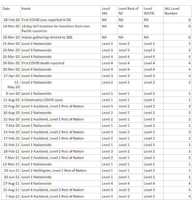
Key Dates table
The next step was to list all the key dates and alert levels throughout both lockdowns. I know that I can use approximate lookup in DAX to display the current level if I just provide a list of Alert Level start dates, which is conveniently compiled on the Timeline of Key Events COVID19.govt.nz website.
This table should NOT be related to any of the other tables in the data model - we'll make all the magic happen with DAX.
Along with key dates table, I created two measures for the start date of the two periods I wanted to compare:
Key Start Date Period to Compare
Lockdown March 2020 Start Date =
DATE ( 2020, 3, 23 )
Key Start Date Current Period
Lockdown August 2021 Start Date =
DATE ( 2021, 08, 17 )
If you prefer, you could add a Parameter (an unrelated Date table) allowing users to select the Key dates themselves. This will make it possible to compare dynamic date ranges and custom time periods.
DAX Variables and Approximate Lookup: Convert Date to relative time since Start of Lockdown
I'm comparing to the start of lockdown, but you can use this method to compare any two time periods by relative length/duration. We simply need to use the value of the GENERATESERIES column we created, add that to the value of the Key Start Date value. I'm calling this value my 'CaseDate', but it's the date in your Fact table.
Key Date Approximate Lookup
For the alert level status, we need to use the DAX approximate lookup technique, I have chosen the MAXX(FILTER( option:
Lockdown August 2021 AKL Level =
VAR _StartDate = [Lockdown August 2021 Start Date]
VAR _Duration =
MAX ( 'Days In Lockdown'[Days In Lockdown] )
VAR _CaseDate = _StartDate + _Duration
VAR _KeyDate =
MAXX (
FILTER (
'NZ Key Dates',
'NZ Key Dates'[Date] <= _CaseDate
),
'NZ Key Dates'[Date]
)
RETURN
IF (
_CaseDate
<= TODAY (),
SUMX (
FILTER (
'NZ Key Dates',
'NZ Key Dates'[Date] = _KeyDate
),
'NZ Key Dates'[AKL Level Number]
)
)
This will allow us to calculate the Alert Level in Auckland on each relative day since the Key Start Date of Lockdown.

Key Date Exact Lookup
The DAX for the Case numbers is a bit simpler, since we have a value for each date that has cases (unlike the Key Dates table which only contained the Start date value). Therefore we don't need the MAXX calculation and can do an exact lookup:
Lockdown August 2021 Cases =
VAR _StartDate = [Lockdown August 2021 Start Date]
VAR _Duration =
MAX ( 'Days In Lockdown'[Days In Lockdown] )
VAR _CaseDate = _StartDate + _Duration
RETURN
IF (
_CaseDate
<= TODAY (),
COUNTX (
FILTER (
'NZ Cases',
'NZ Cases'[Report Date] = _CaseDate
),
'NZ Cases'[Index]
) + 0,
"TBC"
)
This allows us to calculate the total case numbers on each relative day of lockdown since the Key Start Date:

Then put them both together in an area chart and voila! Easy to see the patterns and similarities and differences between the two time periods.
Sunday's spike of 40 new cases is concerning for what Monday's decision may bring, but only time will tell the actual result. For now, I'll content myself with forecasting and playing with Power BI visuals.


