Search

Search this blog:

Search This Blog

Outlook Conditional Formatting (for BCC emails)


I've received a few emails in the past month where I was BCC'd into them and didn't realize. This can be embarrassing when you start talking about one of those emails to the person it was sent to, as they won't realize you were in on it too!

Outlook View Settings

Outlook View Settings is a powerful way to setup your Outlook to work for you. In the View tab in the Outlook ribbon, click "View Settings" to open this dialog box below:


screenshot Outlook advanced view settings


Note I have don this from my inbox, so will be formatting how my inbox looks. Today we want to highlight emails where I'm only in the BCC, so click the 'Conditional Formatting' button. This will pull up a window of all the different formatting changes Outlook makes for us automatically, such as highlighting unread emails.

Click the 'Add' button to create a new conditional formatting rule. Name it 'BCC' and click the 'Font' button to choose a format. I've chosen a slightly lighter font to indicate that these emails may be FYI or less urgent, and probably don't require an action on my part.

screenshot Outlook conditional formatting

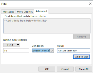
Now click the 'Condition' button. This will pull up yet another dialog box. Here we have three tabs - click the 'Advanced' tab. At the bottom of this window you'll see a 'Field' button.

Click 'Field' and select 'All Mail Fields' and find and click the 'To' field.

screenshot Outlook Advanced Filter


For the condition, select 'doesn't contain' and type your name (as it appears in your inbox) in the 'Value' box:

screenshot Outlook Advanced Filter

Click the 'Add to list' button to add this to the top window.

Repeat the same steps for the 'CC' field, 

screenshot Outlook Advanced Filter


then click 'Add to List'. 

You should now have two criteria in the box on top. Click 'Ok' three times (on the Filter window, the conditional formatting window, and the Advanced View Settings window). 

Send yourself a test email where your name is in the BCC box and see what happens - it should have the formatting you selected.

Remove Duplicates - Power Query vs Data Model


Today's post is going to highlight some of the differences in how Power Query and the Data Model handle duplicate or distinct values, particularly when it comes to case sensitivity and messy data. 

While this isn't a common issue with database source data, many of us use Excel or other less reliable data sources where this might be a potential issue. I've had a few questions around this issue, the most recent being one from @Ana2022 in the Power BI Community.

Case Sensitivity in Power Query

Consider the below table, with two distinct names:

  • ACE
  • Excel with Allison


These names are split across 5 rows, with some duplicates. Note they also are written with different combinations of uppercase and lowercase letters. I know that 'Excel with Allison' is the same as 'Excel with ALLISON', and ACE is the same as Ace.

IMPORTANT: We will prove in this post that if ACE is a different company to Ace, then you will need to create a unique ID that does not depend on case sensitivity.

Remove Duplicates

Let's start by doing a remove duplicates on the Name column: 

Power Query returns 4 distinct values - but we know there are only 2 distinct values.

Load to Data Model

Ok, let's try loading this data to the Data Model (Close & Apply in Power BI or Close & Load to in Excel). 

Interestingly, we note that the Data view counts a total of 4 rows and only 2 distinct values. Note also that Ace with ID 2 has been loaded as ACE and Excel with ALLISON with ID 4 has been loaded as Excel with Allison. 

So, there is no case sensitivity in the data model. When we load data, Power BI takes the uppercase/lowercase of the first value it loads and applies that to all subsequent values. 

This makes many things very difficult (among them are Sort by Columns, 1 to many relationships, and distinct counts). 

To overcome this difference, we can choose a case in Power Query and apply that before removing duplicates. 

UPPERCASE all values

I want ACE to be all uppercase and Excel with Allison to be proper case. I like the values that were loaded previously, so the order they're in works well. That means I don't want to transform the existing name column to all UPPERCASE, because I'll ruin the Excel with Allison. 

So, we'll add a new column: 


Now I will remove duplicates on the UPPERCASE column;


This leaves us with exactly 2 distinct values as we expected, and when we load these into the Data Model they will all be unique. 

If we want, we can remove the UPPERCASE column, as it's not needed anymore. 


Trim Text - Spaces in Power Query

Another common problem we see with Remove Duplicates occurs when there are invisible characters after the text value. Take for example this table, which appears to only have three distinct values:  "Insurance", "Rent" and "Salaries" but Power Query says it has 4 distinct values:


In the View tab, turn on Value Distribution. Select the Name column and we can see where the problem is:

Insurance is listed twice in this bar graph, so it must have the multiple distinct values.

Now that we know "Insurance" is the problem, we'll go back to our original table. If we do a filter and search for Insurance, then look at the code in the formula bar, we'll be able to see what values it's chosen to filter for: 

Here we can see that it is searching for [Name] = "Insurance" or [Name] = "Insurance   " so there are spaces after Insurance in some rows.

To remove the spaces, we can use a TRIM function: 


Now we're left with three distinct values as we expected, and this is the same thing that loads into the Data Model.

Conclusion

The Power Query functions located in the Transform > Format button in the ribbon can be vital in the process of getting a unique list of values for use in the data model.


Setup Outlook Rules to Reduce Spam in your Inbox


 This post is inspired by an email I got last week that turned into over a spam dozen emails simply because the sender of the email did not change the 'Reply To' field.

Most of my students are fairly good about using the 'Reply All' option sparingly in Outlook. However, with the increased use of Microsoft Teams and Office 365 Groups, I'm seeing a lot more email trails sent to large distribution groups. A simple 'Reply' will send an email to everyone in the group - same damage as hitting 'Reply All'. 

So how can we avoid getting spam from distribution lists?

Sender Action: Change Reply To in Email Options

If you're the owner of a distribution list, whenever you send an email from that mailbox, ensure you set the 'Reply to' value to an individual email rather than the entire distribution list.

This can be changed under Email Options when you 'Pop out' the email in Outlook;

Select 'Direct Replies To' in the ribbon:

screenshot Outlook message ribbon

Then type your email in the 'Have replies sent to' box:

screenshot Outlook options

This will automatically update the 'Reply' behavior to put any email(s) you put in that box into the Reply field of an email when recipients hit 'Reply'. If they're observant enough they'll notice. So don't worry, you're not doing anything dodgy.

Recipient Action: Setup Outlook Rules

Unfortunately, we can't always just ask the recipient to setup 'Direct Replies To', so we need to take control of our own Inbox and filter out those junk replies.

Outlook Rules can help manage this:

In the Home tab in the ribbon, select Rules > Manage Rules & Alerts. 

Click New Rule > Create Rule on Messages I receive. 

screenshot Outlook rules

Click Next.

Tick 'To specific people or Group'.

In the bottom pane, click the blue hyperlink to add the email, and type the email for the distribution list.

Click Next to define the action.

Tick 'Stop processing more rules' and 'move it to the specified folder'.

In the bottom pane, click the blue 'specified folder' hyperlink to select a folder. You can move directly to Deleted Items if you're feeling confident, or select / create another folder to store them in.

Click 'Next' again to add exceptions: 

Tick 'except if from people or public group'.

Type the SAME EMAIL as the distribution group you typed in the first screen.

Your rule should look something like this when completed:

screenshot Outlook rules setup

Basically, this will ensure that you receive the original email sent from the distribution list, but all replies to it will be deleted/moved.

Note: This will also delete any emails sent to the distribution list in the first instance, so may not work for all scenarios. 

Power BI Formatting


 Today's post is inspired by @PlentyL in the Power BI Community. I find myself repeating many formatting options across Power BI reports, so thought I'd compile some of my 'defaults' here. 

Time series Column Charts

Configure the chart as follows: 

screenshot Power BI column chart default

You'll need to use the Drill down arrows to view the month values, and this is the default we get: 

screenshot Power BI column chart

Not exactly easy to read or pretty. So, let's clean it up a bit. 

Sort X-Axis

First, we need to sort the X-Axis by Year-Month in ASCENDING order:

screenshot Power BI column chart

That looks a lot better already, but we still have some work to do. 

Sort Month Name

If you haven't already sorted your date table, sort the Month column by Month number using the Sort by Column feature: 

screenshot Power BI column chart

Already this is acceptable, but we'll go one step further.

Concatenate Labels OFF

The final step is to ensure the Year isn't repeated and takes up less space. To do this, we'll turn off the Concatenate Labels for the X-axis: 

screenshot Power BI column chart

To do this, select the visual, click the Format paint roller icon, expand the X-axis formatting and scroll down slowly until you find 'Concatenate labels' and turn that off.

Voila! We now have a nicely formatted time series chart.

Filter by Date

If you want to take it one step further, you can add the Date column to the filters pane and filter by relative date: 

screenshot Power BI column chart

Drag the Date column from the DimDate table to the 'Filters on this visual' and set to Relative date. Note that if you choose Calendar Years or Calendar Months it will use the last date of the previous month as your max date. In the above screenshot you'll see this is Jan 31, 2022.

If you choose Years or Months, it will use today as the max date. In the below screenshot you'll see this is Feb 11, 2022: 

screenshot Power BI column chart


Slicer Selection Controls

I've mentioned this in previous posts, but I'll say it again. Slicer visual formatting is one of my pet peeves in Power BI. It does exactly the opposite of what we are accustomed to in Excel. 

Here is the default formatting of a slicer: 

screenshot Power BI slicer
If you want to tick multiple items, you must hold the Ctrl key on your keyboard. There's also no 'Select all' and no Search like we have in an Excel filter: 

screenshot Power BI slicer

Let's add the search: 

screenshot Power BI slicer

And now we'll edit the Selection controls:


screenshot Power BI slicer

Now I can easily select multiple items, all items, or deselect all items, as well as conduct a search for a particular item: 

screenshot Power BI slicer


New Zealand Win First Ever Winter Olympic Gold


 Zoi Sadowski-Synnott has brought home the GOLD for New Zealand in the Women's Slopestyle final. This marks New Zealand's first ever Olympic Gold medal, and only our 4th ever Winter Olympics medal.

screenshot NZ history Olympics


She competes in the Women's Big Air next week Monday and Tuesday, so tune in to see how she does or keep an eye on my Beijing 2022 Olympics report for live updates. 

Updating the Data Source

Last year I did a post on updated data sources from Olympics to Paralympics where the sources both had the same format (column headers, etc).

This year, Olympics.com site kept timing out before I could get the data to load into Power BI, so I had to find a new source. This source had slightly different column headers and data format. 

So that means I can't simply go into Data Source settings and change the source:

screenshot data source settings

Instead, I chose to Get Data and create a new query, transforming it to have EXACTLY the same column names as my previous query for Tokyo 2020 Olympics. 

Now, if we delete the Tokyo2020 query and load the Beijing2022 query, all my visuals and relationships will break. Even if I rename them.

However, if you copy the code from Advanced Editor of the new Beijing2022 query into the Advanced Editor from the old Tokyo2020 query, Power BI will treat this as the existing table and maintain your visuals and relationships. Even after you rename it and delete the dummy Beijing2022 query you've just copied! Voila! Working smarter, not harder.

Freediving for Depth: The value of learning advanced equalization techniques


I just finished my AIDA 4 Star Master Freediver course with World Champion Constant Weight No Fins diver William Trubridge this weekend.

Photo of freediving course students and instructors in Lake Taupo, NZ

It was four full days of sun, learning, diving and fun. Now that the course is over, I'm digesting all the new things I learned and working on putting them into practice.

This post is a little different than my usual, as it's sharing the report I created based on my learnings in the AIDA 4 course. This course introduces some advanced freediving techniques, such as mouthfill equalization, that can dramatically increase your maximum depth when diving (if that's you're goal). 

The Report

You can view the Freediving Deeper Techniques report and interact with it in Power BI. It's pre-populated with some common depths and reasonable achievements to give you an idea of the leap freedivers can make after mastering the techniques covered in the AIDA 4 course. 

If you're a freediver, play with the values and see what you can achieve. If you're not a freediver, enjoy learning about the physics behind this crazy sport.

DAX Parameters

This report uses lots of DAX parameters which enable the viewer to change the values in order to see their impact. 

Navigator Button

I'm very excited to finally show you the Navigator Button. Last year I wrote a blog about how to design custom navigation in Power BI using buttons. At the end of last year, Microsoft introduced the Page Navigator button to Power BI, making this process so much easier. Now you just need to add a single button to your page and all page names are automatically populated in the navigation pane. You can even change the orientation in case you want your buttons going down the left hand side instead of the top/bottom.

The Course

In order to become an AIDA 4 star certified freediver, you must prove a minimum level of performance:

  • Dive to at least 32m depth and back using only the aid of fins (no pulling on the rope)
  • Dive at least 70m distance in the pool using only the aid of fins
  • Complete a static breath hold greater than 3 minutes 30 seconds in the pool

Additionally, you must also demonstrate that you are capable of assisting fellow divers and yourself in adverse conditions:

  • Rescue a diver from 20m depth and tow them at least 50m to the boat/shore
  • Rescue a diver from 15m depth while you're wearing only 1 fin
  • Return from 20m depth without a mask or nose clip and with only 1 fin

Finally, you must also pass a written exam that tests your knowledge of theory in various areas including nutrition, equalization, environment, safety, training, performance and more.

You can read my summary of the weekend on the Auckland Freediving site: AIDA 4 Star with William Trubridge

Refresh Date in Power BI


 "Today" seems like such a simple term, it should be clear what we mean when we say today - right? As I write this it's Jan 13, 2022 in Auckland, New Zealand, but still Jan 12, 2022 in most of Europe and North America. So when we publish reports to PowerBI.com, what date does it use for today?

Power BI Scheduled Refresh doesn't pull through today's data

Power BI uses UTC as its date value when determining "today". UTC does not change for daylight savings time, so New Zealand time zone is UTC + 12:00 (standard time) or UTC + 13:00 (daylight savings time). Having a universal standard time like UTC is handy, but only if we know how to use it and remember convert from our local time zones.

I've just had a client question why their Power BI report isn't pulling through the latest day's data. They were using a Date table with an end date of DateTime.LocalNow(), which works beautifully in Power BI desktop and uses the time on your local machine. However, in PowerBI.com Date.Time.LocalNow() returns UTC time.  

Power BI Desktop Refresh

In the screenshot below, you can see the result of doing a refresh at 11:14am on January 13, 2022 NZ time. This is 10:14pm on January 12, 2022 UTC time time:

Screenshot data refresh in desktop

Power BI Service (PowerBI.com) Refresh

In the screenshot below, you can see the result of doing a refresh at 11:13am on January 13, 2022 NZ time, but the DateTime.Local() function returns the wrong date - yesterday! DateTime.FixedLocalNow also returns the wrong date (at least for New Zealand). All functions return the UTC date and time, not the local time here in NZ like we'd want to see.

Screenshot data refresh in PowerBI.com

How to ensure Power BI refreshes at the correct date and time

Now that we know Power BI uses UTC time, how do we ensure it refreshes with the correct time? One option is to use the #duration() function in M code Power Query to add (or subtract) the number of hours from UTC:

=  DateTimeZone.UtcNow() + #duration (0,12,0,0)

Note the #duration() function accepts 4 arguments: days, hours, minutes, seconds. I have used 12 as the second argument to this function since I'm in New Zealand Standard Time right now and that is 12 hours after UTC.

If you're wanting to compare dates, just make sure that all your dates have the correct time zone information. If you're pulling data from a SQL database it will likely already have this info. If you're generating a DimDate table from M query you'll need to tell Power BI the timezone for those dates: 

= Table.AddColumn(#"Sorted Rows", "ShowDates", each if DateTime.AddZone( DateTime.From( [Date]) , 12 ) <=    DateTimeZone.UtcNow()   then 1 else 0)

The code above compares the [Date] column of my date table to the current time (in UTC). In order to make this comparison accurately, I must give Power BI additional information about which time zone I'm in. Thus I use the Date.Time.AddZone() function to add the 12 hours to get to NZ standard time. 

Get Data from SharePoint Files into Power BI


Today I'm finally going to let you in on one of my best kept secrets - how to get data from SharePoint files into Power BI without referencing your local C:\ (or D:\ or E:\) drive. This will ensure that you can schedule refreshes on the SharePoint files you are using with Power BI.

How to Get Data from Excel or CSV file on SharePoint into Power BI (without a gateway)

Step 1: Get SharePoint filepath URL

In order to schedule a refresh in PowerBI.com on files stored in SharePoint, you need to use the https:// URL. There are two main methods I use to grab this URL.

Method 1: From Teams or SharePoint

For this method to work, you must open the file in SharePoint. 

If you're starting in Teams:

  • Click the 'Open in SharePoint' button on the ribbon of the Files tab:

screenshot Open in SharePoint button location
  • This will take you to the SharePoint document library for that file. Continue following the steps below for SharePoint.

If you're starting in SharePoint:

  • Locate the file you want to import into Power BI.
  • Click the three dots next to the file
  • Select 'Details'
  • A new pane will open on the right hand side of your screen - scroll ALL the way to the bottom
  • Click the two sheets of paper next to the word 'Path' to copy the filepath
  • That's it - you'll use this to get data into Power BI


Method 2: From Excel or desktop app

This method is easy if you've already got the file open in the desktop app. 

  • Click File > Info
  • Click the 'Copy path' button
  • This URL will have a ?web=1 after it that you'll need to delete:
    • https://excelwithallisonmvp.sharepoint.com/sites/Training/Resources/PowerBIEssentials/Adventure%20Works%20Product%20Categories.xlsx?web=1
  • Keep only the main part of the URL:
    • https://excelwithallisonmvp.sharepoint.com/sites/Training/Resources/PowerBIEssentials/Adventure%20Works%20Product%20Categories.xlsx
  • That's it - that's what you'll need to get data into Power BI

screenshot Copy path file location

Step 2: Get data into Power BI (use Get data from Web)

Even though your data source is likely to be an Excel or CSV file, we are going to use the 'Get data from Web' option to get the data into Power BI.

This is because we have an https URL that points directly to our file. The last part of the URL is the filetype (such as .xlsx) and Power BI will use that to automatically use the correct functions to import the data correctly.

  • Click Get Data > Web
    screenshot Get Data from web
  • Paste the URL from Step 1 (make sure you have deleted the ?web=1 if using Method 2)

    screenshot URL
  • Click OK
  • If you haven't used this data source previously, you'll be prompted to enter credentials. 
    • Choose Organizational Account
    • Sign in with the same account that has access to the SharePoint file.
      screenshot enter credentials


    • Click Connect
  • That's it! 
    • The next screen you see will depend on the file type. For an Excel file, I see a navigator window asking which sheets or tables I want to import. 
    • Continue importing the data as you normally would for that filetype.
      screenshot Navigator window

  • When you publish this to PowerBI.com you'll be able to schedule a refresh using your current credentials - no Gateway needed!

Custom Visual Review: Charticulator

This is not your ordinary custom visual - this is EVERY custom visual. Charticulator puts the power to design and develop custom visuals to ...