Search

Search this blog:

Search This Blog

How to Handle (Blank) Measures


 In a previous post, What does this BLANK() mean?, we looked at why (BLANK) values sometimes appear in our visualizations. To summarize, there are two main causes for (BLANK) showing up on a chart or table visualization are: 

  1. Source Data is Blank: There are blank, null or empty values (or cells) in your source data. 
  2. Source Data is Missing Values: There is no record (or row) in the source data that relates to the specific information displayed in the visualization.

Note that Cause 1 can occur with a single table. Cause 2 can only occur when working with two or more tables, as the problem stems from the joining of tables. This join can be via relationships in the Data Model or merge in Power Query.

In the previous post, we focused on Cause 2 - Source Data is Missing Values and saw how this problem can occur when there is a record in the Fact table for a value that has no matching record in the Dimension table. In today's post, we are going to see what happens when the problem is reversed: 

There is a record in the Dimension table but no matching record in the Fact table.

No Transaction Exists for that Dimension


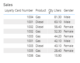
In the image above, we are looking at three raw data tables: Sales, Customers and Calendar. They are related with a typical star schema, 1 to many relationship from the Dimension (Customers, Calendar) tables to the Fact (Sales) table. 

If you examine these tables closely, you will notice that customers Suzy and Sam do not have any sales in the Sales table. In fact, I can see this by creating a simple column chart to show Qty by Customer Name: 

Nothing seems (BLANK) or out of place in the visualization above, but a keen observer will notice that we have 8 customers with 8 distinct names in our Customers table, but only 6 columns in our visualization. 

This scenario happens a lot more frequently than we realize, but the default setting is to 'hide items with no data' in our visualizations. In order to make it more obvious which customers have NOT ordered anything in the selected time frame, we have the option in Power BI to 'Show items with no data'. 

When we activate the 'Show items with no data' our visualization now displays Sam and Suzy proudly and makes it very clear that they either Blank or Zero sales. We can't tell which when 'Show items with no data' is selected (though I can tell you that if you deselect 'Show items with no data' you will still see any Customers with ZERO value for sales, but any BLANK values will disappear. 

To make this difference more obvious, we are going to change the column chart to a table, and I am also going to update the raw data so that Tom has a return on 10 July equal to his purchase amount on 5 July. 

Now we can see the bottom left chart, Liters by Customer (Hide items with no data), has a blank or zero value for Tom. The bottom middle chart, Liters by Customer (Show items with no data), has blank or zero values for Tom, Sam and Suzy. The bottom right table shows clearly that Tom did indeed have orders, they just cancelled each other out to 0.00 liters. Sam and Suzy though have blank values in this table. 

What does a (Blank) Measure Mean? 

The blank value for Sam and Suzy indicates that neither of them had any sales. In fact, they have NO MATCHING TRANSACTIONS or records in the Sales (Fact) table. This actually tells us a lot about those customers, and can be a much more powerful insight than the 'unknown' values we looked at in our previous post on Identifying Blanks. 

In this case, the (Blank) values indicate "No Sales". 

If you find that the Blanks are confusing, you can create a custom measure to replace the Blank values with the more Descriptive "No Sales" value:

Total Qty Liters (Descriptive) =
VAR totalqty =
    SUM ( Sales[Qty Liters] )
RETURN
    IF ( ISBLANK ( totalqty )"No sales"totalqty )

Note that while we still have the Total liters = 341.50 in the Descriptive column, the Total Qty Liters (Descriptive) is now a mixed data type measure. This may cause difficulties (or the need for extra conversions or data type detection) when trying more advanced DAX calculations using this measure. For now though, we can still see the Total value that we need, AND we have made it more clear what that empty value for Sam and Suzy actually means. 

Download the sample pbix file.

What does this BLANK() mean?


Have you ever come across (Blank) values in your charts or visualizations even though you are certain there are absolutely no blanks in your data itself? In this post we will explore why Blank values can creep into those visuals and what it means. 

Most Common Causes for (BLANK) Values

The main causes for (BLANK) showing up on a chart or table visualization are: 

  1. Source Data is Blank: There are blank, null or empty values (or cells) in your source data. 
  2. Source Data is Missing Values: There is no record (or row) in the source data that relates to the specific information displayed in the visualization.

Source Data is Blank

The first cause for BLANK values to show up within a visualization is simply that there are Blank values in the source data. This can happen when working with just one table, or multiple tables. 

For example, examine the Sales table below: 

Loyalty Card Number

Product

Qty Liters

Date Key

1001

Diesel

42

20200701


Gas

51

20200701

1002

Gas

60

20200702

1003

Diesel

62

20200703

1002

Gas

13

20200703

1006

Gas

41

20200704

Row 2 is missing a value for Loyalty Card Number. This indicates the customer did not have (or did not want to use) a customer loyalty card. Therefore, I will not be able to figure out how many sales that customer has made. Additionally, since I already have a blank value in the Sales table, this Blank will carry through to any other tables I relate or merge with the Sales table. So, I also won't know if this sale for 51 liters should be credited to male or female customers from the Customers table.

Source Data is Missing Values

The second cause for BLANK values appearing in our data stems from an unmatched value when combining two or more tables. This can happen with relationships in Power BI/Excel, or when doing a Merge. 

Of course, we know that Blank values can appear in your visualization if there are empty, null or blank values in your raw data. Often though, that isn't the case. Let's take a simple, small data model for example: 


We are going to work with two tables: Customers and Sales. As you can see in the above image, these tables are related using a 1 to many relationship on Loyalty Card Number. The data in the tables is complete; there are no missing, null or blank values:


So why do we have (Blank) showing up in our column chart?

Identifying Blank Values

We know that our two tables above are related by Loyalty Card Number column, so let's take a closer look at these values. I want to know what DISTINCT values we have for Loyalty Card Number in each table.

In our Customers table we have: 
1001
1002
1003
1004
1005

In our Sales table we have:
1001
1002
1003
1004
1005
1006

Note that our Sales table has one extra Loyalty Card Number that does not exist in the Customers table: 1006. In the tables below, we can identify that the 15.90 Liters purchased with Loyalty Card Number are the cause for the (Blank) values in my visualizations. 

Even though we have a Gender for every Loyalty Card Number that is in the Customers table, not every Loyalty Card Number exists in the Customers table. So looking at the Sales table in the right of the image above, we can identify the Gender for all sales until we get to Loyalty Card Number 1006. 1006 does not exist in the Customers table, so we are stuck, and so are Power BI and Excel. There is no way to know the gender of the customer who used Loyalty Card Number 1006 based on the data we have. 

It would be inaccurate to remove the sale for Loyalty Card Number 1006 - that sale actually happened. It would also be inaccurate to assign a value of Male, Female, 0, or anything else. So instead, that sale is reported and assigned a (Blank) value for Gender, and any other columns coming from the Customers table.

"Fixing" Blank Values

There is currently no way to easily replace the (Blank) label in Power BI or Excel with another label, such as "Unknown", without editing the raw data either in Power Query Editor or in the data source itself. 

We can of course put a filter on the visualization to remove (Blank) values, but as mentioned earlier, this would skew the report and is not accurate. Those sales actually happened and we need to report on them. 

Loyalty Card Number Example Explained

The problem lies in the data itself. Let's dig a bit deeper into this Loyalty Card Number example. Imagine you are a customer at a gas station. As you pay for your gas, the sales attendant asks if you'd like to join their loyalty program, it's free! "Sure," you say. After all, why not? So the sales attendant scans a new loyalty card, processes your order and you pay. The sales attendant hands you the loyalty card and explains that you need to register the card online in order to be eligible for savings and discounts. 

So what does that sale look like right now? You have paid for your gas, so the sale appears in the Sales table. The sales attendant scanned the loyalty card, so that too appears in the Sales table. You have NOT registered your card online, so no information is known about you yet. 

Power BI and Excel with both allow a relationship to be created between two tables, such as Sales and Customers, even though some values exist in the Fact (Sales) table that are not in the Dimension (Customers) table. Just because we are able to do something, does not mean that we should. 

The sales attendant had a loyalty card to scan, so we must know that Loyalty Card Number 1006 exists. We just don't know yet who will own it. If we want to avoid having Blank values in our visualizations and instead show "Unknown", then we need to update our source data to include all possible Loyalty Card Numbers that could ever make a sale. 

As in the image below, this means adding Loyalty Card Number 1006 to the Customers table and typing a value of "Unknown" for every column/field of information we don't yet have or know.

Once we update our Customers table, the Sales by Gender information updates automatically to display "Unknown" instead of (Blank). This can make it a little be more clear to the end user what information is actually being displayed in this report and eliminate the question "What the (Blank)??"

Cortana Daily Briefing


Recently, Microsoft have given Cortana, their personal productivity assistant, a new task - sending us a 'Daily Briefing Email' to help us keep track of upcoming meetings, promises we made to complete tasks, and schedule time to 'focus'. 


Whether you find it handy or annoying to have a daily email reminding you of outstanding 'tasks' from your email messages, taking control of your own productivity is the key to success. 

  • Do It NOW! Did Cortana find a task from your emails that you missed? If you can action it in under 5 minutes, do it now!
  • Date Activate It! Create a Cortana Quick Step to turn suggested tasks into actual tasks with start and due dates that you can monitor and track progress on.
  • Delegate It! Forward the email to a colleague with a quick description of the task in question. Follow up with them in person or via Teams if it's something that needs more clarification.
  • Delete It! Nothing helpful in there? Not finding these emails useful? Unsubscribe from the daily Briefing email and declutter your inbox. Keep following the strategies that have worked for you up to this point and remember to be Pro-Active, not Re-Active.

How to Create a Cortana Quick Step

Click Create New button from the Home tab, Quick Steps group in the ribbon in Outlook.
Type 'Cortana Quick Step' for the Name.
Select Create a task with text of message as the first action.
Add Action.
Select Delete message as the second action.
Choose a keyboard shortcut.
Click Finish.


Quick Steps are fantastic when you find yourself repeating the same series of clicks or actions on a daily or weekly basis. If you love keyboard shortcuts, then Quick Steps are for you! The example above is a simple one to get you started on Quick Steps, and while a similar result can be achieved by using the RIGHT mouse button to drag the email onto the Tasks icon a simple keyboard shortcut or single button can make life that much easier.

References: 

Briefing Email Overview Microsoft Docs Article
Making it easier to stay caught up with Cortana in Microsoft 365 blog by Andrew Shuman, Corporate Vice President Cortana

Custom Visual Review: Charticulator

This is not your ordinary custom visual - this is EVERY custom visual. Charticulator puts the power to design and develop custom visuals to ...