Search

Search this blog:

Search This Blog

Showing posts with label DataViz. Show all posts

Power BI Themes


I am a big fan of color; my wardrobe is full of blues and pinks and yellows. Side note: have you ever heard of 'dopamine dressing'? Apparently it's a fashion trend that's been around since at least 2022 but I'm just learning about it now - I'm actually impressed I'm only a season or two behind! 

But I digress, the reason for my post today is to compile some of my favorite resources for working with color in Power BI, and more generally, Power BI themes.


Sentiment Colors in Bar chart


Colors have meaning

Being a good data storyteller means using all the tools at your disposal. This includes color. It is important to note that I'm not advocating the use of color only in your reports - you need to ensure that there is another method to discern what's going on with the data for those in your audience who might be colorblind. But that doesn't mean we can't play around with color and use it to add meaning to our reports. 

Most people I know would agree that GREEN means 'Good' and RED means 'Bad'. But colors can be very personal. For example, my favorite color is BLUE and it was also the color I chose for my math notebooks throughout school. (Yes, math was my favorite subject - I guess it's no surprise I ended up in a career that works so much with data.) My school subjects were always color coded as follows:

  • BLUE - Math
  • GREEN - Science
  • RED - English
  • YELLOW - History

So what does this mean for your Power BI reports? Use color to your advantage. You may not be reporting on school subjects, but you can assign colors to whatever categories or metrics you're reporting on according to your own meaning and interpretation. BLUE is also the color of the sky, water, a common color in many country's flags and so much more. Using the AdventureWorks Sales data as an example, you could assign colors to the product categories as follows:

  • GREEN - Bikes
  • PURPLE - Accessories
  • YELLOW - Components
  • RED - Clothing

If you're reporting on 2 or 3 different metrics, assign a different color to each one and use that consistently throughout your report:

  • BROWN - Actual
  • RED - Budget
  • Light BROWN - Prior Year Actual

Whatever colors you use, make sure you're using them deliberately and with meaning. Adding lots of extra color to your report may give the impression that it's more exciting, but it may have the unwanted result of making your report more difficult to read and understand.

Create your own Power BI theme

I've written a few posts on Power BI themes, and the functionality of themes in Power BI desktop has improved dramatically over the years. 

You have a few options when creating your own theme in Power BI:

  1. Use the built-in theme designer within Power BI desktop
  2. Import a theme someone else has created in JSON
  3. Create and import your own theme using JSON

It used to be extremely difficult to find documentation for creating your own JSON theme in Power BI, but that has gotten easier. The Microsoft Learn article Use report themes in Power BI Desktop - Power BI | Microsoft Learn is a great place to start. 

However, with the speed of development of Power BI desktop, there's just not enough documentation on the new visuals. 

This is a great start: powerbi-desktop-samples/Report Theme JSON Schema at main · microsoft/powerbi-desktop-samples · GitHub

But not everything is documented there. One trick I've learned is that you can use the Power BI project files to explore the JSON code in Power BI desktop and copy that into your own theme. 

How to find the JSON code for formatting visuals in Power BI themes

For example, I'm going to use this method to find the formatting options for Power BI themes.

Step 1: Add the visual you want to format in your theme to a new blank report. 

Step 2: Change the formatting options that you want available for editing within your theme.

Step 3: Save AS - save your report as a .pbip file. When you choose this option, Power BI will save a couple folders with various files into the folder you choose.

Step 4: Open the visual.json file - you'll find this in the MyReportsName.Report > definition > pages folder. This can be difficult to navigate which is why I start Step 1 with a blank new report.

Step 5: Explore the code to discover the names of the visual and the properties.

Step 6: Use those names in your JSON theme, following the instructions from Use report themes in Power BI Desktop - Power BI | Microsoft Learn 

Power BI Color Picker

While my go-to resource for anything color related is usually Coolors.co - I've been inspired to make my own little color picker that calculates the contrast and displays a demo live in Power BI. The thing I like about this tool that I've created is it lets you adjust the colors using RGB method, so if you want to just add a bit of red hue you can, and the contrast value is calculated automatically without needing to switch tools. 

It makes me feel almost like an artist mixing colors in a paint palette. Except, since we're playing with digital colors, mixing the maximum value of all three colors makes white. This follows the light color spectrum, where white light indicates the presence of all colors, and black is the absence of all colors. So if you select 0 for each RGB value, you'll get black.

Have a play with the color picker below and see what you think!


Reference Power BI theme colors in DAX

Now for the REALLY cool bit: this is the straw that finally inspired me to publish today's blog - I was doing research for a talk I was giving and came across this Workout Wednesday challenge on using Power BI theme colors within your DAX:

2024 Week 26 | Power BI: Reference Theme Sentiment Colors in DAX – Workout Wednesday (workout-wednesday.com)

(If you haven't heard of Workout Wednesday - I highly recommend you check them out. They have fantastic demos and challenges for all skill levels and it's a great way to get inspiration.)

This is something I've wanted to do for years, but haven't known how. Just like with everything else in Power BI themes, it all comes down to know which names to use. 

So far, I have discovered the following color names from the theme can be used in your DAX code:

  • good
  • neutral
  • bad
  • maxColor (note this is called 'maximum' in the theme)
  • midColor (note this is called 'center' in the theme)
  • minColor (note this is called 'minimum' in the theme)
  • tableAccent
  • foreground (note this is also called 'firstLevelElements' in the theme)
  • foregroundNeutralSecondary (note this is also called 'secondLevelElements' in the theme)
  • backgroundLight (note this is also called 'thirdLevelElements' in the theme)
  • foregroundNeutralTertiary (note this is also called 'fourthLevelElements' in the theme)
  • background 
  • backgroundNeutral (note this is also called 'secondaryBackground' in the theme)

Sample Theme Colors with DAX conditional formatting

Thanks also to thinkBI for inspiring me to see what other theme colors are available for use beyond what was in the WOW solution. 


References I used to study up for this blog post:

2024 Week 26 | Power BI: Reference Theme Sentiment Colors in DAX – Workout Wednesday (workout-wednesday.com) - the original inspiration for this post and source of some working theme color names in DAX.

Color Contrast Checker - Coolors - one of my go to resources whenever I need to do something with colors.

Reference Power BI theme colors in DAX - thinkBI - source of some additional working theme color names in DAX that inspired me to test out all the theme colors I know the names for.

Choosing font color based on background color in Power BI – XXL BI - Special thanks to Daniil Maslyuk for his measure on font color and David Eldersveld's comment that inspired me to convert it to use Luminance instead of Intensity.

Color Relative Luminance Calculator (WCAG) (contrastchecker.online) - to learn how to calculate Luminance.

RGB - Hexadecimal Color Conversion (tripod.com) - to learn how to convert HEX to RGB and better understand what had been done by Daniil in his Font Color measure.

List of Unicode characters - Wikipedia - again, to better understand what had been done by Daniil.

Chris Webb's BI Blog: Colour Names Supported In Power BI Conditional Formatting (crossjoin.co.uk) - Chris Webb has been one of my go to blogs for many years. This particular post is quite old and many of these colors no longer seem to work in Power BI DAX, but it led me to the correct link of CSS colors that did all seem to work in DAX.

CSS Colors (w3schools.com) - the correct link of CSS colors that work in Power BI DAX.

JSON Editor Online: edit JSON, format JSON, query JSON 

powerbi-desktop-samples/Report Theme JSON Schema at main · microsoft/powerbi-desktop-samples · GitHub - JSON code for many of the classic Power BI visuals.

Power BI Icon Names for Conditional Formatting Using DAX - RADACAD - Not used in this blog but a really great resource for conditional formatting in DAX. 


How Power BI picks the legend colours


I've just had a wonderful discovery about why Power BI sometimes seems to choose random colors in the legend. 

Typically, the first item in a series will match the first color of your Power BI theme, the second item in the series will match the second color of your Power BI theme, and so on. 

However, this isn't always the case. I have noticed that sometimes when I have text category values for my legend that Power BI can assign random colors, seemingly not even part of my theme. Until recently, I just accepted this as a quirk of Power BI and carried on with my report development. 

While developing a new Power BI theme JSON file and reading up on the nitty gritty details, I learned a few things that have helped me understand what's actually going on. 

Dynamic Series

The first thing I learned about was "dynamic series". You can find the Microsoft Docs definition of dynamic series in small print under the very long theme article in the How Report Theme Colors Stick with Your Reports section. 

What is a dynamic series?

To understand dynamic series, we need to understand what is meant by 'series'. Series is the fancy data viz term for items in the legend. There are two ways in Power BI visualizations to get more than one item in the legend:

  1. Add a column to the 'legend' property of a visual.
  2. Add more than one column to the values property of a visual (this could be called 'Values', 'X-axis', 'Y-axis', etc depending on which visual you're using).

When you use option 2, the number of items in the series will always equal the number of columns you added to the values property. This is a 'static series' because the number of items is static (meaning it doesn't change). 

screenshot Power BI dynamic series example

A dynamic series occurs when you use option 1. Depending on the filters and slicers in the report, the number of items in the list of values of the column used in the 'legend' property could change. Let's use months of the year as an example. 

In the image above, we have added 'Month name' to the 'legend' property of the visual. So you can see we're using option 1 for creating more than one series in Power BI. This enables 'dynamic series'. We know there are always 12 months in the year, so it may seem like this is a static series. However, depending on the report filters and slicers, you may only see some of those months at a time. 

As you can see in the image above, March is always red, even when February is missing. This helps ensure that color has meaning throughout your report and that even if you're only showing quarter 4 (October, November, December), they'll maintain the mauve, green and charcoal colors. 

Themes have unlimited colors

 The second thing I learned about the seemingly 'random' colors that Power BI applies to text categories / legend items is that a theme has more than the 8 colors you see in the Power BI desktop interface. If you use the JSON file to customize your theme, you can provide as many colors as you want (there's probably a limit but I haven't needed to find it yet). That means when you have a series with more than 8 items, Power BI will continue down the color list in the hidden JSON file until it runs out of colors. Then it will repeat. 

Conclusion

So, if you see random colors popping up in your Power BI report, don't change them at the visual level. Figure out how many potential items are in your series and update the JSON theme to provide more color values if needed. 


Power BI Formatting


 Today's post is inspired by @PlentyL in the Power BI Community. I find myself repeating many formatting options across Power BI reports, so thought I'd compile some of my 'defaults' here. 

Time series Column Charts

Configure the chart as follows: 

screenshot Power BI column chart default

You'll need to use the Drill down arrows to view the month values, and this is the default we get: 

screenshot Power BI column chart

Not exactly easy to read or pretty. So, let's clean it up a bit. 

Sort X-Axis

First, we need to sort the X-Axis by Year-Month in ASCENDING order:

screenshot Power BI column chart

That looks a lot better already, but we still have some work to do. 

Sort Month Name

If you haven't already sorted your date table, sort the Month column by Month number using the Sort by Column feature: 

screenshot Power BI column chart

Already this is acceptable, but we'll go one step further.

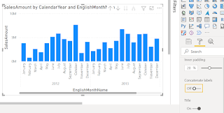
Concatenate Labels OFF

The final step is to ensure the Year isn't repeated and takes up less space. To do this, we'll turn off the Concatenate Labels for the X-axis: 

screenshot Power BI column chart

To do this, select the visual, click the Format paint roller icon, expand the X-axis formatting and scroll down slowly until you find 'Concatenate labels' and turn that off.

Voila! We now have a nicely formatted time series chart.

Filter by Date

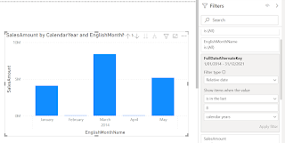
If you want to take it one step further, you can add the Date column to the filters pane and filter by relative date: 

screenshot Power BI column chart

Drag the Date column from the DimDate table to the 'Filters on this visual' and set to Relative date. Note that if you choose Calendar Years or Calendar Months it will use the last date of the previous month as your max date. In the above screenshot you'll see this is Jan 31, 2022.

If you choose Years or Months, it will use today as the max date. In the below screenshot you'll see this is Feb 11, 2022: 

screenshot Power BI column chart


Slicer Selection Controls

I've mentioned this in previous posts, but I'll say it again. Slicer visual formatting is one of my pet peeves in Power BI. It does exactly the opposite of what we are accustomed to in Excel. 

Here is the default formatting of a slicer: 

screenshot Power BI slicer
If you want to tick multiple items, you must hold the Ctrl key on your keyboard. There's also no 'Select all' and no Search like we have in an Excel filter: 

screenshot Power BI slicer

Let's add the search: 

screenshot Power BI slicer

And now we'll edit the Selection controls:


screenshot Power BI slicer

Now I can easily select multiple items, all items, or deselect all items, as well as conduct a search for a particular item: 

screenshot Power BI slicer


Freediving for Depth: The value of learning advanced equalization techniques


I just finished my AIDA 4 Star Master Freediver course with World Champion Constant Weight No Fins diver William Trubridge this weekend.

Photo of freediving course students and instructors in Lake Taupo, NZ

It was four full days of sun, learning, diving and fun. Now that the course is over, I'm digesting all the new things I learned and working on putting them into practice.

This post is a little different than my usual, as it's sharing the report I created based on my learnings in the AIDA 4 course. This course introduces some advanced freediving techniques, such as mouthfill equalization, that can dramatically increase your maximum depth when diving (if that's you're goal). 

The Report

You can view the Freediving Deeper Techniques report and interact with it in Power BI. It's pre-populated with some common depths and reasonable achievements to give you an idea of the leap freedivers can make after mastering the techniques covered in the AIDA 4 course. 

If you're a freediver, play with the values and see what you can achieve. If you're not a freediver, enjoy learning about the physics behind this crazy sport.

DAX Parameters

This report uses lots of DAX parameters which enable the viewer to change the values in order to see their impact. 

Navigator Button

I'm very excited to finally show you the Navigator Button. Last year I wrote a blog about how to design custom navigation in Power BI using buttons. At the end of last year, Microsoft introduced the Page Navigator button to Power BI, making this process so much easier. Now you just need to add a single button to your page and all page names are automatically populated in the navigation pane. You can even change the orientation in case you want your buttons going down the left hand side instead of the top/bottom.

The Course

In order to become an AIDA 4 star certified freediver, you must prove a minimum level of performance:

  • Dive to at least 32m depth and back using only the aid of fins (no pulling on the rope)
  • Dive at least 70m distance in the pool using only the aid of fins
  • Complete a static breath hold greater than 3 minutes 30 seconds in the pool

Additionally, you must also demonstrate that you are capable of assisting fellow divers and yourself in adverse conditions:

  • Rescue a diver from 20m depth and tow them at least 50m to the boat/shore
  • Rescue a diver from 15m depth while you're wearing only 1 fin
  • Return from 20m depth without a mask or nose clip and with only 1 fin

Finally, you must also pass a written exam that tests your knowledge of theory in various areas including nutrition, equalization, environment, safety, training, performance and more.

You can read my summary of the weekend on the Auckland Freediving site: AIDA 4 Star with William Trubridge

Tooltips in Power BI


The Power BI 'tooltip' is available in almost all Power BI visuals. What is a tooltip?

Tooltip: a message which appears when a cursor is positioned over an icon, image, hyperlink, or other element in a graphical user interface

screenshot Power BI visual with default tooltip

View the Live Power BI report here

Power BI Tooltips

Almost every visual, both built-in and custom, has a tooltip section of the fields that can be added to the visual. By default, any fields that are included in the 'Values' will automatically show up in the tooltip, but you have the ability to add additional fields to the tooltips. 

Default Tooltip

With the default tooltip, you have very little control over the order and format of the fields:

  • Fields used in the visual as 'Values' will be listed first, in the same order they are listed in the 'Values'
  • Fields used in the visual as 'Tooltips' will be listed under the 'Values' fields, in the same order they are listed in the 'Tooltips'
  • Fields used in the visual as 'Values' cannot be removed from the tooltip
  • Fields used in the visual as 'Values' must have the same format in both the visual and the tooltip

Now I have a few complaints with these settings for my current visual. I am only plotting the Auckland alert level, but would like the tooltip to display the alert levels for all of NZ, in a natural language friendly manner rather than the label and numerical value. 

screenshot default tooltip

With the tooltips feature I could add the natural language statement (see visual above for 'Lockdown March 2020 Key Event Value: Level 4 Nationwide') but I cannot remove the value used to plot the levels in my graph (see visual above for 'Lockdown March 2020 AKL Level: 4.00')

I would also like to reorder the fields so that the March 2020 stats are grouped (including the friendly natural language tooltip) and the current stats are grouped.

Report Page Tooltip

If we move from the 'Fields' to the 'Format' section of our chosen visual, we find a 'Tooltip' formatting option that can be expanded. This allows us to change the 'Type' to 'Report page'.

screenshot tooltip format options

Once you select the 'Report page' as the tooltip Type, a new dropdown will appear for 'Page'. All the other options below this Page dropdown apply only to the Default tooltips, so ignore them on Report page tooltips.

How to Create Report Page Tooltip

Step 1: Create Tooltip Page Format

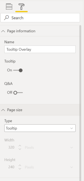
Add a new page to your report. Click the Format paint roller to format the page: 

  • Page information: turn 'Tooltip' to 'On'
  • Page size: set 'Type' to 'Tooltip'


Step 2: Add Tooltip page Field

Add the same field used in the axis of your visual to the 'Tooltip' section of the Visualizations pane. This 'Tooltip' section only appears if you have done Step 1.

screenshot Power BI tooltip field options

Select a single value in this filter so you can visualize and test the tooltip design.

Step 3: Design Tooltip page

Add any visuals or information to your page. Keep in mind this is a tooltip, so it will be small and users cannot click or interact with it - so keep it simple! However, you can use conditional formatting, color, maps, charts or any visual tricks and features you want just like a normal Power BI report page. 

screenshot Power BI tooltip page

I've kept mine simple and just grouped the information I want in an easier to read format.

Step 4: Update Visuals Tooltip settings on other pages

By default, any visuals that use the field you added to the 'Tooltip' field will update to use the Report page tooltip instead of the default tooltip. In my example, any visual that uses the Days[Days In Lockdown] field will automatically start using my tooltip page instead of the default tooltip. 

If I create another tooltip page using that same field, Power BI won't know which to pick so to be safe, go find the visual where you want the tooltip.

Select the visual and click the Format to format the Report page tooltip options we discussed above: 

  • Change 'Type' to 'Report page'
  • Change 'Report page' to 'Tooltip Page Name' (where 'Tooltip Page Name' is the actual name of your tooltip page you created in Step 1)

Tooltips are Easy and Effective

That's all there is to it! Tooltips are an easy and effective way to make your report more meaningful and accessible to all audiences. 

Visual Review: Area Chart


I spend a lot of time using line and column charts, but in trying to overlay different types of information for different time periods, I have discovered that the Area Chart is really effective and underutilized (at least by me).

Today I'm using it to overlay two lockdown time periods and visualize the total number of COVID 19 cases in each period. 

View the live Power BI Report

Power BI Area Chart

Area Chart

Scores

Data Clarity: 8/10

Versatility: 8/10

Fun Factor: 7/10

PBI Certified: Yes (Built-in default visual)

Description

The Basic Area Chart is one of the original built-in visuals. It is useful for showing trends over time. Specifically it highlights the volume trending over time, because it shades the area under the line. If you remember back to high school calculus that area under the line/curve is the volume. Area charts do a great job of focusing the eye on the full volume, making it easier to see the big picture and compare values. I've found it's a good compromise to using cumulative values - just the simple act of shading the area under the line causes the human eye to include all the historical values with the current value and aggregate them. 

As you hover over the area chart, you also get a line showing where you are, which again makes it easy to compare the two regions to left and right of your cursor and see the difference in VOLUME for the two areas. 

How to

Fields

The Area Chart accepts data into the following field categories: 

  • Axis
  • Legend
  • Values
  • Secondary values
  • Small multiples
  • Tooltips

Axis

This should ideally be a date, time, duration or continuous (usually time based) field. In my example I have used 'Days in Lockdown' as my continuous time measure.

Legend

This can be used for categorizing your data. Either use Legend OR put multiple fields in the Values category. If you have something in legend, it will determine the different colors and lines (we call these 'series' in the data viz world). In my example I have opted to use multiple values, so must leave legend empty.

Values

Almost every Power BI visual has a values pane - put your explicit measures here. If your 'Legend' category is empty, you have the option to put multiple values in the Values category. In my example I have two measures in here to show the Alert Level in Auckland on any given day:

  • Alert Level AKL March 2020 
  • Alert Level AKL August 2021

Secondary values

This enables you to visualize data with different scales on the same chart. I have used it to overlay the Alert Levels behind the COVID Cases Reported. The highest alert level is 4, while the highest number of NZ COVID Cases Reported on a single day is over 80. If these were both plotted on the same scale we wouldn't be able to see the change in alert levels very easily. In my example, I have put the COVID Cases Reported in the secondary values:

  • Lockdown March 2020 Cases
  • Lockdown August 2021 Cases

Small multiples

This lets you create multiple charts without the need to copy paste. It ensures the scale and axes are consistent across all the visuals, ensuring that your report reader can safely compare and pick up on patterns across the visualizations. It's a relatively new feature that has been added to all the core Power BI visuals and I have blogged before about Small Multiples

Tooltips

Tooltips are also available on most Power BI visuals - I will be doing a separate blog on Tooltips where I compare the built in tooltips to Report Page Tooltips.

Formatting Options

Once you've got the data into the visual, it's time to format it nicely. Select the visual, then click on the format paint roller to view the formatting options. 

Screenshot Power BI Area Chart formatting options

General

For most visuals this has the responsiveness, size, position, layer order and alt text. The Area Chart General formatting (and line chart too) have an extra option in here for High Density Sampling

> High Density Sampling

High Density Sampling is a feature that ensures Power BI visuals capture all the outliers in your data and provide a true representative sample even when working with many data points. By default this is set to 'On' and you should leave it that way.

In the visual below, you can see that with high density sampling turned on, there's a break in the pink negative areas. With high density sampling turned off, that break is missed because the visual is only plotting regular samples at specific time periods, and misses the maximum value in that range. The high density sampling algorithm ensures that the min and max values are always plotted, and therefore we see the more accurate representation of the data which indicates a break in the negative pink area:

GIF high density sampling turned on and off

Legend

Screenshot of Power BI Area Chart Legend

The 'Legend' section will only appear under formatting options if you have either:

  • A field in the 'Legend' category, OR
  • Multiple fields in the 'Values' category, OR
  • Multiple fields in the 'Secondary values' category, OR
  • A field or fields in both the 'Values' and 'Secondary values' categories

Screenshot Power BI Legends

I particularly like to play around with the 'Style' section of the Legend. Depending on what options you select further down (in Shapes section) you may want to change the default Style.

X axis

By default, this will be set to 'Continuous' which will ensure you can see the entire time range on one screen, but may also result in some sampling, so make sure you've selected the right 'High Density Sampling' option from the General section when Continuous is set to on. 

This dataset has been curated so I decided how many days I wanted to visualize, therefore the 'End' of x axis set to auto will plot all 100 days I created in my GENERATESERIES column for the x axis. You may wish to use the Conditional formatting option here to find the last point in time with data and ensure the x axis stops there. Wonderful power and flexibility! You can even apply conditional formatting to the axis labels (for example on a categorical axis you could change the color for weekends vs weekdays - how cool is that?)!

Y axis

The Y axis settings are mostly a mirror of the X axis. If you're using multiple fields in the 'Values' you may want to turn on and change the Title of the Y axis so that people know which numbers relate to which areas in the chart.

Secondary Y Axis

These settings only appear if you're using the 'Secondary Values' and are the same as the Y axis settings.

Zoom sliders

This is a relatively new feature that I'll leave for another post on another day, but basically it lets the user change the axes start and end values dynamically to focus on what they want to see.

Data colors

Unfortunately, there is no conditional formatting for data colors in the Area Chart, which is one of the things keeping it from getting a higher score in versatility. It's possible to set the data colors specific to each category or series if you're using multiple values or legend.

Data labels

Data labels can be customized by series - just scroll to the bottom and turn customize series to 'on' (will only work if Legend is a formatting option). 

Screenshot Power BI Data Labels two options

An important thing to note - the data labels don't enable you to show the series label for multiple values fields, but you can change the color so that it's easier to tell which numbers relate to which series. Which of the above images do you prefer? I don't like using color as the only distinguishing feature, so this is another reason this visual doesn't get higher scores for data clarity.

Shapes 

This might be where the fun factor comes in, but it's also a really useful way to differentiate between your series. 

Power BI Area Chart Shapes format options


I'm using the area chart to compare two distinct time periods - and to forecast based on previous values. Therefore I want the shapes for the previous 'forecast' to be dashed, making the actual current values stand out more. You can also adjust the stroke width and turn on markers to distinguish data points from the line connection. If you have stepped data (such as my Alert Levels) that you don't want a diagonal line for, turn the stepped layout to 'On'.

Plot area

This just contains the standard plot area format options - adjust the transparency or add a background image. 

Note: this is different to the Background image and transparency - plot area does not include the legend and title of the visual.

Title

Includes all the beautiful title formatting options, including conditional formatting and word wrap if you have long titles or tiny screens.

Background

This is where you set the transparency and image for the entire visual - useful if you have something behind this visual that you want to hide or show (which sometimes happens when I'm creating mobile only visuals since Power BI has no option to hide a visual in desktop but show in mobile). 

Otherwise I leave these as defaults.

Lock aspect

Turn this on if you want the visual to behave like images in Word or PowerPoint. 

When Lock aspect is set to Off (the default), you can grab the corner of your visual and drag it anywhere - changing the aspect ration of the visual as you do. 

When Lock aspect is set to On, you can grab the corner of your visual and it will only let you drag it along the diagonal of the existing visual - thereby maintaining the current aspect ratio. 

If you resize using the side, top, bottom or General section of the visual Lock aspect has no impact. 

Border

If you turn this on, you can add rounded corners by adjusting the 'radius'.

Shadow

Make sure you leave space between your visuals if using the Shadow effect. 

Tooltip

This is how you can change what the additional information that shows up on hover looks like - I'll detail these settings in a separate post because they are very cool and deserve their own post.

Visual header

A while back the visual header was updated to a new look and feel, and now you can control which features show up at the top of the visual when users hover or select the visual. 

Note: This only impacts the header behavior in PowerBI.com so you need to publish the report to see the impact of the visual header changes.

Preview Feature: Data Point Rectangle Select


Today is the day New Zealanders will learn the fate of COVID 19 Lockdown levels for the next few days/weeks. Those of us in Auckland are guaranteed Level 4 through Tuesday, but the rest of the country holds hope of moving down to a lower level in time for the weekend.

What do the numbers look like? 

Since we've had a long (enjoyable) gap with no Community COVID 19 cases in NZ, I thought this would be a good excuse to play around with the Power BI preview feature: Data Point Rectangle Select

Data Point Rectangle Select

In order to use this in your reports, you must:

Step 1: Enable the Preview Feature

Open Power BI Desktop

Click File > Options and Settings > Options

Tick the box to enable 'Data Point Rectangle Select' and click OK.

Restart Power BI Desktop.

Step 2: Use It!

If in Power BI Desktop, you'll need to use the Ctrl key to activate this feature. If in Power BI service it works with just a simple drag and drop. 

That's it! You've now got the power to select specific areas, outliers and ranges using visuals as filters. 

Demo

Below is a short 1 minute video I made on Wednesday, showcasing how I used this feature to hone in on the most recent COVID 19 outbreak in New Zealand and compare that to our first outbreak and the only other time we were in Level 4 Lockdown. The numbers look pretty comparable, but hopefully more isolated to one part of the country.

Stay Safe NZ!

BONUS: Toggle and Bookmarks

At the very end of the video, you'll notice I toggle the map to show the COVID 19 cases for all time across New Zealand, rather than focusing just on the current active cases. I have a tendency to go overboard with Power BI DAX, visuals, and features, which can lead to information overload if you're not careful. 

Historically I've struggled with deciding what information to cut, or how to make it easy for the user to choose without taking up precious real-estate on my screen. 

Well, the Power BI toggle might just be the perfect solution. Thanks to Havens Consulting: Creating Sliding Toggles With Native Buttons in Power BI for the tutorial and David Johnston's winning Enterprise DNA report for the inspiration to toggle! Check out their videos and let me know your thoughts on toggles.

Custom Visual Review: Charticulator

This is not your ordinary custom visual - this is EVERY custom visual. Charticulator puts the power to design and develop custom visuals to ...