Search

Search this blog:

Search This Blog

Showing posts with label Tokyo 2020 Olympics. Show all posts

Tokyo 2020: Per Capita Medal Rankings


Finally, the results you've all been waiting for!

I've had students, fellow MVPs, Aussies and New Zealanders alike ask for the per capita medal rankings for the Olympics. Ask and you shall receive. 

For this data, I've merged the population data from Wikipedia into the OlympicTeams table and calculated the Medals per 1 Million people for each country. 

Happy to say that it's an extraordinary year for New Zealand - we're ranked number 2 per capita in Gold First medal rankings. I've also replaced the United States with Australia in this per capita page as we have to keep the trans-Tasman rivalry alive and well. Australia you have some catching up to do - NZ have more than double the per capita medals with 2.93 to Australia's 1.39 as of now. 

screenshot Power BI per capita page

Keep up to date with the live results in the report below (per capita is page 2).

Enjoy the Olympics!

Tokyo 2020: RANKX


I'm sitting here watching the Olympic action in the Velodrome for men's pursuits finals and proud to say that New Zealand is currently in the top 10 teams overall in the Olympics! Well, as long as you're using the 'Gold First' ranking method that is. They're number 12 if you are ranking by total medals count. 

screenshot Power BI Gold First Medal Ranking

Olympic Medal Ranking System

Lucky for New Zealand, most of the world goes off the Gold First ranking method. This is certainly how they have been ranking the teams on New Zealand TVNZ 1 throughout the Olympic games. 

However, that is not always the case in the United States. I recall watching broadcasts of Olympic games where the total medal count is all that determines the order of the teams. Looking at the stats, it's not surprising that the United States does things differently (were you surprised anyway? We often march to the beat of our own drummer in the USA). 

Tokyo 2020 Ranking Controversy

Do a quick Google search and you'll see some controversy around the USA media Olympic team ranking systems. Here's an excerpt from Independent.co.uk:  

Screenshot quote

Historically, the difference between the Total Medal Count and Gold First Ranking has only mattered in a few years, such as 2008 when China had most Gold but USA had most Total medals.

The USA and China have been battling for first place throughout the Tokyo 2020 Olympics, with ROC and Japan high on the list as well. Currently, USA ranks first in Total Medal Count, but only second (to China) in Gold first ranking. Come on team USA - bring home the Gold!

screenshot Power BI graph Total Medals ranking

RANKX DAX Function

I thought I'd take this opportunity to write a post on the RANKX function in DAX. This is a complex function that I have spent many hours researching, testing and tweaking. What makes the RANKX so difficult to get right?

  • Dynamic measures - when using RANKX in a measure, you need to be aware of the DAX context and ensure you use the needed modifiers, such as ALL and CALCULATE, otherwise you'll end up with every team ranked number 1!
  • Ties - how do you break ties in RANKX? This often becomes a math problem, and one that I need to solve for the Gold First ranking method

The DAX Measure

Gold First Rank =
IF (
    CALCULATE (
        [Tokyo 2020 Total Medals],
        ALL ( OlympicMedals )
    ) > 0,
    CALCULATE (
        RANKX (
            ALL ( OlympicTeams ),
            CALCULATE (
                [Tokyo Gold] * 10000 + [Tokyo Silver] * 100 + [Tokyo Bronze]
            ),
            ,
            DESC,
            SKIP
        ),
        ALL ( OlympicMedals )
    )
)

Gold First Ranking System

Let's start by understanding the Gold First ranking system in the Olympics. It's pretty straightforward - the team with the most Gold medals is ranked 1, next most Gold medals is number 2, and so on. But what if two teams have the same number of Gold medals? Then we look at Silver for the tie break. 

screenshot Power BI ties ranking

For example in today's rankings, France, Republic of Korea and New Zealand all have 6 Gold medals, but France have more than twice as many Silver medals with 10 Silver and are therefore ranked in 8th, higher than Republic of Korea and New Zealand. Republic of Korea and New Zealand each have 4 Silver medals, so are again tied. Therefore we look to Bronze for the tie breaker - Republic of Korea have 9 Bronze to New Zealand's 5 Bronze, therefore Republic of Korea take 9th and New Zealand take 10th place. Just 1 Gold medal and New Zealand could overtake both France and Republic of Korea to gain 8th place!

Rank Expression

In order to rank these teams accurately, I need to calculate a value or 'expression' that can be used to rank them. We need to ensure that Gold is given the most weight, Silver next and Bronze the least.

In order to make sure that a country with lots of Bronze and no Golds is not ranked above a country with 1 Gold, we need to choose the appropriate weighting. To determine this appropriate weighting, I will start with the smallest value. 1 Bronze medal gets 1 point. 

Next, I need to understand my data and ask a very important question:

What is the maximum number of Bronze medals a single Team might win in a single Olympic games?

The USA have won 701 Bronze medals in total (the most of any team), so it's definitely less than that. In Rio, 359 Bronze medals were awarded to all the Teams, so again, a single team will not earn more than that. I have decided that it's highly unlikely that a single team will earn 100 Bronze medals or more in a single Olympic games. Therefore I'm granting 100 points for a Silver medal. This ensures that a Team with 1 Silver medal will always beat a team with 0 Silver medals, even if that 0 Silver Team have earned 99 Bronze medals. Okay, now how many points should a Gold medal be worth? I have chosen to give Gold medals a weighting of 10,000 points. This means that again a Team with 0 Gold medals and 99 Silver and 99 Bronze will have 99*100+99=9,999 points, but still not enough to beat a Team with 1 Gold which earns them 10,000 points.

Okay, now that we've got the mathematics out of the way, let's look at the RANKX function. 

RANKX (
            ALL ( OlympicTeams ),
            CALCULATE (
                [Tokyo Gold] * 10000 + [Tokyo Silver] * 100 + [Tokyo Bronze]
            ),
            ,
            DESC,
            SKIP
        )

Starting from the inside, we see our weighted medal expression: 

 CALCULATE (
                [Tokyo Gold] * 10000 + [Tokyo Silver] * 100 + [Tokyo Bronze]
            )

which assigns the points we have allocated to each Gold, Silver or Bronze medal. I have put this inside a CALCULATE function for completeness and out of habit, but since we aren't using any aggregate functions it's not necessary, I just find it helpful when working with row context to always use the CALCULATE.

This expression will be evaluated over the row context of the entire list of OlympicTeams. We MUST use the ALL function here in row 2, or else every Team will be ranked as 1.

   ALL ( OlympicTeams ),

Using ALL OlympicTeams ensures that we compare the current row to ALL other Teams. Without the ALL function, we'd simply be comparing New Zealand to New Zealand and France to France. That's pretty boring! We want to compare New Zealand to France, Republic of Korea, USA and ALL the OlympicTeams. 

The rest of my expression helps ensure that the Rankings will display as I want them to when the user filters to show only Bronze or only Silver medals - this shouldn't change the Gold First Ranking System, so I've added the last line: 

        ALL ( OlympicMedals )

Go ahead and test out the report. Hopefully the USA will bring home a few more Golds so we can avoid the controversy of the two ranking systems, and I'd love to see NZ have another stellar day tomorrow and bring home some Gold to beat France and Republic of Korea. 

Enjoy the Olympics!

Tokyo Olympics: Automate Twitter Posts


If you follow me on Twitter (@ExcelAllison) you may have noticed I've been playing around with Power Automate and sending out automated Tweets throughout the Olympic games. I've really been enjoying following my two 'home teams' and watching the medal tallies tick up, with near-instant alerts. 

Power Automate

Power Automate is a fantastic tool and really versatile in what it can do. It doesn't require any formal coding, though there is a bit of a learning curve at first and it does help to have some basic understanding of logical functions. However, if you put in a few hours a week to get up to speed with Power Automate, it could save you 2-3 days a month that you'll no longer have to spend on repetitive administrative tasks. I'm not exaggerating - there are studies and the time saved is real!

screenshot PowerAutomate

Objective

The goal of this exercise was to a) demonstrate the capability of Power Automate and b) drive traffic to my Tokyo Olympics 2020 Power BI report and blogs. I wanted to take advantage of the live data streaming throughout the Olympic games and engage with it on some level. I'm not very good at Twitter, but I knew that Power Automate has a Twitter connector so thought I'd give it a go - it's the perfect public forum for testing and showcasing the Power of Power Automate and Power BI together.

Born in the US but living in NZ, I wanted to keep up with both teams throughout the Olympics. NZ tv have been doing a good job of keeping us posted on the Kiwi results, but getting instant updates on the US athletes required a bit more effort. 

Key Components

Okay, so let's lay out the concept from start to finish: 

  1. Connect to live dataset using Power BI
  2. Create explicit measures for the key metrics we want to track (in this case total medals earned by NZ and total medals earned by US)
  3. Publish Power BI dataset
  4. Setup automated, scheduled refresh on Power BI dataset
  5. Create dashboard and manage alerts for the two key metrics
  6. Create flow in Power Automate that is triggered by the alert

We've already completed steps 1-5, so this post is all about step 6. As I started working through this process, I further developed step 6, thinking about what I wanted to accomplish with my flow and what my goals were. I wanted to:

  • be alerted when my favorite teams won a new medal
  • understand what they had won or what was happening in the Olympics
  • share that joy with others

Power Automate has lots of connectors for alerts, notifications and information transfer, but Twitter seemed like the perfect platform for sharing the joy with others and also for figuring out what else was happening with the team.

I created two identical flows - one called 'Congrats Team NZ' and one called 'Congrats Team USA'. To simplify this post, we'll focus on the Congrats Team USA post (I used this one for testing purposes as USA got a medal before NZ and has earned more medals than NZ, so this flow has given me more opportunity to refine and test the process.)

Congrats Team USA

 After a few iterations and learning a bit about Twitter and the Twitter connection, I have developed the 'Congrats Team USA' flow to complete the following tasks: 

  1. Start whenever a new medal has been earned by US (as triggered by alert in Power BI dashboard)
  2. Search for Tweets from @TeamUSA on Twitter - limit search to 1 latest Tweet
  3. Retweet that Tweet (hope here is that it's related to the medal they've just earned)
  4. Post new Tweet - apparently this can't be the same Tweet over and over (and I'm sure my followers would get tired of it too) so I developed a list of inspirational quotes to add to this Tweet. In order to post the new Tweet, Power Automate will:
    1. Go to the SharePoint list of quotes, find the next in sequence and add that text to the Tweet
    2. Update the sequence of all quotes in the SharePoint list to move all items forward one place in line (getting ready for the next run of the flow with a new quote)
    3. Post the Tweet on Twitter

Twitter Rules

There are a few restrictions that Twitter and/or Power Automate place on your tweets that might be common causes for failure, so double check you've got all these in place if you want your flow to succeed:

  • 280 characters or less: Tweets must be less than 280 characters! If you exceed this limit, your flow will fail.
  • Avoid duplicates: You can't post the same tweet twice, nor retweet the same tweet, within a certain time period. Ensure your tweets are unique.
  • Volume quota: Keep within the limits of the Twitter API 
  • # not @: Mentioning users or any reference to @ character will be removed from your tweet, but # and hyperlinks are ok.

How To

Alright, so how do we setup this Flow?

Step 1: Create SharePoint list of Quotes

From Teams or SharePoint, create a New List. Lists are a super cool app that probably deserve an entire post to themselves, but I'll go through the essentials here. I created a new Blank List. 

screenshot SharePoint list

By default, this list will have a single column called 'Title' that must be single line of text and is a required field.

Click on the Settings cog at the top of the list and choose 'List Settings'

Scroll down to find the 'Title' column and click on the link to edit the column. Untick the required box and Save. 

Add a new column - multiple lines of text and call it 'Tweet Text'.

Add a new column - number and call it 'Sequence'. 

We'll use both of these new columns in our Flow.

Now click on 'Edit in grid view' and add some inspirational quotes or Tweet messages. Remember the character limit! For the 'Sequence' column, start with 1 and increment by one each row. 

Click 'Exit grid view' to save your changes.

Step 2: Create Flow

Navigate to Power Automate and click 'Create' to start a new flow. 

Click 'Automated cloud flow'

Type 'Congrats Team USA' (or fill in your team name).

Trigger: When a data driven alert is triggered

Search for Power BI in the triggers. Select 'When a data driven alert is triggered'. Click 'Create'.

Search Tweets

Click 'New step' and search for Twitter. Add the 'Search tweets' action. At this stage you will be asked to login to your Twitter account to create the connection.

Enter your desired Search text. In my flow I put 'from:@TeamUSA' as my search text. 

Expand 'Show advanced options' and limit the maximum results to 1.

screenshot search tweets step

Retweet

Click the 'New step'. Search for and add 'Retweet'. 

From Dynamic Content, add the Tweet Id from the Search Tweets step. This step will automatically get added to an 'Apply to each'. Even though we limited our search results to 1 Tweet, Power Automate still sees it as a list of Tweets, so will Apply the RETWEET to each search result. 

Click the three dots at the top right of the Retweet step and ensure it's using your signed in Twitter connection.

Variables: Quote and NewSequence

Variables are basically a box to hold information. You can then move and reuse this information, or even add and subtract from it. Variables MUST be initialized in Power Automate before you can use them. In this Flow, I created a String variable for 'Quote' and a Float variable for 'NewSequence'. 

I left value blank for both, we'll assign this later.

Get Items (SharePoint List)

Add a new step for 'Get Items'. This will return the values of the columns in a SharePoint list. 

Select your Site Address and List Name that we created in Step 1 from the drop down.

Apply to each SharePoint List Item

Add a new 'Condition' to the Flow. Choose 'Sequence' column from the Get Items step. This will automatically wrap the Condition inside an Apply to each step. Everything we do in here will now be done to EACH item in the SharePoint list. 

screenshot Flow apply to each SharePoint List item

We want to find the next Quote in Sequence - our list starts with Sequence = 1, so that's the quote we want. Ensure your Condition looks like the image above: Sequence is equal to 1.

If yes, add a step for 'Set variable'. Set Quote text Variable to 'Tweet Text' column from the Get Items step. Since we're still inside the Apply to each, this will happen for each item, IF the Sequence is equal to 1. If no, we'll leave that blank.

Now add an action for 'Set variable' below the condition, but still inside the Apply to each. We want to shift ALL the items in the list (not just the one we chose for the quote) so that they move 1 place in line and the next list item ends up with Sequence 1 for the next time this flow runs. 

  • Set the 'NewSequence' variable equal to value of 'Sequence' column from the Get Items step.
  • Add a new step for Increment Variable. Choose the 'NewSequence' variable and type -1 in the value to increment. 
  • Add an new step for Update Item (SharePoint list). Select your Site Address and List Name that we created in Step 1. Put the ID from Get Items into the ID field. Put NewSequence variable in the Sequence field. This moves every item one step forward in sequence/line.

Post Tweet

Below the Apply to Each, add a new step at the very bottom of the flow and search for: Post a Tweet.

Type your Tweet text, be sure to include the Quote Text variable in there somewhere and follow the Twitter character limits!

screenshot Post Tweet step

Save & Test

Once you're happy with your Tweet, save it and test when the Power BI alert triggers. You may need to come back to edit and troubleshoot some small errors. Remember - all testing in Power Automate is live to the data connection. You may want to use a test Twitter account or SharePoint list for testing. When you're ready, you can easily update the connections to the live data sources and Twitter accounts. 

Enjoy!

Tokyo Olympics: Dashboard Alerts & Updates


Today's post is about Power BI Dashboards - what they are, why we need them and how I used it to automate my Twitter posts (more on that in my next blog post). 

Power BI Dashboards

Dashboard is a term that is widely used, but in the world of Power BI it has a specific function. A Power BI Dashboard: 

  • displays key metrics that you need to know RIGHT NOW
  • can combine data from multiple reports and datasets, in one place
  • enables you to set alerts on key measures

I really like this visual, borrowed from the Microsoft Docs on Dashboards to explain how dashboards differ from reports: 

diagram datasets reports dashboards

Manage Alerts

It's not possible to embed a dashboard on a public website, so I haven't created my dashboard for aesthetics. Instead, I have focused on the alert functionality and used my dashboard to trigger a Power Automate flow. 

I have chosen to put only card visuals into my dashboard. Card visuals provide a single value that Power BI can monitor. This means we're able to set alerts on any of these card tiles in the dashboard. 

How to set up alerts

To set up alerts on a dashboard: 

  1. Pin a card or KPI visual to dashboard (or create one using question and answer). You can pin tiles from your report by hovering over the visualization and clicking the 'pin' icon. 
  2. From the dashboard, click the three dots at the top of your card visual and select 'Manage alerts'. NOTE: for alerts to work, this visual must display a single value that Power BI can monitor. You will NOT see the 'Manage alerts' option for a column chart for example.
    screenshot Power BI dashboard Manage Alerts menu item
  3. Set the alert threshold. Note that Power BI will send you an alert ANY time the data changes if it's over/under the threshold you selected. For my scenario, I want to know any time the US wins a medal, so I have set my threshold to 0. Any time the data changes, I'll get an alert that the US has earned another medal. If the number doesn't change, the alert won't trigger (even if the value is greater than 0). Pretty powerful!
    WARNING: If you republish the dataset this will trigger the alert, even if the value hasn't changed, so if you're using it for a similar purpose to me, you may want to update your alerts threshold to the current number, then republish the dataset.
    screenshot Power BI manage alerts settings

Update Dashboard Tiles

Dashboard tiles will update automatically when the dataset is refreshed - they don't need the report anymore to update. That means that if you change something in the report, the dashboard won't change. 

How I broke my dashboard

However, if you rename, remove or drastically alter the measure that is used in the dashboard tile, Power BI won't have any way to calculate that tile anymore. In the image below you can see the first two tiles on my dashboard display the PowerBI icon and no data value. 

screenshot Power BI dashboard
This is because they are referencing the [New Zealand Total Tokyo2020] and [United States Total Tokyo2020] measures. After pinning these dashboard tiles, I went back to my report and decided to rename the measures to [NZ Tokyo2020 Medals] and [US Tokyo2020 Medals] in an effort to shorten them a bit. Unfortunately, this change was not picked up by the dashboard. All the dashboard could see was that the original measures no longer existed. 

Therefore the dashboard tiles could not display a value. There is NO alert or warning that this has happened. 

Always check your dashboard after a dataset change/republish

In order to fix this, I simply removed the old broken tiles and repinned the new tiles. It's an easy fix, but a little bit of a gotcha if you aren't aware.

As a rule of thumb, if you make any change to the report or data model (aka you do a re-publish overwriting an existing dataset), CHECK YOUR DASHBOARD and make sure all the tiles still have references and are pulling through the correct data.

Tokyo Olympics: Small Multiples


 It's officially out of preview - small multiples are here to stay and all the kinks have been ironed out. 

Power BI screenshot

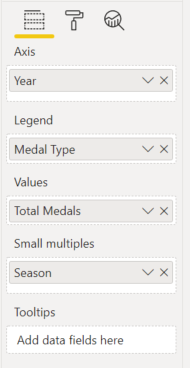
Small multiples are a great way to display data when you have too many things for one visual. I wanted to depict the history of each country in the Olympics, and obviously we want to see the Gold/Silver/Bronze split for each year. However, the Summer/Winter difference was also important to me. Particularly as some countries have won almost no Winter medals but do really well in summer. With a simple column chart, you can only split the data by legend once, but with small multiples I could add the Season into the Small Multiples field to show exactly what I wanted.

The great thing about small multiples are that it ensures you have the same axis on all visuals, which is vital for enabling users to make eyeball comparisons of the data. 

How to use Small Multiples

If you have the latest version of Power BI desktop, you should see a Small multiples option on your column, bar and line charts:


Simply drag a dimension field into the Small multiples and viola! Power BI has created multiple small visualizations for you, that all behave with the same formatting. 

Now to iron out the details. Swap to the format view for this visual and you'll notice two new options: 

Small multiple titles

By default this is on, and I think that's pretty helpful. You don't get a legend for small multiples, so it's important to know what we're actually looking at. 

Grid layout

This lets you define the default for how many multiples you'll see without scrolling. Users can always scroll to see more. 

Tokyo Olympics: Mobile Friendly View


 I believe Microsoft still have some work to do in terms of improving the ease of designing mobile friendly reports in Power BI desktop, but overall it's remarkable how much information you can get at your fingertips from your mobile device - on the go!

Here's a quick demo of what the Power BI mobile app looks like on Android and how to navigate your way around: 

Power BI Mobile Layout

You can set the mobile layout in Power BI for both reports and dashboards. The interface is an easy drag and drop. All visuals must snap to the grid, so you don't need to worry about getting pixel perfect sizing - Power BI takes care of that for you. 

Power BI Screenshot mobile layout

In the screenshot above, you will notice that I have dragged some visuals onto the mobile canvas, but there are still 4 visuals left in the 'Page visuals' pane that I have decided not to put on the mobile view of the report. I consider the mobile view to be more of a quick look at the most important info, so have left off most slicers. I also prefer vertical layout for mobile view - try not to make your end user scroll in two directions. Since the mobile view canvas will scroll up and down, use visuals that also scroll up and down. 

Power BI make it really easy to leave visuals off the mobile view, but unfortunately it's not so easy to leave them off the desktop view. If you want the visual displayed in the mobile view, it must be displayed in the desktop view. If you hide a visual in desktop view, it will also be hidden in mobile view. 

Vote for this in Power BI Ideas.

In the meantime, in order to work around this limitation, I find myself creating mobile only visuals and then layering them behind other visuals in the desktop. That way they are still 'visible' in the desktop view, but users don't see them. In the mobile layout, I choose the vertical orientation (bar chart) and leave the landscape orientation (column chart) for the desktop. 

Power BI GIF

Mobile Layout Design Considerations

When you're designing mobile friendly reports, keep these things in mind:

Test Font Size:

Power BI will auto-scale the text in your visuals for the mobile device, so check what it looks like on your own device before publishing to a wider audience. Ensure you've tested the mobile view with the longest text values in your report so you know how they will appear to your users.

Replace Right Click with Buttons: 

Make sure your users can access all the pages and information they need easily. If there is a lot of right clicking or Ctrl key needed in the desktop version, ensure you give mobile users buttons or instructions on how to get the information they need.

Orient Visuals Vertically: 

Try to keep the mobile view to a single directional (up/down) scroll. This might mean replacing your column charts with bar charts and leaving off some of the more detailed tables (or reshaping them).

Make Space for Scrolling: 

If a visual will have a scroll bar, consider leaving an extra gap on the report so users can scroll the report page or the visual (the native gap width in Power BI mobile isn't quite wide enough for the average finger). 

Fit Visuals to Screen: 

Power BI mobile layouts are designed to scroll indefinitely, so make sure your user knows there's more to see. Ensure you can always see the top of the next visual when the current visual is aligned with the top of the screen. Users shouldn't have to scroll to see the entire visual. NOTE: Not all mobile devices are the same size, so test on the devices your end users will be using. The mobile layout view in desktop isn't necessarily what your users will see.

Tokyo Olympics: Data Category in Power BI


 Today's post is a nice short one on the importance and helpfulness of 'Data category' in Power BI. 

Data Category Power BI

Power BI allows us to categorize any of your columns to help the engine determine how to handle these values. 

Data categorization is primarily useful for: 

  • Mapping correct locations
  • Web URLs
  • Images

If you set the data categorization properly in Power BI, you can get accurate and interactive visuals. 

Example 1: Georgia (the Country)

In our Olympics report, Georgia have won a few medals. Obviously this is Georgia the country, not Georgia the city. It would be nice if Power BI could read our mind, or look in the column at the other values and decipher that most of them are also countries, and pick Georgia the country. Unfortunately, it seems to have a large bias for North America. 

In order to demonstrate this, I have changed the color for Georgia to red in the visuals below, to make it easier to spot. 

Without data categorization

Georgia is plotted in the United States, as the state of Georgia.

PowerBI screenshot Georgia in USA

With data categorization

When we set the Data Category for the 'Team' column to 'Country' (careful not to choose County!!! look for the 'R'), it's plotted correctly.


PowerBI screenshot Georgia country

Example 2: Web URL in Matrix header

Web URLs in Power BI are a bit tricky. They must start with https in order for Power BI to allow and recognize them. Tables give you the ability to conditionally format any value as a 'Web URL'. This is pretty cool, as it enables us to display one value but link to the underlying URL. You can see this in the images below with the number - each one is underlined because they are a hyperlink to that Olympic Games web page. Conditional formatting with web URLs will work when the column is categorized or not, as long as it is text and has the https. 

In the matrix row header however, this is a different story. 

To display hyperlinks in matrix row headers, you can use the URL icon functionality. Simply turn 'On' the URL icon property in the 'Row headers' section of the matrix formatting:

PowerBI screenshot matrix formatting
Without data categorization

Here you'll see that the URL column displays the URL text of the column, even though I have turned the URL icon to 'On' in the matrix formatting.

PowerBI screenshot

With data categorization

When we set the Data category for the URL column to 'Web URL', the matrix row headers automatically update to the URL icon, thanks to the formatting we set earlier:


PowerBI screenshot

How to set Data Category

In conclusion, setting the Data category for your columns can be a very important step in getting the right results in your Power BI report. To set the Data category, simply select the column in Power BI Fields pane, then in the ribbon select the Data category you want. 

Power BI screenshot GIF

Tokyo Olympics: Cross Filter Direction and DAX Measures


In my Olympics History YouTube video I stated that using a Cross-filter direction of 'both' can introduce ambiguity into your data model and give you incorrect results. 


In this post I will give a concrete example of why Cross-filter direction of 'both' can cause errors.

Cross-filter direction

Let's start by defining Cross-filter direction. This is the direction that filters propagate through your data model. In plain English, if the Cross-filter direction is set to single from DimTable to FactTable (which it should be), then we get the following behavior: 

  • putting a filter on the DimTable will filter the FactTable 
  • putting a filter on the FactTable will NOT filter the DimTable 

As we saw in the video above, this behavior can be annoying at times - we want to filter our DimTable to remove records with no entry in the FactTable. However, the problem arises when we have many DimTables. Let's look at the example below.

PowerBI screenshot

In the above image, let's focus on the three tables at right: 

  • OlympicMedals (DimTable1)
  • OlympicTeams (DimTable2)
  • Tokyo 2020 Medal Standings (FactTable1)

You can see that the Cross-filter direction between DimTable1 and FactTable1 is set to both. This means that if we filter DimTable2, it will filter both the FactTable1 AND the DimTable1. 

In this example, if I choose a specific team, for example the  United States of America, that will filter the Tokyo 2020 Medal Standings table. Since the Team USA haven't yet won any medals in Tokyo 2020 at the time of writing, the Tokyo 2020 Medal Standing table is now empty. 

With a Cross-filter direction of both between Tokyo 2020 Medal Standing table and OlympicMedals table, the Tokyo 2020 Medal Standing table filters the OlympicMedals table, so it is also empty. This causes my slicer for Medal Type to be empty: 

PowerBI screenshot USA

 Let's look at another country; Japan was the first team in Tokyo 2020 to win two medals. At the time of writing this post, they have earned a Gold and a Silver medal. In the image below when Cross-filter direction is set to both, you can see that my slicer for MedalType[Medal Type] now shows only two medals; Gold and Silver. This table has again been filtered by the Tokyo 2020 Medal Standings table. 

Single Cross-Filter Direction

To fix the slicer, we need to set the Cross-filter direction to Single. This should be your default setting for a one to many relationship. 

PowerBI screenshot how to edit relationship

Now our data model looks like this: 

Power BI screenshot correct data model

When we return to the report, our United States Olympic Medal History page is fixed - the Medal Type slicer has restored Gold, Silver and Bronze as options. 

Power BI screenshot single cross filter


Tokyo Olympics: Schedule Refresh in PowerBI.com


 Since the Olympics is in full swing, we want to keep up to date on the latest medal counts and information, automatically. 

In order to do this, we should be able to schedule a refresh on our report since it uses public web data as the source. 

Schedule Refresh in PowerBI.com

There are a few things we need to overcome in order to succeed with the scheduled refresh. You may encounter two error messages commonly when trying to refresh your data in PowerBI.com. These messages relate to:

  • Dynamic Data Source
  • Gateway

Dynamic Data Source

In order to schedule the refresh on this dataset in PowerBI.com, we need to tweak the source code slightly. If you have a look in Power Query at the SampleResultsTable query we authored using the custom parameter you will see that Power Query generated the following code for Source step: 

= Web.BrowserContents("https://olympics.com/en/olympic-games/" & URLpart)

This code is what is know as a 'Dynamic Data Source', which cannot be refreshed in PowerBI.com

screenshot PowerBI.com Dynamic data source refresh error

dynamic data source in Power BI is one which cannot be determined without running the Power Query code. Since this URL requires Power Query to run another query, it is a dynamic data source. In order to fix it, we need to provide a static base URL which can be accessed independently, and then use the RelativePath property to direct Power BI to each page based on our parameter. 

We will update the source step to read: 

= Web.Contents("https://olympics.com/en/olympic-games/", [RelativePath = URLpart])

Data Gateway 

If we try publishing this to PowerBI.com, it now asks us for a Gateway connection. 


A data Gateway allows you to manage access to secure data sources that aren't available otherwise. If you are using Excel files stored on SharePoint or OneDrive and get a Gateway error message on refresh, this post is for you too!

Why the error?

If our data is available on the web with no login required, or in the cloud in SharePoint with the same login credentials we're using for PowerBI.com, why does PowerBI.com insist on a gateway?

Data Gateway & Web.BrowserContents

Web.BrowserContents as a function requires the secure gateway connection to our datset. In order to refresh the dataset we have two options:

  • add the Web.BrowserContents data sources to a gateway
  • convert all queries to use Web.Contents instead

Data Gateway and OneDrive / SharePoint files

If you connected to a SharePoint or OneDrive Excel file using the Get Data > Excel option, Power BI will use the local path specific to the current computer you're using. In order to access this same filepath, you'll need to build a gateway. Again, you have two options here:

  • add the Excel.Workbook data sources to a gateway
  • convert all queries to use Web.Contents instead

Add data to Gateway

If you are lucky enough to have admin access to your company's gateway, this is a simple process that you can do from PowerBI.com. If you don't yet have admin access to a gateway, install one!

Your gateway must be installed on a computer that is always running. If the computer stops running or goes to sleep, so does your gateway, and so too will your scheduled refreshes. 

Once you've installed your gateway, using it is straightforward. Simply add each data source to the gateway using the blue links seen in the screenshot above. 

Convert Source: No Gateway Needed

Alternatively, we can convert the source steps to use Web.Contents, and avoid the need for the Gateway. Do I hear a sigh of relief here? 

Web Data

In our Olympics example, this process is easy - simply edit the formula bar for the Source step wherever you see Web.BrowserContents and change to Web.Contents.

NOTE: If you have already published to PowerBI.com, you will need to delete the data source before trying to republish. If you simply overwrite the data source your changes will not pull through.

One Drive / SharePoint Data

For a OneDrive / SharePoint file, I recommend that you use the Get Data > Web option, then paste the Filepath of your desired document. This filepath can be found in SharePoint by clicking the three dots next to the file you want, then select Details (you may need to click More, then Details). Scroll down on the Details pane and click the Icon to copy the filepath.

Once you've loaded this data into Power BI, you can see what the Source step needs changed to in order to avoid the need for a gateway.

Update Credentials

Even though we don't need a Gateway for this method, we still need to update our credentials in PowerBI.com in order to schedule the refresh. When you're in the dataset settings page on PowerBI.com you'll see a prompt to 'Edit Credentials'. You must do this for each data source in your file. Once you've done this once, it will allow you to enable scheduled refresh on the dataset.

In order to Update credentials for Web or SharePoint based data sources; 

Step 0: If you're getting data from SharePoint, ensure you've used the correct link. See more info in my Get Data From SharePoint blog. 

Step 1: Navigate to your workspace in PowerBI.com

Step 2: Click the 'Schedule Refresh' icon next to the dataset you wish to refresh.


Step 3: Scroll to the 'Data Source Credentials' area. Click 'Edit credentials' for each data source and sign in with Oauth (or the correct credentials for your chosen data source).


Tokyo Olympics: Power Query Custom Functions


The Tokyo 2020 Olympics opening ceremony is only days away, and some of the qualifying matches are already underway. I say 'already'; I guess they're only a year late!

This is the first blog in a short series designed to:

  • demonstrate common Power BI principles using a non-sales related dataset
  • address common pain points when working with non-fact table measures
  • keep up to date with the latest stats in the Tokyo 2020 Olympic games
  • cheer for the little guy - we're going to throw population into the mix and see how the big players stack up now
screenshot Power BI Olympics Total Medals History


Over the coming weeks I'll document how I created the reports using Olympic medals data readily available on the web.

Power Query Parameters

I've blogged about parameters in Power Query before. The 'Get Data from Folder' packages up data for us nicely and does all the custom function work, but what if you have something tricky or different you need to handle in each file? What if all the sheets in Excel are named the same as the filename - the Get Data from Folder won't allow you to pick a different sheet name each time. Parameters can make this possible, but we need to get familiar with using parameters and be able to understand how the data fits together. 

This is an easy demonstration on using parameters, and it uses data that's readily available on the web. As a bonus, you can use this technique to crawl a website to get the lowest prices or read all the reviews on a product you're looking to buy. Parameters are all about finding the patterns in your data source, which in our case today is the URL of the website. 

In this sample, we connect to Olympics.com using two main URLs: 

  • Parameter Table: https://olympics.com/en/olympic-games/olympic-results
  • Sample URL: https://olympics.com/en/olympic-games/pyeongchang-2018/medals

The https://olympics.com/en/olympic-games/olympic-results site gives a simple table of all the Olympic games throughout history, and thankfully they are formatted in a way that is very similar to the Sample URL for each medals table. 


Screenshot of Olympics.com Olympic Results

When pulled into Power Query, the above table looks like this: 

Screenshot of Power Query
With just a bit of Power Query Magic, we can format it to match the URL for the Sample URL file: 

Screenshot of Power Query formatted URL part

In the first half of the video below, I walk through how I turned this table into a complete list of all Teams who have won medals for each of the Olympic games. 


Custom Visual Review: Charticulator

This is not your ordinary custom visual - this is EVERY custom visual. Charticulator puts the power to design and develop custom visuals to ...