Search

Search this blog:

Search This Blog

Showing posts with label DAX. Show all posts

Power BI Themes


I am a big fan of color; my wardrobe is full of blues and pinks and yellows. Side note: have you ever heard of 'dopamine dressing'? Apparently it's a fashion trend that's been around since at least 2022 but I'm just learning about it now - I'm actually impressed I'm only a season or two behind! 

But I digress, the reason for my post today is to compile some of my favorite resources for working with color in Power BI, and more generally, Power BI themes.


Sentiment Colors in Bar chart


Colors have meaning

Being a good data storyteller means using all the tools at your disposal. This includes color. It is important to note that I'm not advocating the use of color only in your reports - you need to ensure that there is another method to discern what's going on with the data for those in your audience who might be colorblind. But that doesn't mean we can't play around with color and use it to add meaning to our reports. 

Most people I know would agree that GREEN means 'Good' and RED means 'Bad'. But colors can be very personal. For example, my favorite color is BLUE and it was also the color I chose for my math notebooks throughout school. (Yes, math was my favorite subject - I guess it's no surprise I ended up in a career that works so much with data.) My school subjects were always color coded as follows:

  • BLUE - Math
  • GREEN - Science
  • RED - English
  • YELLOW - History

So what does this mean for your Power BI reports? Use color to your advantage. You may not be reporting on school subjects, but you can assign colors to whatever categories or metrics you're reporting on according to your own meaning and interpretation. BLUE is also the color of the sky, water, a common color in many country's flags and so much more. Using the AdventureWorks Sales data as an example, you could assign colors to the product categories as follows:

  • GREEN - Bikes
  • PURPLE - Accessories
  • YELLOW - Components
  • RED - Clothing

If you're reporting on 2 or 3 different metrics, assign a different color to each one and use that consistently throughout your report:

  • BROWN - Actual
  • RED - Budget
  • Light BROWN - Prior Year Actual

Whatever colors you use, make sure you're using them deliberately and with meaning. Adding lots of extra color to your report may give the impression that it's more exciting, but it may have the unwanted result of making your report more difficult to read and understand.

Create your own Power BI theme

I've written a few posts on Power BI themes, and the functionality of themes in Power BI desktop has improved dramatically over the years. 

You have a few options when creating your own theme in Power BI:

  1. Use the built-in theme designer within Power BI desktop
  2. Import a theme someone else has created in JSON
  3. Create and import your own theme using JSON

It used to be extremely difficult to find documentation for creating your own JSON theme in Power BI, but that has gotten easier. The Microsoft Learn article Use report themes in Power BI Desktop - Power BI | Microsoft Learn is a great place to start. 

However, with the speed of development of Power BI desktop, there's just not enough documentation on the new visuals. 

This is a great start: powerbi-desktop-samples/Report Theme JSON Schema at main · microsoft/powerbi-desktop-samples · GitHub

But not everything is documented there. One trick I've learned is that you can use the Power BI project files to explore the JSON code in Power BI desktop and copy that into your own theme. 

How to find the JSON code for formatting visuals in Power BI themes

For example, I'm going to use this method to find the formatting options for Power BI themes.

Step 1: Add the visual you want to format in your theme to a new blank report. 

Step 2: Change the formatting options that you want available for editing within your theme.

Step 3: Save AS - save your report as a .pbip file. When you choose this option, Power BI will save a couple folders with various files into the folder you choose.

Step 4: Open the visual.json file - you'll find this in the MyReportsName.Report > definition > pages folder. This can be difficult to navigate which is why I start Step 1 with a blank new report.

Step 5: Explore the code to discover the names of the visual and the properties.

Step 6: Use those names in your JSON theme, following the instructions from Use report themes in Power BI Desktop - Power BI | Microsoft Learn 

Power BI Color Picker

While my go-to resource for anything color related is usually Coolors.co - I've been inspired to make my own little color picker that calculates the contrast and displays a demo live in Power BI. The thing I like about this tool that I've created is it lets you adjust the colors using RGB method, so if you want to just add a bit of red hue you can, and the contrast value is calculated automatically without needing to switch tools. 

It makes me feel almost like an artist mixing colors in a paint palette. Except, since we're playing with digital colors, mixing the maximum value of all three colors makes white. This follows the light color spectrum, where white light indicates the presence of all colors, and black is the absence of all colors. So if you select 0 for each RGB value, you'll get black.

Have a play with the color picker below and see what you think!


Reference Power BI theme colors in DAX

Now for the REALLY cool bit: this is the straw that finally inspired me to publish today's blog - I was doing research for a talk I was giving and came across this Workout Wednesday challenge on using Power BI theme colors within your DAX:

2024 Week 26 | Power BI: Reference Theme Sentiment Colors in DAX – Workout Wednesday (workout-wednesday.com)

(If you haven't heard of Workout Wednesday - I highly recommend you check them out. They have fantastic demos and challenges for all skill levels and it's a great way to get inspiration.)

This is something I've wanted to do for years, but haven't known how. Just like with everything else in Power BI themes, it all comes down to know which names to use. 

So far, I have discovered the following color names from the theme can be used in your DAX code:

  • good
  • neutral
  • bad
  • maxColor (note this is called 'maximum' in the theme)
  • midColor (note this is called 'center' in the theme)
  • minColor (note this is called 'minimum' in the theme)
  • tableAccent
  • foreground (note this is also called 'firstLevelElements' in the theme)
  • foregroundNeutralSecondary (note this is also called 'secondLevelElements' in the theme)
  • backgroundLight (note this is also called 'thirdLevelElements' in the theme)
  • foregroundNeutralTertiary (note this is also called 'fourthLevelElements' in the theme)
  • background 
  • backgroundNeutral (note this is also called 'secondaryBackground' in the theme)

Sample Theme Colors with DAX conditional formatting

Thanks also to thinkBI for inspiring me to see what other theme colors are available for use beyond what was in the WOW solution. 


References I used to study up for this blog post:

2024 Week 26 | Power BI: Reference Theme Sentiment Colors in DAX – Workout Wednesday (workout-wednesday.com) - the original inspiration for this post and source of some working theme color names in DAX.

Color Contrast Checker - Coolors - one of my go to resources whenever I need to do something with colors.

Reference Power BI theme colors in DAX - thinkBI - source of some additional working theme color names in DAX that inspired me to test out all the theme colors I know the names for.

Choosing font color based on background color in Power BI – XXL BI - Special thanks to Daniil Maslyuk for his measure on font color and David Eldersveld's comment that inspired me to convert it to use Luminance instead of Intensity.

Color Relative Luminance Calculator (WCAG) (contrastchecker.online) - to learn how to calculate Luminance.

RGB - Hexadecimal Color Conversion (tripod.com) - to learn how to convert HEX to RGB and better understand what had been done by Daniil in his Font Color measure.

List of Unicode characters - Wikipedia - again, to better understand what had been done by Daniil.

Chris Webb's BI Blog: Colour Names Supported In Power BI Conditional Formatting (crossjoin.co.uk) - Chris Webb has been one of my go to blogs for many years. This particular post is quite old and many of these colors no longer seem to work in Power BI DAX, but it led me to the correct link of CSS colors that did all seem to work in DAX.

CSS Colors (w3schools.com) - the correct link of CSS colors that work in Power BI DAX.

JSON Editor Online: edit JSON, format JSON, query JSON 

powerbi-desktop-samples/Report Theme JSON Schema at main · microsoft/powerbi-desktop-samples · GitHub - JSON code for many of the classic Power BI visuals.

Power BI Icon Names for Conditional Formatting Using DAX - RADACAD - Not used in this blog but a really great resource for conditional formatting in DAX. 


DAX Time Intelligence - Easy pattern to get DAX Time Intelligence functions to return the correct results


 DAX is a simple but complex language. It can be very powerful if you understand how to use it properly. In this post, we're going to look at a specific group of functions in DAX: Time Intelligence.

Time Intelligence DAX functions

Time Intelligence functions in DAX change the filter context on the Date table of your model. 

Step 0: Prepare 

Before using Time Intelligence functions, you should:

Time Intelligence functions in DAX are not vital functions. We can calculate the same results without their use, just need to think a bit differently about the problem. Greg Deckler has a great post on this here: 

https://community.fabric.microsoft.com/t5/Quick-Measures-Gallery/Time-Intelligence-quot-The-Hard-Way-quot-TITHW/td-p/434008

My post here aims to debunk the mysteries behind using Time Intelligence functions and provide you with an easy pattern that works every time.

Easy Time Intelligence DAX Pattern

Now that we know what time intelligence is, how do we use it?

Step 1: Create a base measure

You may have already completed this step. The base measure is what you are reporting on, it should come from a table related to your Date table. Consider the 'Example 2' in my post on Relationships in Power BI: https://excelwithallison.blogspot.com/2020/08/its-complicated-relationships-in-power.html 

We have a 'Date' dimension table and an 'Incident Reports' fact table. These are the only two tables we need to consider for this solution. 

Our base measure will be Incident Count:

Incident Count = DISTINCTCOUNT( 'Incident Reports'[IncidentID] )

Your base measure could be anything, and use any aggregate function or filters, or combination of DAX functions, as long as it returns the results you expect when put in a table/matrix with a column from your Date table. 

Step 2: Select your time intelligence function

This may be the most difficult step, and I may write a separate blog on this if I get time. For this post, I'm going to use my favorite time intelligence function: DATEADD. I like this function because it's versatile and works for a lot of the scenarios my clients ask for, without requiring me to learn /memorize new functions.

For this example, I want to compare my [Incident Count] base measure above to the same period last year. DATEADD will work nicely for this.

Step 3: Apply the Time Intelligence Pattern

Now we're ready to apply the easy Time Intelligence Pattern. 

Time Intelligence Pattern Measure = CALCULATE ( [Base Measure], FUNCTION ( 'dimDate'[Date], functionparameters ) )

What does this look like in practice? Let's apply it to our example using DATEADD and [Incident Count]: 

Incident Count Prior Year = CALCULATE ( [Incident Count], DATEADD( 'Date'[Date], -1, YEAR) )

Step 4: Use in the context of your Date table

This final step is critical, and one that can cause many well-written time intelligence functions to fail if forgotten. You MUST use this measure in the context of your Date dimension table. 

In my example, I've created an [Incident Count Prior Year] measure. If I don't put a filter for year, or use this in a table / visual split by Year, I'll just get the result of all Incidents except the maximum year in my date table (this is by design and how time intelligence functions work, something that I may expand on in another blog post). 

For many people, their date tables include future years (for budgeting and forecasting purposes), so when they create a time intelligence function correctly, it simply returns the same value as the base measure. That is, until they apply a date filter.

Use the Date dimension in any visuals or filters for this measure. 

Conclusion

That's it! You've now got the easy time intelligence pattern for DAX. It can be applied to all sorts of different scenarios. 

Additional Examples

Total Sales = SUM( Sales[Sales Amount] )

Total Sales Prior Year = CALCULATE( [Total Sales], DATEADD( dimDate[Date] , -1 , YEAR) )

Total Sales YTD (calendar) = CALCULATE( [Total Sales], DATESYTD( dimDate[Date] )

Total Sales YTD (fiscal) = CALCULATE( [Total Sales], DATESYTD( dimDate[Date], '6-30' )

Remember

Key tips:

  • Create a base measure first - it makes things easier to follow
  • Use the CALCULATE function with the Time Intelligence function as a filter
  • Use the Date dimension table in:
    • Your time intelligence function wherever it asks for a date
    • Your visuals and filters whenever using the new measure
Enjoy!

Copy and Paste DAX Code - Power BI Hack


 This blog will be short and sweet, but it's a game changer for those of use learning DAX.

One of my favorite keyboard shortcuts in DAX Power BI desktop is:

Ctrl Shift L

This lets you easily change multiple values in one go. 

It is a bit strange and takes some practice to get used to what data to select and typing in multiple places at once, but it's super handy once you get the hang of it. 

Here's a demo on how it works: 


Power BI Forecasting with irregular time periods


Will Auckland move to Alert Level 3 on Monday?

Power BI screenshot of COVID lockdown levels and case numbers

It's day 31 of Lockdown Level 4 for us Aucklanders (how did that happen and what have I done with all that time?!). Monday we will find out if Auckland stays in Level 4 or moves to another alert level.

This is already Auckland's longest time in Level 4, and it seems everyone is getting stir crazy; We've all walked our neighbourhoods so many times we know every nook and cranny by heart. It's been rainy the past week or so, so we've also probably finished all the puzzles in the house (twice), read plenty of books, watched the Top 10 on Netflix, run out of flour from excessive baking and put on a few kilos. Well, that's been my lockdown anyway. 😂

After all that activity, I'm left wondering what Monday's announcement will bring for us Aucklanders; will we get to enjoy someone else's cooking skills with Lockdown Level 3? (See my Lockdown with Takeaways post if you're not from NZ.) Or will we stay in Level 4 a bit longer to beat the delta variant? (If so, send me your favourite recipes - I need new ideas!)

I have been wanting to overlay the current case numbers with the last big lockdown we had in Auckland, so finally got around to making it happen. 

View the Live Power BI report

DAX Data Overlay for Forecasting

Power BI has some built in forecasting that will automatically calculate and forecast, allowing you to change the number and length of periods, as well as the seasonality. However, this doesn't work for irregular time frames. COVID lockdowns in New Zealand don't really have a seasonality. It also doesn't allow you to overlay past actuals at the same time as forecasting, so I decided to create some crazy DAX measures to show what I wanted.

GENERATESERIES: Days since start of Lockdown

The first calculation I made was to create the X-axis: Number of Days in Lockdown

DAX has an easy function that can make this axis for you. Click New Table to create a new table for this calculation: 

Days In Lockdown =

GENERATESERIES (

    -10,

    100,

    1

)

This creates a single column table with numbers ranging from -10 to 100, increasing by 1 each row. I decided to start at -10 because the first lockdown in NZ started about 10 days after the first reported case, so this would ensure we could see that history in the graph.

Key Dates table

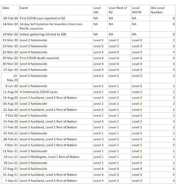
The next step was to list all the key dates and alert levels throughout both lockdowns. I know that I can use approximate lookup in DAX to display the current level if I just provide a list of Alert Level start dates, which is conveniently compiled on the Timeline of Key Events COVID19.govt.nz website.

table of key COVID19 NZ Dates

This table should NOT be related to any of the other tables in the data model - we'll make all the magic happen with DAX.

Along with key dates table, I created two measures for the start date of the two periods I wanted to compare: 

Key Start Date Period to Compare

Lockdown March 2020 Start Date =

DATE ( 2020323 )

Key Start Date Current Period

Lockdown August 2021 Start Date =

DATE ( 20210817 )

If you prefer, you could add a Parameter (an unrelated Date table) allowing users to select the Key dates themselves. This will make it possible to compare dynamic date ranges and custom time periods.

DAX Variables and Approximate Lookup: Convert Date to relative time since Start of Lockdown

I'm comparing to the start of lockdown, but you can use this method to compare any two time periods by relative length/duration. We simply need to use the value of the GENERATESERIES column we created, add that to the value of the Key Start Date value. I'm calling this value my 'CaseDate', but it's the date in your Fact table. 

Key Date Approximate Lookup

For the alert level status, we need to use the DAX approximate lookup technique, I have chosen the MAXX(FILTER( option: 

Lockdown August 2021 AKL Level =
VAR _StartDate = [Lockdown August 2021 Start Date]
VAR _Duration =
    MAX ( 'Days In Lockdown'[Days In Lockdown] )
VAR _CaseDate = _StartDate + _Duration
VAR _KeyDate =
    MAXX (
        FILTER (
            'NZ Key Dates',
            'NZ Key Dates'[Date] <= _CaseDate
        ),
        'NZ Key Dates'[Date]
    )
RETURN
    IF (
        _CaseDate
            <= TODAY (),
        SUMX (
            FILTER (
                'NZ Key Dates',
                'NZ Key Dates'[Date] = _KeyDate
            ),
            'NZ Key Dates'[AKL Level Number]
        )
    )
 

This will allow us to calculate the Alert Level in Auckland on each relative day since the Key Start Date of Lockdown. 

Power BI levels overlay chart

Key Date Exact Lookup

The DAX for the Case numbers is a bit simpler, since we have a value for each date that has cases (unlike the Key Dates table which only contained the Start date value). Therefore we don't need the MAXX calculation and can do an exact lookup: 

Lockdown August 2021 Cases =
VAR _StartDate = [Lockdown August 2021 Start Date]
VAR _Duration =
    MAX ( 'Days In Lockdown'[Days In Lockdown] )
VAR _CaseDate = _StartDate + _Duration
RETURN
    IF (
        _CaseDate
            <= TODAY (),
        COUNTX (
            FILTER (
                'NZ Cases',
                'NZ Cases'[Report Date] = _CaseDate
            ),
            'NZ Cases'[Index]
        ) + 0,
        "TBC"
    )

This allows us to calculate the total case numbers on each relative day of lockdown since the Key Start Date: 

Power BI chart cases overlay

Then put them both together in an area chart and voila! Easy to see the patterns and similarities and differences between the two time periods. 

Sunday's spike of 40 new cases is concerning for what Monday's decision may bring, but only time will tell the actual result. For now, I'll content myself with forecasting and playing with Power BI visuals.

Advanced Filter OR vs AND


This post was inspired by @saud968 from the Power BI Community and their post on Multiple values from same column under same visual

Their question centered around being able to find all the survey results that were equal to 4 AND all the survey results that were equal to 5. While the wording I have used here, specifically the word AND, is commonly how we approach and think of the problem, it will unfortunately trip you up when working with advanced filter logic. 

Screenshot Power Query Advanced Filter

I am going to keep this post generic, as this concept can apply to DAX Logical Operators (specifically && and ||), Excel Advanced Filter conditions, Power Query Advanced Filters with And / Or selection and more!

The Problem

Let's use the below table as our sample data. Nice and simple, only 5 rows of ice cream orders:

Order ID Name Location Country Flavor Scoops
1 Allison Chicago USA Chocolate 2
2 Phil Wellington NZ Vanilla 2
3 Allison Auckland NZ Chocolate 1
4 Vijay New York USA Mint Chocolate Chip 1
5 Agnes San Francisco USA Vanilla 1

The boss wants to know the total number of scoops for Chocolate of any kind, so Chocolate and Mint Chocolate Chip scoops combined total. How do we write the filter - using AND vs OR?

Let's start simpler:

If we want all Orders for vanilla that's easy: Order IDs 2 and 5. 

venn diagram vanilla only

If we want all Orders for 1 scoop that's easy: Order IDs 3, 4 and 5. 

venn diagram 1 scoop only

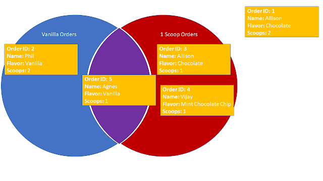
But what if we want Orders for vanilla AND 1 scoop?

What about Orders for vanilla OR 1 scoop?

AND: 1 scoop AND Vanilla

Let's start with the AND condition: 

venn diagram

As you can see in the Venn Diagram above, I have moved Order ID 5 to the middle of the Venn Diagram, since it is both a Vanilla AND a 1 scoop order, so it falls into BOTH filter conditions. 

If we choose an AND filter, we will only get the intersection of the chosen conditions, in this case, Order ID 5 only.

OR: 1 scoop OR Vanilla

But what if we wanted all four of those Orders 2, 3, 4 and 5?

Well, again referring to the Venn Diagram above, in order to get all orders, we need to include ALL orders that fall into Vanilla Orders and ALL orders that fall into 1 Scoop Orders. 

As I have mentioned before, the use of that pesky little word and in the sentence above often gets us into trouble. We have already demonstrated that when using the AND filter, we only get Order ID 5. So to get all four orders we must need to use the OR condition. But why?

Let's rephrase our question to look at EACH order individually, as that is how the filter conditions are evaluated when we use them in the various Power BI, Excel, etc applications: 

Does each Order have either Vanilla OR 1 scoop?

Now we have the key to success. Looking at EACH item individually:

  • Order ID 1, does it have either vanilla or 1 scoop? NO
  • Order ID 2, does it have either vanilla or 1 scoop? YES, vanilla only
  • Order ID 3, does it have either vanilla or 1 scoop? YES, 1 scoop only
  • Order ID 4, does it have either vanilla or 1 scoop? YES, 1 scoop only
  • Order ID 5, does it have either vanilla or 1 scoop? YES, vanilla AND 1 scoop

So now we can see that by using the OR condition on EACH item, we get the desired result of all four orders that have either 1 scoop or vanilla.

EACH item is evaluated individually

Now that we know that each item is evaluated individually, let's rephrase our questions and revisit the AND filter. 

Does each Order have Vanilla AND 1 scoop?

  • Order ID 1, does it have vanilla and 1 scoop? NO
  • Order ID 2, does it have vanilla and 1 scoop? NO, vanilla only
  • Order ID 3, does it have vanilla and 1 scoop? NO, 1 scoop only
  • Order ID 4, does it have vanilla and 1 scoop? NO, 1 scoop only
  • Order ID 5, does it have vanilla and 1 scoop? YES, vanilla AND 1 scoop

Find the Chocolate and Mint Chocolate Chip combined total scoops

To determine which filter condition (AND vs OR) to use, we need to think about evaluating EACH item individually. 

If we draw our Venn Diagram, we can see that nothing is in the middle AND condition section: 

venn diagram

Does each Order have Chocolate AND Mint Chocolate Chip?

  • Order ID 1, does it have Chocolate and Mint Chocolate Chip? NO, Chocolate only
  • Order ID 2, does it have Chocolate and Mint Chocolate Chip? NO
  • Order ID 3, does it have Chocolate and Mint Chocolate Chip? NO, Chocolate only
  • Order ID 4, does it have Chocolate and Mint Chocolate Chip? NO, Mint Chocolate Chip only
  • Order ID 5, does it have Chocolate and Mint Chocolate Chip? NO, 

Does each Order have Chocolate OR Mint Chocolate Chip?

  • Order ID 1, does it have Chocolate or Mint Chocolate Chip? YES, Chocolate only
  • Order ID 2, does it have Chocolate or Mint Chocolate Chip? NO
  • Order ID 3, does it have Chocolate or Mint Chocolate Chip? YES, Chocolate only
  • Order ID 4, does it have Chocolate or Mint Chocolate Chip? YES, Mint Chocolate Chip only
  • Order ID 5, does it have Chocolate or Mint Chocolate Chip? NO, 

Therefore, in order to get both Chocolate AND Mint Chocolate Chip orders, we actually need to use an OR filter condition. 

Solution

In conclusion, be careful how you word your filter condition questions - don't mislead yourself. In order to pick the correct filter condition (AND vs OR):

  • Evaluate EACH item individually
  • Make a Venn Diagram
    • AND filter condition: Intersection of all conditions (aka the middle of the Venn diagram)
    • OR filter condition: Union of all conditions (aka everything within the Venn diagram)

Now we can confidently tell the boss that there are 4 total scoops that were either Chocolate OR Mint Chocolate Chip because we used an OR filter condition to filter our data. 

Categorical Date Slicer in Power BI


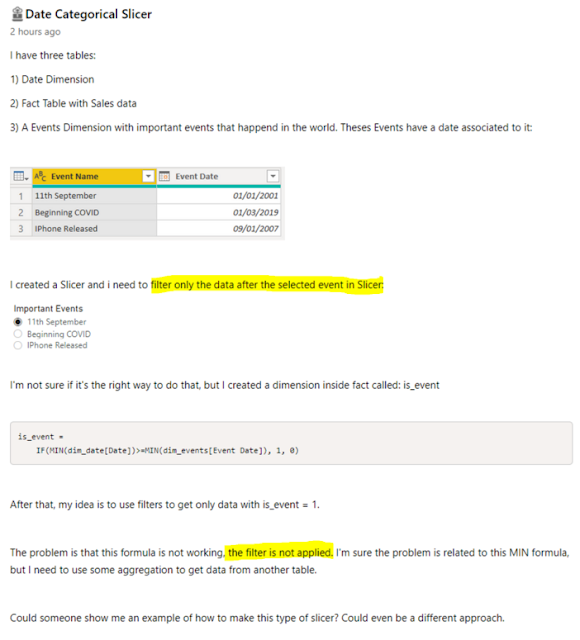
Today's post is inspired by @Iguima of the Power BI Community. You can read their original Date Categorical Slicer question on the Power BI Community Desktop Forum.

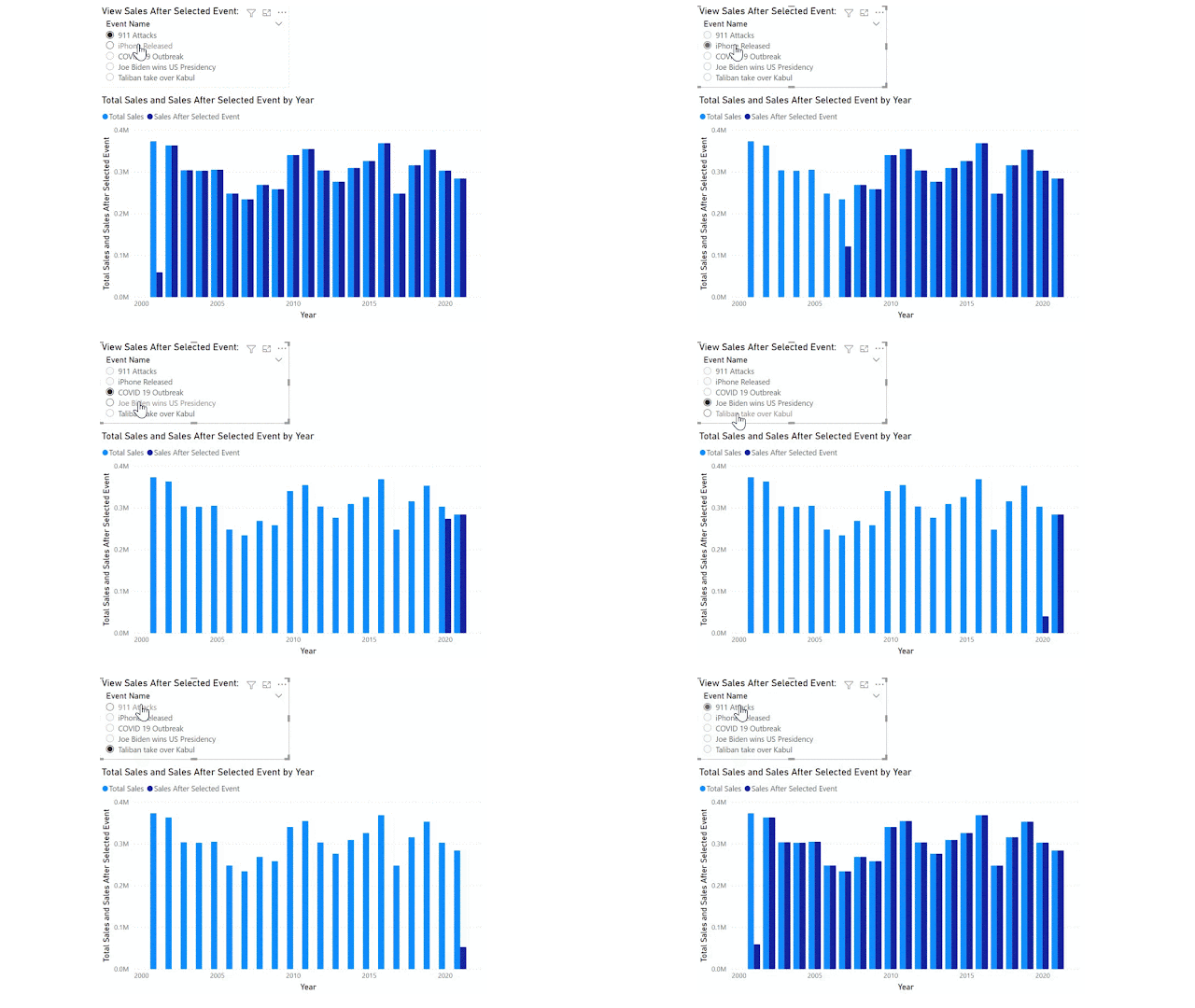
The original poster would like to achieve a categorical date slicer that enables the report user to filter the Sales (fact) table for all data AFTER the selected event/date category. Something similar to the final result below:

GIF screenshot Power BI final result

Note the events span over 20 years and include the 911 terrorist attacks on the USA, COVID 19 pandemic and also some not so catastrophic events such as iPhone first release date. I have added a few more recent events for 2020-21 in case you want to test on your own sales data (which might not span 20+ years!).

Event Name Event Date
COVID 19 Outbreak Wednesday, March 11, 2020
Joe Biden wins US Presidency Saturday, November 7, 2020
Taliban take over Kabul Sunday, August 15, 2021
911 Attacks Tuesday, September 11, 2001
iPhone Released Friday, June 29, 2007

For reference, I have highlighted the important parts of the original question: 

screenshot Original Poster's Question in Power BI Community forum

There are two key issues in this request: 

  1. We want to filter for data only AFTER the selected event. Most filter behavior will return data only ON the selected event.
  2. We want this to be responsive to the filter and slicer selections made by the report consumer.

I have already written about key issue number 2 in a previous blog on Reporting Order of Operations. Basically, calculated columns do not respond to report filters and slicers. We need to solve this problem with a MEASURE.

Data Model

Before we can get into the measure and DAX, we need to review the Data Model. Any of my former students will tell you this is the foundation of your Power BI report. Without the correct data model, DAX won't work. 

For this scenario, we want the Important Event to act as a bookend for our Date table, not filter it just for that specific date. Therefore we need to ensure that the Important Events table is NOT related in any way to the other tables in our data model. 

Below I have a very simple data model: Calendar (date dimension) and Sales (fact) with my Important Events (Categorical slicer table) unrelated to any of these.

screenshot Power BI data model

DAX Formula

Now that we have the Data Model sorted, we can move on to the DAX.

We start with a simple measure for Total Sales:

Total Sales =
SUM ( Sales[Sales Amount] )

Use this [Total Sales] measure in a visualization by Calendar[Year].

We then add a slicer for the 'Important Events'[Event Name]. Since the Important Events table has no relationship to our data, this won't do anything in our report. 

In order to get the Total Sales to filter based on the slicer, we need to figure out what value the user has selected. I have chosen to use the MIN function in case multiple events are selected. This will ensure we are looking at all data after the earliest event.

Selected Event Date =
MIN ( 'Important Events'[Event Date] )

NOTE: Because the [Selected Event Date] is a measure, it will respond to user selections in the slicer as per the Reporting Order of Operations blog. 

Finally, we can use this measure as a filter. You may initially be tempted to write the following DAX and get an error: 

screenshot wrong DAX formula

I haven't used CALCULATE within the filter, but I have used [Selected Event Date] measure, and every measure has an implicit CALCULATE function in front of it. Therefore this DAX expression is not allowed. 

Instead, we need to provide a ROW CONTEXT for the calculation, here I use the FILTER function to provide this context. Now, I am able to use the [Selected Event Date] measure (with its hidden CALCULATE function and all) inside the filter expression:

Sales After Selected Event =
CALCULATE (
    [Total Sales],
    FILTER (
        'Calendar',
        'Calendar'[Date] > [Selected Event Date]
    )
)

Hurray! We get the final result we're looking for, as per the GIF at the start of this article. 

CONCLUSION

You cannot use COLUMNS to respond to filter/slicer selections.

You must not have relationships if you want to do before/after/range filters. 

Once we have overcome these two obstacles, the desired result is achievable. Now to just update any other measures with this added filter. 

Tokyo 2020: RANKX


I'm sitting here watching the Olympic action in the Velodrome for men's pursuits finals and proud to say that New Zealand is currently in the top 10 teams overall in the Olympics! Well, as long as you're using the 'Gold First' ranking method that is. They're number 12 if you are ranking by total medals count. 

screenshot Power BI Gold First Medal Ranking

Olympic Medal Ranking System

Lucky for New Zealand, most of the world goes off the Gold First ranking method. This is certainly how they have been ranking the teams on New Zealand TVNZ 1 throughout the Olympic games. 

However, that is not always the case in the United States. I recall watching broadcasts of Olympic games where the total medal count is all that determines the order of the teams. Looking at the stats, it's not surprising that the United States does things differently (were you surprised anyway? We often march to the beat of our own drummer in the USA). 

Tokyo 2020 Ranking Controversy

Do a quick Google search and you'll see some controversy around the USA media Olympic team ranking systems. Here's an excerpt from Independent.co.uk:  

Screenshot quote

Historically, the difference between the Total Medal Count and Gold First Ranking has only mattered in a few years, such as 2008 when China had most Gold but USA had most Total medals.

The USA and China have been battling for first place throughout the Tokyo 2020 Olympics, with ROC and Japan high on the list as well. Currently, USA ranks first in Total Medal Count, but only second (to China) in Gold first ranking. Come on team USA - bring home the Gold!

screenshot Power BI graph Total Medals ranking

RANKX DAX Function

I thought I'd take this opportunity to write a post on the RANKX function in DAX. This is a complex function that I have spent many hours researching, testing and tweaking. What makes the RANKX so difficult to get right?

  • Dynamic measures - when using RANKX in a measure, you need to be aware of the DAX context and ensure you use the needed modifiers, such as ALL and CALCULATE, otherwise you'll end up with every team ranked number 1!
  • Ties - how do you break ties in RANKX? This often becomes a math problem, and one that I need to solve for the Gold First ranking method

The DAX Measure

Gold First Rank =
IF (
    CALCULATE (
        [Tokyo 2020 Total Medals],
        ALL ( OlympicMedals )
    ) > 0,
    CALCULATE (
        RANKX (
            ALL ( OlympicTeams ),
            CALCULATE (
                [Tokyo Gold] * 10000 + [Tokyo Silver] * 100 + [Tokyo Bronze]
            ),
            ,
            DESC,
            SKIP
        ),
        ALL ( OlympicMedals )
    )
)

Gold First Ranking System

Let's start by understanding the Gold First ranking system in the Olympics. It's pretty straightforward - the team with the most Gold medals is ranked 1, next most Gold medals is number 2, and so on. But what if two teams have the same number of Gold medals? Then we look at Silver for the tie break. 

screenshot Power BI ties ranking

For example in today's rankings, France, Republic of Korea and New Zealand all have 6 Gold medals, but France have more than twice as many Silver medals with 10 Silver and are therefore ranked in 8th, higher than Republic of Korea and New Zealand. Republic of Korea and New Zealand each have 4 Silver medals, so are again tied. Therefore we look to Bronze for the tie breaker - Republic of Korea have 9 Bronze to New Zealand's 5 Bronze, therefore Republic of Korea take 9th and New Zealand take 10th place. Just 1 Gold medal and New Zealand could overtake both France and Republic of Korea to gain 8th place!

Rank Expression

In order to rank these teams accurately, I need to calculate a value or 'expression' that can be used to rank them. We need to ensure that Gold is given the most weight, Silver next and Bronze the least.

In order to make sure that a country with lots of Bronze and no Golds is not ranked above a country with 1 Gold, we need to choose the appropriate weighting. To determine this appropriate weighting, I will start with the smallest value. 1 Bronze medal gets 1 point. 

Next, I need to understand my data and ask a very important question:

What is the maximum number of Bronze medals a single Team might win in a single Olympic games?

The USA have won 701 Bronze medals in total (the most of any team), so it's definitely less than that. In Rio, 359 Bronze medals were awarded to all the Teams, so again, a single team will not earn more than that. I have decided that it's highly unlikely that a single team will earn 100 Bronze medals or more in a single Olympic games. Therefore I'm granting 100 points for a Silver medal. This ensures that a Team with 1 Silver medal will always beat a team with 0 Silver medals, even if that 0 Silver Team have earned 99 Bronze medals. Okay, now how many points should a Gold medal be worth? I have chosen to give Gold medals a weighting of 10,000 points. This means that again a Team with 0 Gold medals and 99 Silver and 99 Bronze will have 99*100+99=9,999 points, but still not enough to beat a Team with 1 Gold which earns them 10,000 points.

Okay, now that we've got the mathematics out of the way, let's look at the RANKX function. 

RANKX (
            ALL ( OlympicTeams ),
            CALCULATE (
                [Tokyo Gold] * 10000 + [Tokyo Silver] * 100 + [Tokyo Bronze]
            ),
            ,
            DESC,
            SKIP
        )

Starting from the inside, we see our weighted medal expression: 

 CALCULATE (
                [Tokyo Gold] * 10000 + [Tokyo Silver] * 100 + [Tokyo Bronze]
            )

which assigns the points we have allocated to each Gold, Silver or Bronze medal. I have put this inside a CALCULATE function for completeness and out of habit, but since we aren't using any aggregate functions it's not necessary, I just find it helpful when working with row context to always use the CALCULATE.

This expression will be evaluated over the row context of the entire list of OlympicTeams. We MUST use the ALL function here in row 2, or else every Team will be ranked as 1.

   ALL ( OlympicTeams ),

Using ALL OlympicTeams ensures that we compare the current row to ALL other Teams. Without the ALL function, we'd simply be comparing New Zealand to New Zealand and France to France. That's pretty boring! We want to compare New Zealand to France, Republic of Korea, USA and ALL the OlympicTeams. 

The rest of my expression helps ensure that the Rankings will display as I want them to when the user filters to show only Bronze or only Silver medals - this shouldn't change the Gold First Ranking System, so I've added the last line: 

        ALL ( OlympicMedals )

Go ahead and test out the report. Hopefully the USA will bring home a few more Golds so we can avoid the controversy of the two ranking systems, and I'd love to see NZ have another stellar day tomorrow and bring home some Gold to beat France and Republic of Korea. 

Enjoy the Olympics!

Tokyo Olympics: Cross Filter Direction and DAX Measures


In my Olympics History YouTube video I stated that using a Cross-filter direction of 'both' can introduce ambiguity into your data model and give you incorrect results. 


In this post I will give a concrete example of why Cross-filter direction of 'both' can cause errors.

Cross-filter direction

Let's start by defining Cross-filter direction. This is the direction that filters propagate through your data model. In plain English, if the Cross-filter direction is set to single from DimTable to FactTable (which it should be), then we get the following behavior: 

  • putting a filter on the DimTable will filter the FactTable 
  • putting a filter on the FactTable will NOT filter the DimTable 

As we saw in the video above, this behavior can be annoying at times - we want to filter our DimTable to remove records with no entry in the FactTable. However, the problem arises when we have many DimTables. Let's look at the example below.

PowerBI screenshot

In the above image, let's focus on the three tables at right: 

  • OlympicMedals (DimTable1)
  • OlympicTeams (DimTable2)
  • Tokyo 2020 Medal Standings (FactTable1)

You can see that the Cross-filter direction between DimTable1 and FactTable1 is set to both. This means that if we filter DimTable2, it will filter both the FactTable1 AND the DimTable1. 

In this example, if I choose a specific team, for example the  United States of America, that will filter the Tokyo 2020 Medal Standings table. Since the Team USA haven't yet won any medals in Tokyo 2020 at the time of writing, the Tokyo 2020 Medal Standing table is now empty. 

With a Cross-filter direction of both between Tokyo 2020 Medal Standing table and OlympicMedals table, the Tokyo 2020 Medal Standing table filters the OlympicMedals table, so it is also empty. This causes my slicer for Medal Type to be empty: 

PowerBI screenshot USA

 Let's look at another country; Japan was the first team in Tokyo 2020 to win two medals. At the time of writing this post, they have earned a Gold and a Silver medal. In the image below when Cross-filter direction is set to both, you can see that my slicer for MedalType[Medal Type] now shows only two medals; Gold and Silver. This table has again been filtered by the Tokyo 2020 Medal Standings table. 

Single Cross-Filter Direction

To fix the slicer, we need to set the Cross-filter direction to Single. This should be your default setting for a one to many relationship. 

PowerBI screenshot how to edit relationship

Now our data model looks like this: 

Power BI screenshot correct data model

When we return to the report, our United States Olympic Medal History page is fixed - the Medal Type slicer has restored Gold, Silver and Bronze as options. 

Power BI screenshot single cross filter


DAX Parameter - Single Value Select


DAX parameters are similar to What-if analysis in Excel - they let you gather user defined input and use it within your report. Since they're DAX parameters, we're going to need to use a bit of DAX to make them work. 

You can write the parameter yourself, but if you use the built in Parameter button in Power BI desktop, you'll automatically get the DAX table expression, measure, and single select slicer. So why not take the easy way?

Click the Modeling tab in the ribbon > New parameter.


I like to name my parameters something that is user friendly and instructive. In this example I'm trying to create a parameter for our Freediving report that enables you to adjust the depth of the diver, so I'm going to name my parameter "Select diver's depth".

The data type is a Whole Number.

Minimum 0; what's the smallest value your end user will want/need to do What-if analysis on?

Maximum 65; what's the largest value your end user will want/need to do What-if analysis on?

You may need to consider your data when setting the allowed values for your parameter - what does the dataset allow? What will make sense? 

Increment 1; starting at the Minimum, how much should the What-if analysis increase each time? 

Consider the granularity of your report and analysis - how much detail do you want/need?

Default 0; if the end user doesn't select a value for the What-if analysis, what default will we use for the calculations?

Note: I'll often set the Default to 1 for percentage change parameters and 0 for value increase parameters. Think about what you're using it for.

Once you click OK, a few things happen:

  • A new table using DAX function GENERATESERIES is created with a single column. Both the table and the column are named the same as your parameter
  • A new measure using DAX function SELECTEDVALUE is created with an alternate result equal to the Default you specified. The measure is named the same as your parameter with the word 'value' after it.
  • A slicer is added to the page using the new measure. It defaults to the 'single value' option.

Note, this slicer does NOTHING until you do a bit more DAX legwork. Since we've added a new table to our data model, we should check the Model view - you'll notice there are no relationships on this new table. In some cases, a relationship may be all you need to get your parameter working properly, in many cases DAX is the magic that brings it all together.

I'll examine DAX parameters in another article. Today, we'll simply create a relationship between [Select Diver's Depth] and [Depth]. 

That's it! You've created a What-if parameter in Power BI.


Data Story of the Month: Employee Form Completion


This month's data story is courtesy of Sarah (sk15227) from the Power BI Community forum. Power BI makes it really easy to show relationships within our data. We can easily filter for a region and date range to see which employees were in attendance or which products were sold, or how many people filled in the daily paperwork. 


Sarah wanted to know which employees did NOT complete the paperwork each day. More than a count, she wanted to know their names - who does she need to chase up?

Show Records NOT IN results / filter / selection

Sarah's question is a common request I get with Power BI. How can I filter for a specific region/category/segment and show the missing records? This applies to more than just Sarah's employee form example, but her scenario is so simple and yet powerful that I thought it was the perfect story to highlight for my data story of the month. 

The Challenge: Find missing records

We will start with three simple tables in our data model: 

  • Employees 
  • FormSubmissions
  • Calendar

The Employees table has three columns: ID, Name and Station. 

The FormSubmissions table has two columns: EmployeeID, Submission Date. 

The Calendar table is a typical DimDate table and should have any columns you want. As a good practice starting point you will need at least a Date and DateKey columns. 

Without doing any DAX calculations, I can create a simple report to show the:

  • number of submissions per Employee (Count of Submission Date)
  • number of employee forms submitted per Date (Count of Employee ID)


As you can see in the image above, the North Station has 5 total employees. In the top chart, you can see that we are missing some forms from Alison, Dave and Eric. Alison has only submitted 21 forms while Bob and Charlie each submitted 24. Dave and Eric also appear to be missing a few submissions, but Alison is the worst offender. 

How can we determine which dates these employees are missing? The Submission Date and Count of Employee ID shows that Feb 1, 2, 9, ... have not received submissions from all 5 employees. I could even filter this second table for Count of Employee ID less than 5, but this won't update when I select another station (the South station only has 3 employees). 

Even if the filter were dynamic, it still requires me to know my employees by heart as it only shows the employees who have filled in the form. We want to see the employees who have not filled in the form. Below you can see that Eric is not in the list when I select Feb 1, but I want to see Eric's name listed as 'MissingForm'.


The Solution: DAX 'NOT IN'

To solve this challenge we will use the DAX function NOT() in combination with the IN operator. First, we will create a list of all the Employees who have completed the form within the current slicer and filter selections using: 

VAR formcomplete =
    VALUES ( FormSubmissions[Employee ID] )

Then, we will check that list of Employees who have completed the form against the entire list of ALLSELECTED Employees, again within the current slicer and filter selections, using: 

FILTER (
            ALLSELECTED ( Employees ),
            NOT ( Employees[ID]
                IN formcomplete )
        )

Finally, we will use the CONCATENATEX function to create a simple list of all Employee Names separated by commas. The final DAX function becomes: 

MissingForm =
VAR formcomplete =
    VALUES ( FormSubmissions[Employee ID] )
RETURN
    CONCATENATEX (
        FILTER (
            ALLSELECTED ( Employees ),
            NOT ( Employees[ID]
                IN formcomplete )
        ),
        Employees[Name],
        ", "
    )

And as you can see, this gives us the names of the employees who have not completed the form on any given day and highlights that no one completes the form on Sundays.


Custom Visual Review: Charticulator

This is not your ordinary custom visual - this is EVERY custom visual. Charticulator puts the power to design and develop custom visuals to ...