It's officially out of preview - small multiples are here to stay and all the kinks have been ironed out.

Small multiples are a great way to display data when you have too many things for one visual. I wanted to depict the history of each country in the Olympics, and obviously we want to see the Gold/Silver/Bronze split for each year. However, the Summer/Winter difference was also important to me. Particularly as some countries have won almost no Winter medals but do really well in summer. With a simple column chart, you can only split the data by legend once, but with small multiples I could add the Season into the Small Multiples field to show exactly what I wanted.
The great thing about small multiples are that it ensures you have the same axis on all visuals, which is vital for enabling users to make eyeball comparisons of the data.
How to use Small Multiples
If you have the latest version of Power BI desktop, you should see a Small multiples option on your column, bar and line charts:
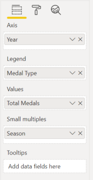
Simply drag a dimension field into the Small multiples and viola! Power BI has created multiple small visualizations for you, that all behave with the same formatting.
Now to iron out the details. Swap to the format view for this visual and you'll notice two new options:
Small multiple titles
By default this is on, and I think that's pretty helpful. You don't get a legend for small multiples, so it's important to know what we're actually looking at.
Grid layout
This lets you define the default for how many multiples you'll see without scrolling. Users can always scroll to see more.


