I believe Microsoft still have some work to do in terms of improving the ease of designing mobile friendly reports in Power BI desktop, but overall it's remarkable how much information you can get at your fingertips from your mobile device - on the go!
Here's a quick demo of what the Power BI mobile app looks like on Android and how to navigate your way around:
Power BI Mobile Layout
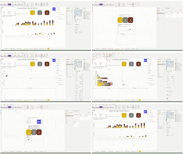
You can set the mobile layout in Power BI for both reports and dashboards. The interface is an easy drag and drop. All visuals must snap to the grid, so you don't need to worry about getting pixel perfect sizing - Power BI takes care of that for you.
In the screenshot above, you will notice that I have dragged some visuals onto the mobile canvas, but there are still 4 visuals left in the 'Page visuals' pane that I have decided not to put on the mobile view of the report. I consider the mobile view to be more of a quick look at the most important info, so have left off most slicers. I also prefer vertical layout for mobile view - try not to make your end user scroll in two directions. Since the mobile view canvas will scroll up and down, use visuals that also scroll up and down.
Power BI make it really easy to leave visuals off the mobile view, but unfortunately it's not so easy to leave them off the desktop view. If you want the visual displayed in the mobile view, it must be displayed in the desktop view. If you hide a visual in desktop view, it will also be hidden in mobile view.
Vote for this in Power BI Ideas.
In the meantime, in order to work around this limitation, I find myself creating mobile only visuals and then layering them behind other visuals in the desktop. That way they are still 'visible' in the desktop view, but users don't see them. In the mobile layout, I choose the vertical orientation (bar chart) and leave the landscape orientation (column chart) for the desktop.
Mobile Layout Design Considerations
When you're designing mobile friendly reports, keep these things in mind:
Test Font Size:
Power BI will auto-scale the text in your visuals for the mobile device, so check what it looks like on your own device before publishing to a wider audience. Ensure you've tested the mobile view with the longest text values in your report so you know how they will appear to your users.
Replace Right Click with Buttons:
Make sure your users can access all the pages and information they need easily. If there is a lot of right clicking or Ctrl key needed in the desktop version, ensure you give mobile users buttons or instructions on how to get the information they need.
Orient Visuals Vertically:
Try to keep the mobile view to a single directional (up/down) scroll. This might mean replacing your column charts with bar charts and leaving off some of the more detailed tables (or reshaping them).
Make Space for Scrolling:
If a visual will have a scroll bar, consider leaving an extra gap on the report so users can scroll the report page or the visual (the native gap width in Power BI mobile isn't quite wide enough for the average finger).
Fit Visuals to Screen:
Power BI mobile layouts are designed to scroll indefinitely, so make sure your user knows there's more to see. Ensure you can always see the top of the next visual when the current visual is aligned with the top of the screen. Users shouldn't have to scroll to see the entire visual. NOTE: Not all mobile devices are the same size, so test on the devices your end users will be using. The mobile layout view in desktop isn't necessarily what your users will see.


