Search

Search this blog:

Search This Blog

Copilot for Microsoft 365 - my eager interns


I've been playing around with Copilot for Microsoft 365 for a few months now. I like to think of Copilot as my new interns:

  • Copilot is still learning what I do and what is helpful for me - the more descriptive I can be in my questions, instructions, 'prompts', the more helpful I find the information Copilot provides
  • Copilot is eager to help, sometimes so much so that it makes things up - don't assume that just because it provided a reference for its information that what it has provided is accurate. I truly wish some of the Excel functions and formulas it has provided me exist, but alas they do not. Copilot often jumbles different languages, gets confused, or even just pulls things out of thin air. It is a generative AI tool, so it's really great at generating new content, and sometimes that includes things that don't exist and aren't helpful.
  • Copilot is conversational - talking to it like a human intern (rather than trying to craft a search result like I normally do in Google) seems to get better results. I have learned that adding in those extra words and providing some additional context are really helpful. 
  • Copilot needs breaks too - sometimes starting a new chat will give better results. Copilot remembers what you've discussed earlier in the conversation, so if you are stuck in a loop where it's making up unhelpful information, try opening a new chat and starting fresh.
  • Copilot for Word has different capability to Copilot for Excel, which is different again from Copilot for PowerPoint, etc - treat each Copilot as a different 'intern'. Copilot for PowerPoint isn't that great at generating new content, but Copilot for Word does a fantastic job at this. I find that I often need to swap between the different Copilots to complete a single task.
  • Copilot is constantly evolving - I am starting to actually like Copilot for Excel, whereas my first impression was that it was slow and not very useful. I have learned that Copilot evolves quickly, and it's not always obvious. Asking the exact same question two days in a row can produce different results. So, while first impressions are lasting, it's important to keep an open mind about what Copilot may be capable of tomorrow.

Below are some of the things I've found most helpful about Copilot so far.

Copilot for Teams

This is probably where people are most buzzing about Copilot. It will take very detailed notes for you. If you'd like Copilot to record something specific as an action, state that during the meeting. If there are multiple people in the same room, let Copilot know who the action is for or who's speaking.

Copilot for Excel

Clean Data with Copilot

I use lots of tables in my Excel files, and I'm fairly detail oriented, so for the most part my tables are consistent and there are some clear patterns, but I am human so I'm not perfect.

Copilot pops up when I open an existing spreadsheet and offers suggestions for how I might like to tidy up my raw data - it's really clear which cells of the workbook it's going to edit before I click apply, and it lets me step through each suggestion so I still feel like I'm in control.


screenshot Clean Data for Excel with copilot

If the 'Clean Data' prompt doesn't appear but you think there might be something in your table to clean up, you can find the 'Clean Data' button in the 'Data' tab in the ribbon: 

Screenshot of Clean Data button

Explain Formula

Copilot is fantastic and deciphering formulas and explaining them in plain English. It does this for existing formulas, and formulas that you ask it to help write.

Unfortunately for existing formulas it can't yet read directly from the selected cell:


Screenshot Copilot

But once you provide Copilot with the formula, it happily explains it for you. Below is an example of Copilot explaining the formula: 

=IFERROR([@[Total Price (NZD)]]/([@[End Date]]-[@[Start Date]]), "")

The explanation it provided me with is: 

This formula calculates the average daily price by dividing the total price by the number of days between the start and end dates. If there is an error in the calculation (e.g., if the start or end date is missing), it returns an empty string.

      • [@[Total Price (NZD)]]: References the total price in the current row.
      • [@[End Date]]-[@[Start Date]]: Calculates the number of days between the end date and the start date in the current row.
      • IFERROR(..., ""): If the division results in an error, it returns an empty string instead of an error message.

Screenshot Copilot

I think it consistently does a good job of explaining formulas. If I ask it to simplify the formula, I get a nice compliment that my formula is already quite simple, but it offers an alternative, inside a code box with an icon that makes it easy for me to copy this formula and paste it into Excel:

screenshot

I still would like Excel Copilot to interact more with my data, I think it's a bit silly that I have to copy the formula into the table myself for example, but at least it helps guide me on what to do.

Generate Formula Columns

Excel Copilot may not edit existing columns, but it's quite good at generating new columns. When you ask it to create a new column, you have the option to click the 'Insert column' button and Copilot will add the new column to your table automagically. Clicking on the 'Show explanation' button will provide a similar explanation to the one we saw in the example above. I have found the Generate Formula Columns experience with Copilot to be very consistent, and helpful when I'm not sure how to approach the problem, or if I'm trying to explain something in plain English to a new user. 

If I already know the formula I want, I find it's still quicker to just do it myself as Copilot spends a bit of time thinking. 

Show Data Insights

The Show Data Insights can be hit or miss, but I do like how it creates a dashboard style page of my insights, and gives me some design inspiration for how to format the charts. 

Copilot for PowerPoint

I am still learning how to get Copilot for PowerPoint to interact directly with my presentation. I want it to be more helpful with formatting images and layouts, etc. It does a great job of telling me what I need to do, but won't do it for me.

Create a presentation from file

Where I've found it really helpful is in turning a word document into a presentation. Copilot takes the content and breaks it down into bite-size (or slide-size) chunks. Any text from the Word doc that it doesn't put in the slide itself, it adds to the notes section. From here, it's easy to change the images, delete or add a few things.

Make information easier to understand

I am really liking the create presentation from file so much, that I'm giving it two headings. While Word's Copilot can do a great job of summarizing documents for me, the PowerPoint Copilot makes documents visual - which for me is much easier to understand. I've started turning Word docs into PowerPoint presentations simply for my own benefit and understanding, even if I don't need to present the content to anyone else. I have a feeling PowerPoints are going to make a big comeback.

Creating placeholder slides

One thing that took a bit of trial and error, was getting PowerPoint to split my Agenda slide into one slide for each item. Slides that I could use as section headers or starters for the content. I find this works best when the Agenda slide is simple, and the details are in the notes or elsewhere in the presentation.

Conclusion

Copilot is definitely helpful, but needs to be used by a knowledgeable and responsible human in order to get helpful results. 


Power BI Themes


I am a big fan of color; my wardrobe is full of blues and pinks and yellows. Side note: have you ever heard of 'dopamine dressing'? Apparently it's a fashion trend that's been around since at least 2022 but I'm just learning about it now - I'm actually impressed I'm only a season or two behind! 

But I digress, the reason for my post today is to compile some of my favorite resources for working with color in Power BI, and more generally, Power BI themes.


Sentiment Colors in Bar chart


Colors have meaning

Being a good data storyteller means using all the tools at your disposal. This includes color. It is important to note that I'm not advocating the use of color only in your reports - you need to ensure that there is another method to discern what's going on with the data for those in your audience who might be colorblind. But that doesn't mean we can't play around with color and use it to add meaning to our reports. 

Most people I know would agree that GREEN means 'Good' and RED means 'Bad'. But colors can be very personal. For example, my favorite color is BLUE and it was also the color I chose for my math notebooks throughout school. (Yes, math was my favorite subject - I guess it's no surprise I ended up in a career that works so much with data.) My school subjects were always color coded as follows:

  • BLUE - Math
  • GREEN - Science
  • RED - English
  • YELLOW - History

So what does this mean for your Power BI reports? Use color to your advantage. You may not be reporting on school subjects, but you can assign colors to whatever categories or metrics you're reporting on according to your own meaning and interpretation. BLUE is also the color of the sky, water, a common color in many country's flags and so much more. Using the AdventureWorks Sales data as an example, you could assign colors to the product categories as follows:

  • GREEN - Bikes
  • PURPLE - Accessories
  • YELLOW - Components
  • RED - Clothing

If you're reporting on 2 or 3 different metrics, assign a different color to each one and use that consistently throughout your report:

  • BROWN - Actual
  • RED - Budget
  • Light BROWN - Prior Year Actual

Whatever colors you use, make sure you're using them deliberately and with meaning. Adding lots of extra color to your report may give the impression that it's more exciting, but it may have the unwanted result of making your report more difficult to read and understand.

Create your own Power BI theme

I've written a few posts on Power BI themes, and the functionality of themes in Power BI desktop has improved dramatically over the years. 

You have a few options when creating your own theme in Power BI:

  1. Use the built-in theme designer within Power BI desktop
  2. Import a theme someone else has created in JSON
  3. Create and import your own theme using JSON

It used to be extremely difficult to find documentation for creating your own JSON theme in Power BI, but that has gotten easier. The Microsoft Learn article Use report themes in Power BI Desktop - Power BI | Microsoft Learn is a great place to start. 

However, with the speed of development of Power BI desktop, there's just not enough documentation on the new visuals. 

This is a great start: powerbi-desktop-samples/Report Theme JSON Schema at main · microsoft/powerbi-desktop-samples · GitHub

But not everything is documented there. One trick I've learned is that you can use the Power BI project files to explore the JSON code in Power BI desktop and copy that into your own theme. 

How to find the JSON code for formatting visuals in Power BI themes

For example, I'm going to use this method to find the formatting options for Power BI themes.

Step 1: Add the visual you want to format in your theme to a new blank report. 

Step 2: Change the formatting options that you want available for editing within your theme.

Step 3: Save AS - save your report as a .pbip file. When you choose this option, Power BI will save a couple folders with various files into the folder you choose.

Step 4: Open the visual.json file - you'll find this in the MyReportsName.Report > definition > pages folder. This can be difficult to navigate which is why I start Step 1 with a blank new report.

Step 5: Explore the code to discover the names of the visual and the properties.

Step 6: Use those names in your JSON theme, following the instructions from Use report themes in Power BI Desktop - Power BI | Microsoft Learn 

Power BI Color Picker

While my go-to resource for anything color related is usually Coolors.co - I've been inspired to make my own little color picker that calculates the contrast and displays a demo live in Power BI. The thing I like about this tool that I've created is it lets you adjust the colors using RGB method, so if you want to just add a bit of red hue you can, and the contrast value is calculated automatically without needing to switch tools. 

It makes me feel almost like an artist mixing colors in a paint palette. Except, since we're playing with digital colors, mixing the maximum value of all three colors makes white. This follows the light color spectrum, where white light indicates the presence of all colors, and black is the absence of all colors. So if you select 0 for each RGB value, you'll get black.

Have a play with the color picker below and see what you think!


Reference Power BI theme colors in DAX

Now for the REALLY cool bit: this is the straw that finally inspired me to publish today's blog - I was doing research for a talk I was giving and came across this Workout Wednesday challenge on using Power BI theme colors within your DAX:

2024 Week 26 | Power BI: Reference Theme Sentiment Colors in DAX – Workout Wednesday (workout-wednesday.com)

(If you haven't heard of Workout Wednesday - I highly recommend you check them out. They have fantastic demos and challenges for all skill levels and it's a great way to get inspiration.)

This is something I've wanted to do for years, but haven't known how. Just like with everything else in Power BI themes, it all comes down to know which names to use. 

So far, I have discovered the following color names from the theme can be used in your DAX code:

  • good
  • neutral
  • bad
  • maxColor (note this is called 'maximum' in the theme)
  • midColor (note this is called 'center' in the theme)
  • minColor (note this is called 'minimum' in the theme)
  • tableAccent
  • foreground (note this is also called 'firstLevelElements' in the theme)
  • foregroundNeutralSecondary (note this is also called 'secondLevelElements' in the theme)
  • backgroundLight (note this is also called 'thirdLevelElements' in the theme)
  • foregroundNeutralTertiary (note this is also called 'fourthLevelElements' in the theme)
  • background 
  • backgroundNeutral (note this is also called 'secondaryBackground' in the theme)

Sample Theme Colors with DAX conditional formatting

Thanks also to thinkBI for inspiring me to see what other theme colors are available for use beyond what was in the WOW solution. 


References I used to study up for this blog post:

2024 Week 26 | Power BI: Reference Theme Sentiment Colors in DAX – Workout Wednesday (workout-wednesday.com) - the original inspiration for this post and source of some working theme color names in DAX.

Color Contrast Checker - Coolors - one of my go to resources whenever I need to do something with colors.

Reference Power BI theme colors in DAX - thinkBI - source of some additional working theme color names in DAX that inspired me to test out all the theme colors I know the names for.

Choosing font color based on background color in Power BI – XXL BI - Special thanks to Daniil Maslyuk for his measure on font color and David Eldersveld's comment that inspired me to convert it to use Luminance instead of Intensity.

Color Relative Luminance Calculator (WCAG) (contrastchecker.online) - to learn how to calculate Luminance.

RGB - Hexadecimal Color Conversion (tripod.com) - to learn how to convert HEX to RGB and better understand what had been done by Daniil in his Font Color measure.

List of Unicode characters - Wikipedia - again, to better understand what had been done by Daniil.

Chris Webb's BI Blog: Colour Names Supported In Power BI Conditional Formatting (crossjoin.co.uk) - Chris Webb has been one of my go to blogs for many years. This particular post is quite old and many of these colors no longer seem to work in Power BI DAX, but it led me to the correct link of CSS colors that did all seem to work in DAX.

CSS Colors (w3schools.com) - the correct link of CSS colors that work in Power BI DAX.

JSON Editor Online: edit JSON, format JSON, query JSON 

powerbi-desktop-samples/Report Theme JSON Schema at main · microsoft/powerbi-desktop-samples · GitHub - JSON code for many of the classic Power BI visuals.

Power BI Icon Names for Conditional Formatting Using DAX - RADACAD - Not used in this blog but a really great resource for conditional formatting in DAX. 


Microsoft Fabric Learn Together: Episode 1 - Get started with end-to-end analytics and lakehouses in Microsoft Fabric


The Microsoft Fabric Learn Together series has kicked off this week. This means you can prep for the new DP-600: Implementing Analytics Solutions Using Microsoft Fabric exam with the guidance and support of experts, live and in real time, for free!

You can complete the Microsoft Learn modules in your own time by following the 'self-paced' option (scroll down after clicking the exam link above), or you can register for the Microsoft Fabric Learn Together series.

Personally, I find it difficult to focus and learn on my own, so am really enjoying the Learn Together series. I also find it helps when I write stuff down, so I'll be using this blog to capture my own thoughts and key takeaways from each session. 

If you missed the first few, don't worry, you can still catch up - just click the 'Register' button and it will take you straight to the recording. 

This episode covers two modules.

Introduction to end-to-end analytics using Microsoft Fabric

It's always good to start at the beginning - this intro reminded me just how vast Fabric is. It truly does take a team, and the 'data teams' highlighted in this module be familiar, or you may have a slightly different setup in your org. I recommend firing up your own personal tenant trial to have a play with all the features as you're going through these modules - it ensures you can explore all the options and toggle things on and off without needing to wait for that other team member to enable things. 

Once you've got stuff figured out, you'll see how all the pieces fit together and how easy it is to work as a team within Microsoft Fabric - and so customisable too!

Get started with lakehouses in Microsoft Fabric

Data lake + data warehouse = lakehouse

Get the best of both worlds - just like working remote from a lakehouse, you get the structure

My cliff notes on Episode 1: Get Started with end-to-end analytics and lakehouses in Microsoft Fabric.

My key takeaways from the Learn Together session by Heidi and Treb:

  • Don't be intimidated by the jargon (aka confusing technical terms).
  • 'End-to-End Analytics' means your whole analytics team can work from one place; MS Fabric is your one stop shop for data engineers, data scientists, data analysts, and decision makers.
  • 'Lakehouse' is not just a holiday destination - and it's waaaay easier to build a Fabric Lakehouse to import and transform data, than it is to build a holiday home (and maybe even cheaper too?).
  • While some of us wear many hats and work across lots of roles, Fabric is huge and you'll likely stumble upon stuff that looks foreign and new to you - you're not alone.
  • There's multiple ways to achieve the same outcome, find a way that works for you!
  • The good stuff is under the ... ellipsis menu
  • Stick around for the exercise; you'll surprise yourself with how familiar some of the concepts are when you see them in action.

DAX Time Intelligence - Easy pattern to get DAX Time Intelligence functions to return the correct results


 DAX is a simple but complex language. It can be very powerful if you understand how to use it properly. In this post, we're going to look at a specific group of functions in DAX: Time Intelligence.

Time Intelligence DAX functions

Time Intelligence functions in DAX change the filter context on the Date table of your model. 

Step 0: Prepare 

Before using Time Intelligence functions, you should:

Time Intelligence functions in DAX are not vital functions. We can calculate the same results without their use, just need to think a bit differently about the problem. Greg Deckler has a great post on this here: 

https://community.fabric.microsoft.com/t5/Quick-Measures-Gallery/Time-Intelligence-quot-The-Hard-Way-quot-TITHW/td-p/434008

My post here aims to debunk the mysteries behind using Time Intelligence functions and provide you with an easy pattern that works every time.

Easy Time Intelligence DAX Pattern

Now that we know what time intelligence is, how do we use it?

Step 1: Create a base measure

You may have already completed this step. The base measure is what you are reporting on, it should come from a table related to your Date table. Consider the 'Example 2' in my post on Relationships in Power BI: https://excelwithallison.blogspot.com/2020/08/its-complicated-relationships-in-power.html 

We have a 'Date' dimension table and an 'Incident Reports' fact table. These are the only two tables we need to consider for this solution. 

Our base measure will be Incident Count:

Incident Count = DISTINCTCOUNT( 'Incident Reports'[IncidentID] )

Your base measure could be anything, and use any aggregate function or filters, or combination of DAX functions, as long as it returns the results you expect when put in a table/matrix with a column from your Date table. 

Step 2: Select your time intelligence function

This may be the most difficult step, and I may write a separate blog on this if I get time. For this post, I'm going to use my favorite time intelligence function: DATEADD. I like this function because it's versatile and works for a lot of the scenarios my clients ask for, without requiring me to learn /memorize new functions.

For this example, I want to compare my [Incident Count] base measure above to the same period last year. DATEADD will work nicely for this.

Step 3: Apply the Time Intelligence Pattern

Now we're ready to apply the easy Time Intelligence Pattern. 

Time Intelligence Pattern Measure = CALCULATE ( [Base Measure], FUNCTION ( 'dimDate'[Date], functionparameters ) )

What does this look like in practice? Let's apply it to our example using DATEADD and [Incident Count]: 

Incident Count Prior Year = CALCULATE ( [Incident Count], DATEADD( 'Date'[Date], -1, YEAR) )

Step 4: Use in the context of your Date table

This final step is critical, and one that can cause many well-written time intelligence functions to fail if forgotten. You MUST use this measure in the context of your Date dimension table. 

In my example, I've created an [Incident Count Prior Year] measure. If I don't put a filter for year, or use this in a table / visual split by Year, I'll just get the result of all Incidents except the maximum year in my date table (this is by design and how time intelligence functions work, something that I may expand on in another blog post). 

For many people, their date tables include future years (for budgeting and forecasting purposes), so when they create a time intelligence function correctly, it simply returns the same value as the base measure. That is, until they apply a date filter.

Use the Date dimension in any visuals or filters for this measure. 

Conclusion

That's it! You've now got the easy time intelligence pattern for DAX. It can be applied to all sorts of different scenarios. 

Additional Examples

Total Sales = SUM( Sales[Sales Amount] )

Total Sales Prior Year = CALCULATE( [Total Sales], DATEADD( dimDate[Date] , -1 , YEAR) )

Total Sales YTD (calendar) = CALCULATE( [Total Sales], DATESYTD( dimDate[Date] )

Total Sales YTD (fiscal) = CALCULATE( [Total Sales], DATESYTD( dimDate[Date], '6-30' )

Remember

Key tips:

  • Create a base measure first - it makes things easier to follow
  • Use the CALCULATE function with the Time Intelligence function as a filter
  • Use the Date dimension table in:
    • Your time intelligence function wherever it asks for a date
    • Your visuals and filters whenever using the new measure
Enjoy!

Get Link to Channel: Private Teams Channel


 I've just struggled with trying to 'Get link to channel' for a Private Channel in Teams. I typically recommend against using private channels in Teams, and perhaps this is one reason. 

Not sure why, but the 'Get link to channel' functionality doesn't exist for Private Channels like it does for Public Channels. 

Even more frustrating, when you do finally find the link to the Private Channel, it doesn't work for a button embedded in a SharePoint page within Teams tab.

Luckily, with a few simple deletions, you can get this to work.

Step 1: Click the three dots at the top right of Channel 'Posts'

Public Channel Menu:

screenshot Public Channel Menu


Private Channel Menu:

screenshot Private Channel Menu

For the Public Channel, your job is done - click the 'Get link to channel' option and copy the link. It will look something like this:

Get Link to Channel Link

https://teams.microsoft.com/l/channel/19%3randomstringguidbtg1%40thread.tacv2/ChannelName?groupId=GUIDwillbehere&tenantId=GUIDwillbehere

For the Private Channel, click 'Open in SharePoint' first, then click the Teams icon (you won't be able to right click > copy link, so will have to actually click the link to open. This will open a brower tab initially, with an option to open Teams - cancel the dialog box. 


Copy the URL from the web browser. It will look something like this:

Open in Teams Link

https://teams.microsoft.com/dl/launcher/launcher.html?url=%2F_%23%2Fl%2Fchannel%2F19%3Aguid%40thread.tacv2%2FChannelName%3FgroupId%3guid3%26tenantId%3guid&type=channel&deeplinkId=guidDl=true&msLaunch=true&enableMobilePage=true&suppressPrompt=true

https://teams.microsoft.com/dl/launcher/launcher.html?url=/_%23/l/channel/19:2fe074ff85f149d6b02db2d8e2c2d708%40thread.tacv2/Emerging%2520Leaders?groupId%3De1ebf9f0-c485-49b1-bc91-98f1cc7a1dd3%26tenantId%3D8a587731-94b7-42f0-80c3-955f55452f65&type=channel&deeplinkId=7a17c76e-7862-47c4-a91f-7c0b455aac5e&directDl=true&msLaunch=true&enableMobilePage=true

Step 2: Edit link

We want to make this link follow the same format as our first 'Get link to Channel' link. Let's compare them side by side: 

Get Link to Channel Link

https://teams.microsoft.com/l/channel/19%3randomstringguidbtg1%40thread.tacv2/ChannelName?groupId=GUIDwillbehere&tenantId=GUIDwillbehere

Open in Teams Link


https://teams.microsoft.com/dl/launcher/launcher.html?url=/_%23%/l/channel%2F19%3A2fe074ff85f149d6b02db2d8e2c2d708%40thread.tacv2%2FChannelName%3FgroupId%3DguidtenantId%3D8a587731-94b7-42f0-80c3-955f55452f65&type=channel&deeplinkId=7c37e892-9b61-48f2-8fba-f009ebf8b1e2&directDl=true&msLaunch=true&enableMobilePage=true&suppressPrompt=true


Differences

You'll notice the 'Get Link to Channel' link is just a simpler version of the 'Open in Teams' link. To get the 'Open in Teams' link to work from SharePoint page embedded within Teams tab, simply delete the parts in bold below:

https://teams.microsoft.com/dl/launcher/launcher.html?url=/_%23/l/channel%2F19%3Aguid%40thread.tacvChannelNamegroupId%3guid3%26tenantId%3guid&type=channel&deeplinkId=guidDl=true&msLaunch=true&enableMobilePage=true&suppressPrompt=true

to end with a link that resembles the 'Get Link to Channel' link:

https://teams.microsoft.com/l/channel/19:31616bb9ae134f9ab605c0ac9635c2a1%40thread.tacv2/ChannelNamegroupId%3De1ebf9f0-c485-49b1-bc91-98f1cc7a1dd3%26tenantId%3D8a587731-94b7-42f0-80c3-955f55452f65&type=channel&deeplinkId=d2990055-682c-4183-857f-50a1a8b51087

Meaningful Power BI titles using DAX


Today's post is a short one with a video to demonstrate what I have learned. I'm a big believer in providing your end user with as much information as possible. Someone new should be able to pick up the report and understand it without needing to get a degree in Power BI or go digging through your company's intranet to learn what's what. 

One of the neat features that Power BI provides, is the ability for any visual to act as a filter or 'cross-filter' to other visuals. This provides us with comparative values and highlighted bars, but Power BI tooltip just says 'highlighted', which isn't very helpful.

screenshot Power BI cross filter

So, I wanted to create a dynamic title that showed the user what exactly was 'highlighted' as well as what that 'sum of value' that the 'highlighted' was compared to.

You can see how I did it in the video, but the DAX is below:

Title =
VAR _Cat =
    IF (
        ISFILTERED ( Items[Category] ),
        SELECTEDVALUE ( Items[Category] ),
        "All Categories"
    )
VAR _Item =
    CONCATENATEX ( Items, Items[Item], " & " )
RETURN
    IF ( ISFILTERED ( Items[Item] )_Item & " compared to " & _Cat_Cat )

The basic trick is to use ISFILTERED to figure out if the user has actually filtered by that column, or only by another column. The next trick is to design the report so that the user doesn't accidentally filter by the wrong column in the wrong place.


Power BI Fabric Announcement - Feeling Overwhelmed?


There have been a lot of major announcements this week at Microsoft Build conference for Power BI. Some exciting things are coming soon! Check out the new Fabric blog to keep up to date with the new releases, announcements and private and public previews.

There's a lot of new things to learn, some jargon, and some incentives to learn some of the stuff that's been around for a while but you may not have prioritized. I spend most of my day every day in Power BI and I'm a bit overwhelmed by all the news - it's exciting, but I will need to make a conscious effort to study what's useful and what's not, or I'll get left in the dust!

I'll keep blogging my learnings as I have been doing over the years and will follow the same methodology; anything I think is important, useful, or good to reference for later.

Useful Links

So, let's start with some useful links, things I've found really helpful for deciphering the exciting news. 

Data Goblins Visual Overview of Microsoft Fabric Power BI Announcements: I absolutely love Data Goblins, Kurt Buhler posts some really easy to understand content that is aimed the target audience of the business analyst / end user. So it's a not to technical summary of some technical stuff. I found this visual summary really helpful for creating my Study List below.

What is Microsoft Fabric, and Why it is a Big Deal! Reza Rad has a nice way of providing that big picture overview and this post does really answer the question "Why should I care about Microsoft Fabric?"

Study Later

Now a list of things I want to learn.

TMDL

TMDL - sounds like another language. Okay, it is another language. So that sounds exhausting, difficult, unnecessary. We already need to know M, DAX, sometimes a bit of JSON, and if you want some more functionality or better performance you may use SQL, Python, R or another language to build a Power BI report. If I hadn't seen a demo of TMDL I would have ignored this blog post, but the demo made me really curious. I think TMDL is going to help save me a lot of time with themes, formatting, and other bulk changes. It looks like it won't be a big leap from JSON to TMDL, so I'm hoping I'll pick it up quickly enough for it to save me some time.

Announcing public preview of the Tabular Model Definition Language (TMDL) | Microsoft Power BI Blog | Microsoft Power BI

Data Science Soft Skills

This course claims to be for 'beginners' and it's also called 'data science'. I like to think of myself as a data 'analyst' not 'scientist', as I don't do a lot of the stats, python, etc. So maybe I am a beginner when it comes to data science? 

Even if you know a thing or two about data science, check out the visual sketch notes that Nitya Narasimhan made for the course - it helped me find some of the lessons that I wanted to explore and learn more about.

The course itself has a combination of videos, quizzes, text and hands on examples. The quizzes don't seem to give you the right answers and some of the links to the challenges are broken, but there's still lots of good content in there. It's newly released so I'm hoping they'll iron out the bugs soon!

Data Science for Beginners (microsoft.github.io)


Try Now

Finally the reason I started writing this blog; these are the things I'm already playing with and how they're saving me time.

Users can edit data models in the Power BI Service

aka Data modeling in the web

This preview feature is awesome. You turn it on at the WORKSPACE admin level. This trips me up every time I read 'admin' I think Power BI Admin portal and that I'll need to go to IT to enable it - but that's not the case.

With the announcement of Fabric, the look and feel of 'Workspace settings' has changed a bit, so if you're struggling to figure out how to enable 'Users can edit data models in the Power BI service' or Power BI Data modelling for the web, look under 'Power BI' > General settings. If you don't see it there, try refreshing your browser and check again - for some reason it likes to hide.


I have been using it solely for viewing the DAX code of measures without needing to open or download the pbix file. That alone is worth enabling it, but there's so many other wins.

And don't worry - if you can edit the data model in the web, you can also download the .pbix file, so you won't get stuck making lots of in depth model changes only to find you can't get that file back into Power BI desktop.

Edit your data model in the Power BI Service (Preview) | Microsoft Power BI Blog | Microsoft Power BI


Power BI DimTime table


 Today's post is going to be short and sweet. I'm simply publishing my version of a DimTime table for Power BI.

Thanks to Radacad for posting a great article on why we need a DimTime table, along with their script for creating one in Power BI. 

If you don't already have a DimDate table, you can find my version in my DimDate: What, Why and How blog article. I update the script occasionally with new requests. 

Quickly Create a DimDate Table in Power Query (M code)

Follow the instructions below to create a quick, simple yet effective DimDate table in Power Query:

From the Power Query Editor, in the Home tab, click New Source > Blank Query

Rename the Query1 to DimTime in the Query Settings pane on the right (if you don't see this pane tick the box in the View tab in the ribbon to turn it on).

Click Advanced Editor in the Home tab in the ribbon. 

Replace all the code in the Advanced Editor window with the below code: 


let

    Source = List.Times(#time(0,0,0),24*60*60,#duration(0,0,0,1)),

    #"Converted to Table" = Table.FromList(Source, Splitter.SplitByNothing(), null, null, ExtraValues.Error),

    #"Renamed Columns" = Table.RenameColumns(#"Converted to Table",{{"Column1", "Time"}}),

    #"Changed Type" = Table.TransformColumnTypes(#"Renamed Columns",{{"Time", type time}}),

    #"Added TimeKey" = Table.AddColumn(#"Changed Type", "TimeKey", each Time.ToText( [Time], "HHmmss"), type text),

    #"Inserted Hour" = Table.AddColumn(#"Added TimeKey", "Hour", each Time.Hour([Time]), Int64.Type),

    #"Inserted Minute" = Table.AddColumn(#"Inserted Hour", "Minute", each Time.Minute([Time]), Int64.Type),

    #"Inserted Second" = Table.AddColumn(#"Inserted Minute", "Second", each Time.Second([Time]), type number),

    #"Added AM PM" = Table.AddColumn(#"Inserted Second", "AM/PM", each if [Hour] < 12 then "a.m." else "p.m."),

    #"Added Index" = Table.AddIndexColumn(#"Added AM PM", "Index", 0, 1),

    #"Inserted Hour (12hr)" = Table.AddColumn(#"Added Index", "Hour (12hr)", each Replacer.ReplaceValue( Number.Mod([Hour], 12), 0, 12), type number),

    #"Inserted 8 Hour Sort" = Table.AddColumn(#"Inserted Hour (12hr)", "8 Hour Sort", each Number.IntegerDivide([Hour], 8), Int64.Type),

    #"Added 8 Hour Groups" = Table.AddColumn(#"Inserted 8 Hour Sort", "8 Hour Groups", each if [8 Hour Sort] = 0 then "Midnight to 8am" else if [8 Hour Sort] = 1 then "8am to 4pm" else if [8 Hour Sort] = 2 then "4pm to Midnight" else "Not Specified"),

    #"Inserted 6 Hour Sort" = Table.AddColumn(#"Added 8 Hour Groups", "6 Hour Sort", each Number.IntegerDivide([Hour], 6), Int64.Type),

    #"Added 6 Hour Groups" = Table.AddColumn(#"Inserted 6 Hour Sort", "6 Hour Groups", each if [6 Hour Sort] = 0 then "Midnight to 6am" else if [6 Hour Sort] = 1 then "6am to noon" else if [6 Hour Sort] = 2 then "noon to 6pm" else if [6 Hour Sort] = 3 then "6pm to midnight" else "Not Specified"),

    #"Inserted 4 Hour Sort" = Table.AddColumn(#"Added 6 Hour Groups", "4 Hour Sort", each Number.IntegerDivide([Hour], 4), Int64.Type),

    #"Added 4 Hour Groups" = Table.AddColumn(#"Inserted 4 Hour Sort", "4 Hour Groups", each if [4 Hour Sort] = 0 then "Midnight to 4am" else if [4 Hour Sort] = 1 then "4am to 8am" else if [4 Hour Sort] = 2 then "8am to noon" else if [4 Hour Sort] = 3 then "noon to 4pm" else if [4 Hour Sort] = 4 then "4pm to 8pm" else if [4 Hour Sort] = 5 then "8pm to midnight" else "Not Specified"),

    #"Inserted 3 Hour Sort" = Table.AddColumn(#"Added 4 Hour Groups", "3 Hour Sort", each Number.IntegerDivide([Hour], 3), Int64.Type),

    #"Added 3 Hour Groups" = Table.AddColumn(#"Inserted 3 Hour Sort", "3 Hour Groups", each if [3 Hour Sort] = 0 then "Midnight to 3am" else if [3 Hour Sort] = 1 then "3am to 6am" else if [3 Hour Sort] = 2 then "6am to 9am" else if [3 Hour Sort] = 3 then "9am to noon" else if [3 Hour Sort] = 4 then "noon to 3pm" else if [3 Hour Sort] = 5 then "3pm to 6pm" else if [3 Hour Sort] = 6 then "6pm to 9pm" else if [3 Hour Sort] = 7 then "9pm to Midnight" else "Not Specified"),

    #"Inserted 30 Minute Intervals" = Table.AddColumn(#"Added 3 Hour Groups", "30 Minute Intervals", each Number.IntegerDivide([Minute], 30)*30, Int64.Type),

    #"Inserted 15 Minute Intervals" = Table.AddColumn(#"Inserted 30 Minute Intervals", "15 Minute Intervals", each Number.IntegerDivide([Minute], 15)*15, Int64.Type),

    #"Inserted 10 Minute Intervals" = Table.AddColumn(#"Inserted 15 Minute Intervals", "10 Minute Intervals", each Number.IntegerDivide([Minute], 10)*10, Int64.Type),

    #"Changed Type1" = Table.TransformColumnTypes(#"Inserted 10 Minute Intervals",{{"AM/PM", type text}, {"4 Hour Groups", type text}, {"3 Hour Groups", type text}, {"6 Hour Groups", type text}, {"8 Hour Groups", type text}})

in

    #"Changed Type1"


Click Done to close the Advanced Editor.

Use the options in the Add Column tab in the ribbon to add any additional Time information you might need. 

Close and Apply. 

How Power BI picks the legend colours


I've just had a wonderful discovery about why Power BI sometimes seems to choose random colors in the legend. 

Typically, the first item in a series will match the first color of your Power BI theme, the second item in the series will match the second color of your Power BI theme, and so on. 

However, this isn't always the case. I have noticed that sometimes when I have text category values for my legend that Power BI can assign random colors, seemingly not even part of my theme. Until recently, I just accepted this as a quirk of Power BI and carried on with my report development. 

While developing a new Power BI theme JSON file and reading up on the nitty gritty details, I learned a few things that have helped me understand what's actually going on. 

Dynamic Series

The first thing I learned about was "dynamic series". You can find the Microsoft Docs definition of dynamic series in small print under the very long theme article in the How Report Theme Colors Stick with Your Reports section. 

What is a dynamic series?

To understand dynamic series, we need to understand what is meant by 'series'. Series is the fancy data viz term for items in the legend. There are two ways in Power BI visualizations to get more than one item in the legend:

  1. Add a column to the 'legend' property of a visual.
  2. Add more than one column to the values property of a visual (this could be called 'Values', 'X-axis', 'Y-axis', etc depending on which visual you're using).

When you use option 2, the number of items in the series will always equal the number of columns you added to the values property. This is a 'static series' because the number of items is static (meaning it doesn't change). 

screenshot Power BI dynamic series example

A dynamic series occurs when you use option 1. Depending on the filters and slicers in the report, the number of items in the list of values of the column used in the 'legend' property could change. Let's use months of the year as an example. 

In the image above, we have added 'Month name' to the 'legend' property of the visual. So you can see we're using option 1 for creating more than one series in Power BI. This enables 'dynamic series'. We know there are always 12 months in the year, so it may seem like this is a static series. However, depending on the report filters and slicers, you may only see some of those months at a time. 

As you can see in the image above, March is always red, even when February is missing. This helps ensure that color has meaning throughout your report and that even if you're only showing quarter 4 (October, November, December), they'll maintain the mauve, green and charcoal colors. 

Themes have unlimited colors

 The second thing I learned about the seemingly 'random' colors that Power BI applies to text categories / legend items is that a theme has more than the 8 colors you see in the Power BI desktop interface. If you use the JSON file to customize your theme, you can provide as many colors as you want (there's probably a limit but I haven't needed to find it yet). That means when you have a series with more than 8 items, Power BI will continue down the color list in the hidden JSON file until it runs out of colors. Then it will repeat. 

Conclusion

So, if you see random colors popping up in your Power BI report, don't change them at the visual level. Figure out how many potential items are in your series and update the JSON theme to provide more color values if needed. 


Working with Dates Regional Formats


Dates are fundamental to pretty much every report. No matter what industry you work in, at some stage you're going to work with dates in your reporting. This might be in the form of Semesters, Quarters, Seasons, Weeks, or just good old fashioned Dates. 

If you're working with Power Query or Power BI, you should have a Date Table. In this post, I'm going to demonstrate how to work with Dates that can be tricky to format. 

We're going to address a few different challenges:

  • Challenge 1A: Use Excel to format dates in the correct (regional) format
  • Challenge 1B: Use Power BI to format dates in the correct regional format
  • Challenge 2: Use Excel to enter and store dates in the correct regional format

As you can see, most of these challenges stem from regional formatting differences, and all are related to ensuring our dates are stored as dates (in both format and data type where relevant). 

Challenge 1: Format dates in the correct (regional) format

This challenge applies to all of us, whether you struggle with regional formatting or not. It's most applicable when you export data from another system.

For example, you may export data weekly or monthly from your financial software (such as Xero, QuickBooks, MYOB, Sage, Zoho or even PayPal, Stripe, etc), from your time log systems, from your Learning Management System (aka LMS for short), and so on. 

I think you get the idea - this challenge applies to those of us who are exporting data that contains dates from a system into Excel. Sometimes it just works. However, many times we run into one or both of the challenges below:

  • The dates are formatted as text, and changing the date format from 'General' to 'Date' doesn't fix it.
  • The dates are in the wrong regional format (for example your export data is in US format but your Excel only understands NZ format).

If you're struggling to get dates to format as dates with data exports / extracts, then text to columns might just be your new best friend. 

Solution A) Use Excel's Text to Columns to Fix Date Formatting

In the short video below, I demonstrate how to use Excel's text to columns to format dates as dates - in the correct regional format and not as text.

The Text to Columns feature is a great solution for one-off exports or fixes to Excel data that will continue to live and be updated within Excel.

If you are going to be exporting the same data on a regular basis, this Text to Columns fix will get tiresome quickly. I already got annoyed at having to fix each column individually. If I had to do that each week (or even monthly) I wouldn't have any time to write these blogs or do other stuff I enjoy (or need to get done!). 

Solution B) Use Power Query to Fix Date Formatting

In the short video below, I demonstrate how to use Power Query's 'Using Locale' to change the data type for dates. 

This enables us to define the regional format of our source data dates. Remember that long list of systems I spouted out at the start of this article (it's okay if you skimmed past them - just think of your system now). We need to choose the regional format for our system we're getting the data from. Don't worry about what format you want the dates in - Power Query will figure that out based on your computer and Power Query settings. 

Change Regional Settings in Power BI for date outputs

If you do want to change what format your dates end up in, you can find that in the Power BI options. 

Click File > Options and Settings > Options.

Under 'Current File' select 'Regional Settings' and change your options: 

Screenshot Power BI regional settings

Challenge 2: Use Excel to enter and store dates in the correct regional format

Both options above work great when we're working with structured data that has a consistent date format for the entire column. Unfortunately, that isn't always the case. It's far too easy to create a new SharePoint site (either from SharePoint or Teams) without considering the consequences. New Teams and SharePoint sites are created using the default regional settings of United States. This means that if we're editing Excel files online or via Teams, any dates we enter will be assumed to be in the US format. If we're editing Excel files on desktop, that's a different story. The result? An Excel file with a mish-mash of date formats and regional settings that can be impossible to sort out. 

This challenge is difficult to overcome for past data. The best advice I have for you is to get it right from the start. 

Words of wisdom:

  • Start entering dates in a format that includes a minimum of 3 letter abbreviation for Month. This ensures it's crystal clear which date you've entered - you'll know that you and Excel are on the same page.
  • Whenever you set up a new Team or SharePoint site, check the regional settings. You can see how to do this in my video below. 


Copy and Paste DAX Code - Power BI Hack


 This blog will be short and sweet, but it's a game changer for those of use learning DAX.

One of my favorite keyboard shortcuts in DAX Power BI desktop is:

Ctrl Shift L

This lets you easily change multiple values in one go. 

It is a bit strange and takes some practice to get used to what data to select and typing in multiple places at once, but it's super handy once you get the hang of it. 

Here's a demo on how it works: 


Power BI Timesaving Tips


It's the start of a new year, so that logical time to look back at what you've accomplished in the past year and look ahead for your future goals. I've been absent from blogging for much of the year, so hoping to do better at that this year. Even so, my blog on date tables and why you need them for Power BI or Excel Data Model projects is still my most viewed blog for the year. You can find it here: 

Excel with Allison: DimDate: What, Why and How?

I myself still refer back to that blog post whenever I start a new project where there isn't a date table already in the data source. Below are a few of my other favorite resources that I visited most frequently in 2022.

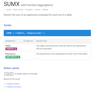
DAX Guide

I still refer to this DAX.guide at least once a week, even though I'm pretty good at writing DAX. 😉

It's really useful when:

  • using a new function for the first time
  • doing a measure or code you haven't used in a while
  • optimizing code
  • looking for something new to learn

Pay close attention to the return value of each function - this is important to making sure you get the results you expect.

screenshot of DAX.Guide


DAX Guide

Keyboard Shortcuts

There are some great keyboard shortcuts in Power BI. I particularly love the 'DAX Editor' ones in this reference below. My strategy is to pick one or two new shortcuts and practice them (daily if possible) until they become second nature. Then I go back to the list and find two new ones. This week I'm going to start working on:

 Ctrl Shift \

which jumps to the matching bracket. 


Best Practice Power Query

Okay, this isn't one of my most visited sites, I just stumbled upon it recently. But it is pretty useful and one that I wanted to bookmark and highlight as I know it'll come in handy for future projects. This is a fantastic article that anyone using Power Query should at least skim. Thanks Microsoft for making some quality content with design considerations! 

Best practices when working with Power Query - Power Query | Microsoft Learn

Timesaving Tips

Align Page to Center

I have been doing this the long way for years, but just recently discovered a tick box in the global settings to align the pages for all future reports to center. This makes it so much easier to see your visuals while editing DAX formulas!

How To

You can find this option under File > Options & Settings > Global > Report Settings

screenshot of Power BI Options align page

Align Visuals

This can be one of the most tedious tasks in Power BI - aligning and formatting your visuals so that they don't detract from the main message. There's lots of ways to format visuals, and I use a combination of methods to get my reports to look just right. 

Step 1: Resize

I use the Format pane > General > Properties to resize my visuals so I know they're exactly the size I want. Tip: If you're resizing multiple visuals that are all the same type and you want them to be the same size, use the Ctrl key to select them all and you can resize all at once!

screenshot properties pane


Step 2: Align

You can continue using the Format pane for position of visuals. I sometimes do this for the first visual on the page, but then I use the Align option to line them all up perfectly. I love the 'Distribute horizontally' option. I think I use it most often.


screenshot Align

Step 3: Format painter

This is an oldie but a goodie. You may know the Format painter tool from other Microsoft applications such as Excel or Word. Well, it's in Power BI too. The great thing about the Format painter is that you can copy formatting from a bar chart to a column chart using this tool. It's so smart, that if you format the y-axis of a column chart, and format paint that onto a bar chart it will apply to the x-axis of the bar chart. Confused? Just try it out!

screenshot format painter


Duh! Power BI Learnings from a Microsoft Certified Trainer (2022 Edition)


First of all, happy 2023! I hope you have all had a great New Year's and holiday season and are coming back a bit more rested and ready for more fun with data. 

Duh! I knew better...

This post is inspired by those silly little 'duh' moments that I've encountered over the past year. You know the ones I mean - you spend hours searching for a feature or how to do something, only to find out that you missed a simple tick box. 

Some of these moments are courtesy of my students, myself, or my colleagues. No matter how much you think you know about Power BI, there's always more to learn. If you've had a 'duh' moment, please tell me about it. I'll add it to this post so others can learn from it too (you can choose to remain anonymous or get credit / link to your own site or blog). 

Preview Features Need to be Enabled

When you get a new computer, or install Power BI for the first time, check the 'Preview Features' and enable any that you think look useful.

If you're a basic user of Power BI, you may have no idea what a 'preview feature' means. They're the new stuff that Microsoft have just introduced, but need to test out and work out all the bugs before they can publish to 'default' settings. With monthly Power BI updates, preview features are an important part of the development cycle and they often come with a link to share your feedback. See an example here of the Feedback Page for the DirectQuery for PBI datasets and AS preview feature.

Even if you're a seasoned Power BI user, it can be easy to get caught out by long standing preview features. I recently got a new computer and have started with a fresh, clean install of Power BI desktop. That means all my 'Global' options have reverted back to default, and my previously enabled preview features need to be re-enabled. Okay, fine. That makes perfect sense. What I didn't realize was that Direct Query for Power BI datasets is still in preview mode! 

I've been playing with DirectQuery for PBI datasets for years, so didn't think to check the preview features. I started with a Google search for "power bi make changes to this model missing" which led me to search through Microsoft Learn and the Power BI community to no avail. No where was there mention of it being in preview still. Eventually I found a really old blog post that told me to enable the preview feature. I checked thinking that I would have no luck with this solution too, but sure enough the preview feature was there. I ticked the box, restarted Power BI, and voila! have the option to make changes to my Power BI live dataset connection. 

To Enable Power BI Preview Features

To enable Power BI preview features;

screenshot Power BI preview features


Open a new Power BI desktop file.

Click File > Options & Settings > Options

Select 'Preview features' under 'Global'.

Tick the box next to any preview features you wish to enable.

Click 'Ok'.

Get Data from Folder

"Does Power BI have a get data from folder option?" is one of my top requests in Power BI courses.

Okay, no one actually says that. They don't yet know the name of the feature they're searching for - which is what places it in the top 'duh!' moments of 2022. Common questions my students have asked include:

How do I copy data and paste it to the bottom of a table?

Can Power BI add new data to the end of a table?

I want to copy paste data into one spreadsheet each week, then load that into Power BI. 

How do I combine lots of different files into one Power BI table?

Some who know a bit more about Power Query or Power BI may even ask:

What's the best way to append data in Power BI? 

Regardless of how you phrase it, if you want to take lots of files that have the same column headings and pull them into a single report, the 'Get data from folder' option is likely what you need. This feature deserves a blog post of its own, so I'll publish that later this month on the how to.


Outlook Conditional Formatting (for BCC emails)


I've received a few emails in the past month where I was BCC'd into them and didn't realize. This can be embarrassing when you start talking about one of those emails to the person it was sent to, as they won't realize you were in on it too!

Outlook View Settings

Outlook View Settings is a powerful way to setup your Outlook to work for you. In the View tab in the Outlook ribbon, click "View Settings" to open this dialog box below:


screenshot Outlook advanced view settings


Note I have don this from my inbox, so will be formatting how my inbox looks. Today we want to highlight emails where I'm only in the BCC, so click the 'Conditional Formatting' button. This will pull up a window of all the different formatting changes Outlook makes for us automatically, such as highlighting unread emails.

Click the 'Add' button to create a new conditional formatting rule. Name it 'BCC' and click the 'Font' button to choose a format. I've chosen a slightly lighter font to indicate that these emails may be FYI or less urgent, and probably don't require an action on my part.

screenshot Outlook conditional formatting

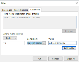
Now click the 'Condition' button. This will pull up yet another dialog box. Here we have three tabs - click the 'Advanced' tab. At the bottom of this window you'll see a 'Field' button.

Click 'Field' and select 'All Mail Fields' and find and click the 'To' field.

screenshot Outlook Advanced Filter


For the condition, select 'doesn't contain' and type your name (as it appears in your inbox) in the 'Value' box:

screenshot Outlook Advanced Filter

Click the 'Add to list' button to add this to the top window.

Repeat the same steps for the 'CC' field, 

screenshot Outlook Advanced Filter


then click 'Add to List'. 

You should now have two criteria in the box on top. Click 'Ok' three times (on the Filter window, the conditional formatting window, and the Advanced View Settings window). 

Send yourself a test email where your name is in the BCC box and see what happens - it should have the formatting you selected.

Remove Duplicates - Power Query vs Data Model


Today's post is going to highlight some of the differences in how Power Query and the Data Model handle duplicate or distinct values, particularly when it comes to case sensitivity and messy data. 

While this isn't a common issue with database source data, many of us use Excel or other less reliable data sources where this might be a potential issue. I've had a few questions around this issue, the most recent being one from @Ana2022 in the Power BI Community.

Case Sensitivity in Power Query

Consider the below table, with two distinct names:

  • ACE
  • Excel with Allison


These names are split across 5 rows, with some duplicates. Note they also are written with different combinations of uppercase and lowercase letters. I know that 'Excel with Allison' is the same as 'Excel with ALLISON', and ACE is the same as Ace.

IMPORTANT: We will prove in this post that if ACE is a different company to Ace, then you will need to create a unique ID that does not depend on case sensitivity.

Remove Duplicates

Let's start by doing a remove duplicates on the Name column: 

Power Query returns 4 distinct values - but we know there are only 2 distinct values.

Load to Data Model

Ok, let's try loading this data to the Data Model (Close & Apply in Power BI or Close & Load to in Excel). 

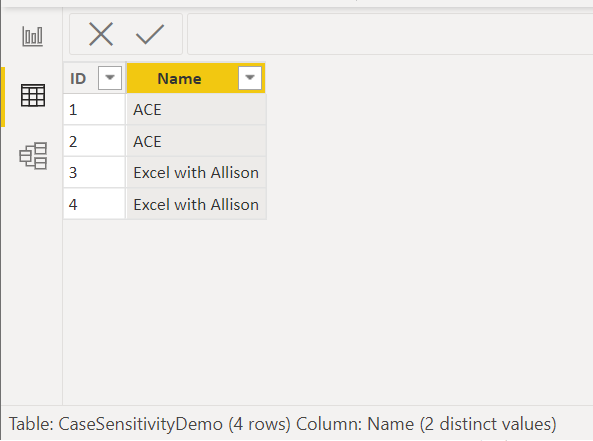
Interestingly, we note that the Data view counts a total of 4 rows and only 2 distinct values. Note also that Ace with ID 2 has been loaded as ACE and Excel with ALLISON with ID 4 has been loaded as Excel with Allison. 

So, there is no case sensitivity in the data model. When we load data, Power BI takes the uppercase/lowercase of the first value it loads and applies that to all subsequent values. 

This makes many things very difficult (among them are Sort by Columns, 1 to many relationships, and distinct counts). 

To overcome this difference, we can choose a case in Power Query and apply that before removing duplicates. 

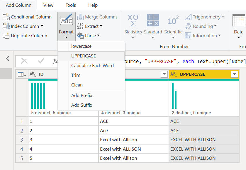
UPPERCASE all values

I want ACE to be all uppercase and Excel with Allison to be proper case. I like the values that were loaded previously, so the order they're in works well. That means I don't want to transform the existing name column to all UPPERCASE, because I'll ruin the Excel with Allison. 

So, we'll add a new column: 


Now I will remove duplicates on the UPPERCASE column;


This leaves us with exactly 2 distinct values as we expected, and when we load these into the Data Model they will all be unique. 

If we want, we can remove the UPPERCASE column, as it's not needed anymore. 


Trim Text - Spaces in Power Query

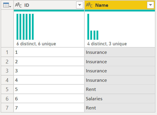
Another common problem we see with Remove Duplicates occurs when there are invisible characters after the text value. Take for example this table, which appears to only have three distinct values:  "Insurance", "Rent" and "Salaries" but Power Query says it has 4 distinct values:


In the View tab, turn on Value Distribution. Select the Name column and we can see where the problem is:

Insurance is listed twice in this bar graph, so it must have the multiple distinct values.

Now that we know "Insurance" is the problem, we'll go back to our original table. If we do a filter and search for Insurance, then look at the code in the formula bar, we'll be able to see what values it's chosen to filter for: 

Here we can see that it is searching for [Name] = "Insurance" or [Name] = "Insurance   " so there are spaces after Insurance in some rows.

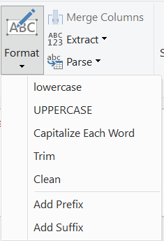
To remove the spaces, we can use a TRIM function: 


Now we're left with three distinct values as we expected, and this is the same thing that loads into the Data Model.

Conclusion

The Power Query functions located in the Transform > Format button in the ribbon can be vital in the process of getting a unique list of values for use in the data model.


Custom Visual Review: Charticulator

This is not your ordinary custom visual - this is EVERY custom visual. Charticulator puts the power to design and develop custom visuals to ...