Search

Search this blog:

Search This Blog

Power BI New Format Pane


 I'm so excited to finally be able to share the new Format Pane with you. As part of the November 2021 Feature Update, Power BI format pane has got a new face lift.

Format Pane

Formatting visuals can take a lot of time and for new Power BI users it's a bit overwhelming and confusing. As of the November release, we have the opportunity to get familiar with a new format pane, one that will soon become the new normal. 

screenshot Power BI new format pane

Enable the Preview Feature

Since this is in preview, you'll need to turn it on. 

Click File > Options and Settings > Options

Then Select 'Preview Features' from the 'Global' menu on left hand side.

Tick the box next to 'New format pane'.

Click OK.

screenshot enable Power BI preview features

Save and close Power BI desktop.

Re open Power BI desktop and welcome to the new format pane.

Have your Say

The really exciting thing about this feature is that it is still in Preview mode - which means that you still have time to provide feedback and have your say. Check out the Official Microsoft blog: Introducing the New Format Pane and add your comments to the blog to provide feedback on what you like, what's missing, what you don't like. 

What's new?

There are lots of changes to get used to with the new format pane, luckily we can turn it on and off as needed, but it's definitely an improvement.

Two pivots

I'm so excited about this feature - I actually requested this in MVP meetings and now it's here! You'll notice the Format pane is now split into two topics: 

  • Visual - formatting options specific to this visualization
  • General - formatting options available for all (or most) visualizations

Microsoft call these 'pivots'. 

General Pivot

The 'General' pivot has most of the formatting options from the 'General' section of the old formatting pane, but also has lots of other familiar Categories too. The key to this pivot it that it only contains formatting options that are available in bulk across all Power BI visualizations:

  • Properties - here you'll find all the size and positioning stuff that was in the old General section
  • Title - every visual has a title, so makes sense to see this under the General pivot
  • Effects - this is where things like background, border, shadow have moved
  • Header icons - this is the new 'Visual header' section
  • Tooltips - almost every visual has tooltips, so again logical to find this under General pivot. There is some additional formatting options in here too!
  • Alt text - Accessibility is important for all visuals. 

screenshot new format pane shape map

Visual Pivot

The 'Visual' pivot has formatting options specific to the visualization type. I'm going to use the slicer visualization as an example. The old format pane for slicers was one of the least intuitive and most challenging to navigate.

screenshot slicer new format pane
Looking at the new format pane for slicers we have three categories:

  • Slicer settings - All the fun stuff has moved here, including the Orientation to turn your list into buttons and the search option that was previously hidden away in the three dots. LOVE this!
  • Slicer header
  • Values

Right Click

You can now right click on the cards for more options: 


I'd like to see this made a bit more obvious, but it's nice that it doesn't take up extra space and detract from the heading of the card itself - we can finally actually read the entire heading description!

Hover

You can also hover over any of the formatting options to get a quick description of what they do. Continuing with the non-intuitive slicer visual, 'Multi-select with CTRL' scares a lot of new users as it sounds like turning it off might turn off multi-select. When you hover over this in the new format pane, it tries to explain what this actually means, though I think it could still use a bit more clarification. How would you re-word it? "CTRL key required for multi-select" makes a tiny bit more sense to me.


Conclusion

The Power BI new format pane is still in preview mode, so you need to enable it and be patient with updates and bug fixes, but it's worth turning it on early to get in on the feedback stage and take advantage of the upgraded functionality and ease of formatting visualizations.

Custom Sort Order for Text Columns in Power BI


How to sort months properly in Power BI

How do you sort your months chronologically? Or how can we put 'Other' at the end of the list without putting zzzz in front of it?

In this post I'll look at two methods for sorting your data correctly and in any custom sort order of your choosing in Power BI.

Method 1: Use 'Sort by Column' feature to sort Months of Year 

Power BI Desktop (and Excel Data Model) have a feature that enable us to change the sort order of any column. The Sort by Column button works when you have another column in your data model that tells Power BI how to sort your data.

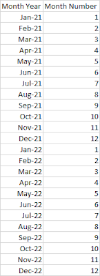
For example, in the table below, we have [Month] and [Month Number] columns. If we leave everything as default, the Month column will sort alphabetically, but by using the Sort by Column feature of Power BI, we can tell it to use the Month Number column to determine the order of the months.


In order for this to work, you must have:

  • Two columns: the Display column and the Sort column
  • A single value in the Sort column for every value in the Display column
  • The Sort column must be independent of the Display column (it cannot use DAX conditions)

Let's look at some examples to see what that means. 

It's okay to have the same value in the Sort column for different values in the Value column. 

Here we have a Value column [Month Year] and we want to Sort by [Month Number]:

table example

This works because every value of Jan-21 has the same value in the [Month Number] column. It's okay to have Month Number 1 for multiple values, they'll just get sorted by default within that range. For example if we sort Month Year by Month Number, and then sort the Month Year column Ascending, the result is: 


Error: There can't be more than one value in 'Sort Column' for the same value in 'Value Column'.

We can't sort the 'Month' column by 'Month Year'. There can't be more than one value in 'Month Year' for the same value in 'Month'. Please choose a different column for sorting or update the data in 'Month Year'.

screenshot Power BI error message
If you've seen some version of that error message before, it means that you have too many sort order values for the same value in the value column. In this example below, we are trying to sort [Month] by [Month Year], but January has the sort value 202101 and 202201. Where then do we place January in the list? It's ambiguous and cannot be used as a sort by column.

sample data can't sort


Error: 'A circular dependency was detected:

Failed to save modifications ot the server. Error returned: 'A circular dependency was detected: Table[Display Column], Table[DAX Sort], Table[Display Column].'


If you don't have a Sort column in your data model, you need to add it using Power Query M code, not DAX. Due to the Order of Operations in Power BI, we cannot use DAX as a Sort by Column in Power BI.

To overcome this problem, open Power Query, click New Column > Conditional Column and create your Sort column there. Then follow the steps in the Microsoft Docs link above to use the Sort by Column feature.

Method 2: Use M Code Zero Width Space Characthers to sort Power BI data

Power BI sorting sorts in ascending order with spaces and special characters first, then numbers, followed by text: 


Your report users will notice if you start putting spaces at the beginning of your data, but we can use the Zero Width Space Character to add an invisible space that can't be seen by the naked eye, however Power BI will still see it and sort it before any other values without that space. 

Zero Width Space Characters

In M code, the Zero Width Space Character can be written as: 

Character.FromNumber(8203)

So to use this, we just need to add it as a prefix to any data. This will require some custom M coding, so we're going to use the interface to learn a few things. If you don't have the formula bar turned on, click the View tab in Power Query, tick the box next to 'Formula bar' to turn it on.

Add Prefix to Column

To add a prefix to any column, we just use the & operator in M. In order to see that in action, click the 'Add Column' tab > Format > Add Prefix

Screenshot Power BI Format

Type anything in the Prefix box:

screenshot Power BI prefix

Now check the formula: 

= Table.AddColumn(Source, "Prefix", each "zero" & [Customer], type text)

Note the part that is underlined in the formula above. The prefix you typed in the box is in quotation marks, followed by the & symbol and the name of the column you had selected. If you look at your data preview, the prefix appears in front of the text in the column you had selected.

We can replace the "zero" with Character.FromNumber(8203) so that our formula now reads: 

= Table.AddColumn(Source, "Prefix", each Character.FromNumber(8203) & [Customer], type text)

If you look at your data preview now, the new column should look the same as the original column, only there's an invisible space character there that we can't see.

This is cool, but doesn't help us with sorting when every value has this character.

Add Conditional Column

Now we're going to add a Conditional column, this will help give us the base structure we'll use to add our prefix. We want our VIP customers to appear first in the list, followed by our Standard, then Other. So to do this, we'll put two zero width space characters in front of the VIP customers, one zero width space character in front of the Standard, and none in front of the Other customers.

We're still using the built in interface to learn M code, so click the Add Column tab > Conditional Column. 

screenshot Power BI conditional column

In this area we'll just create the conditions and use the same 'Output' for each condition. This will give us the base formula, which we can then change to: 

= Table.AddColumn(Source, "Customer Sort", each if [Category] = "VIP" then Character.FromNumber(8203) & Character.FromNumber(8203) & [Customer] else if [Category] = "Standard" then Character.FromNumber(8203) & [Customer] else [Customer])

Now you'll see if we sort by this new column, or use this new column in visuals, it will automatically sort the VIP customers first, then Standard, then Other: 

screenshot Sorted data


Top 3 Reasons to Use Tabular Editor


Tabular Editor may seem a bit scary and technical - it is. However, it can also save you a LOT of time, and teach you some good best practice tips too. Are you using it? What for?

Create a single value slicer (parameter)

Use Tabular Editor to create a single value slicer. We can do this with the 'New Parameter' button in Power BI Desktop, but how can we convert an existing column into a single value slicer? Here's a handy article from SQLBI that shows you How to Enable the Single Value option in a Power BI Slicer.  

Optimize Data Model - Best Practice Tips

In January I wrote a brief Intro to Tabular Editor post on how to install and start using Tabular Editor and focused on the Optimize Data Model feature, which includes some best practice tips for managing your data model.

Calculation Groups

This is fast becoming the new buzz word, and if you're not using them, you may feel left out. I myself am still using the long way and creating all my time intelligence measures one by one - I like the control and flexibility I get when I author the measures myself. However, I'm going to start working through the SQLBI Calculation Groups Blog Series and will try to summarize my learnings each week as I go.

Summarization

One thing to be aware of when using Calculation Groups is that enabling this will disable all default summarizations of your columns. This means you MUST create Explicit Measures (no more using Implicit Measures). You should really be using Explicit Measures anyway, so great way to force best practice behavior, but can be a bit inconvenient when you're trying to do data quality checks or still getting familiar with your data model. 

Custom Visual Review: Charticulator

This is not your ordinary custom visual - this is EVERY custom visual. Charticulator puts the power to design and develop custom visuals to ...